Chow & Herr
I designed this logo for Chow & Herr, a gynecology practice based in Offenburg, Germany. They requested an ampersand that looked like a pregnant woman.
Categories
Logo design, gynecologist practice

As usual, I began the process with a series of sketches.
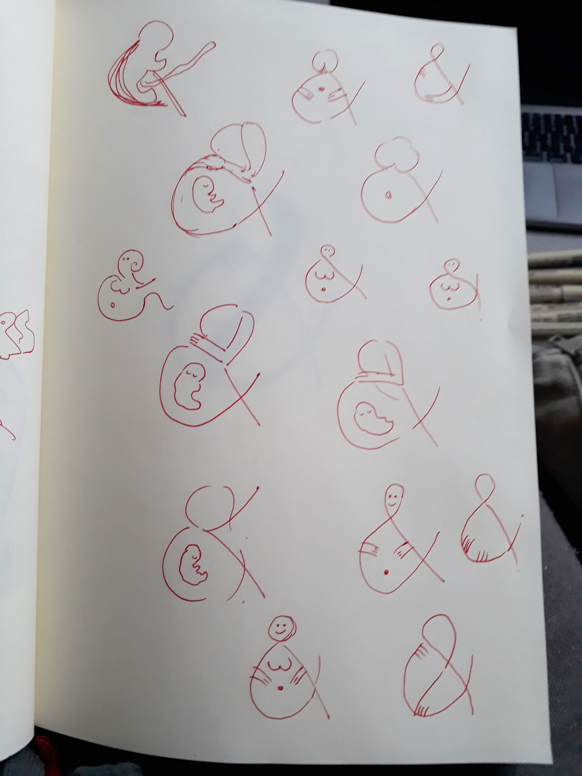
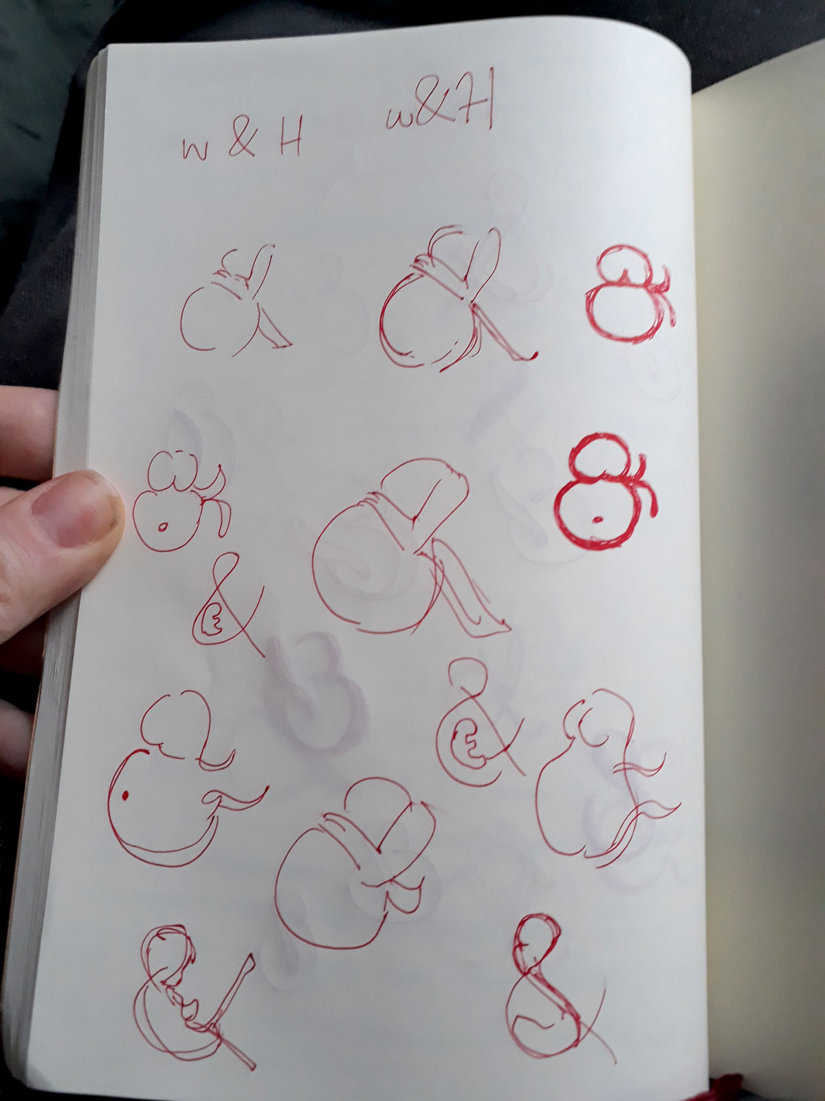
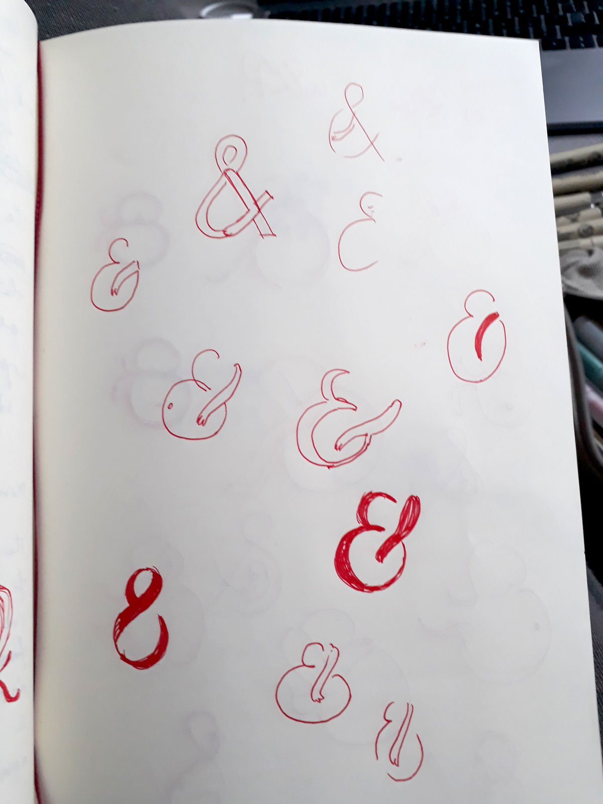
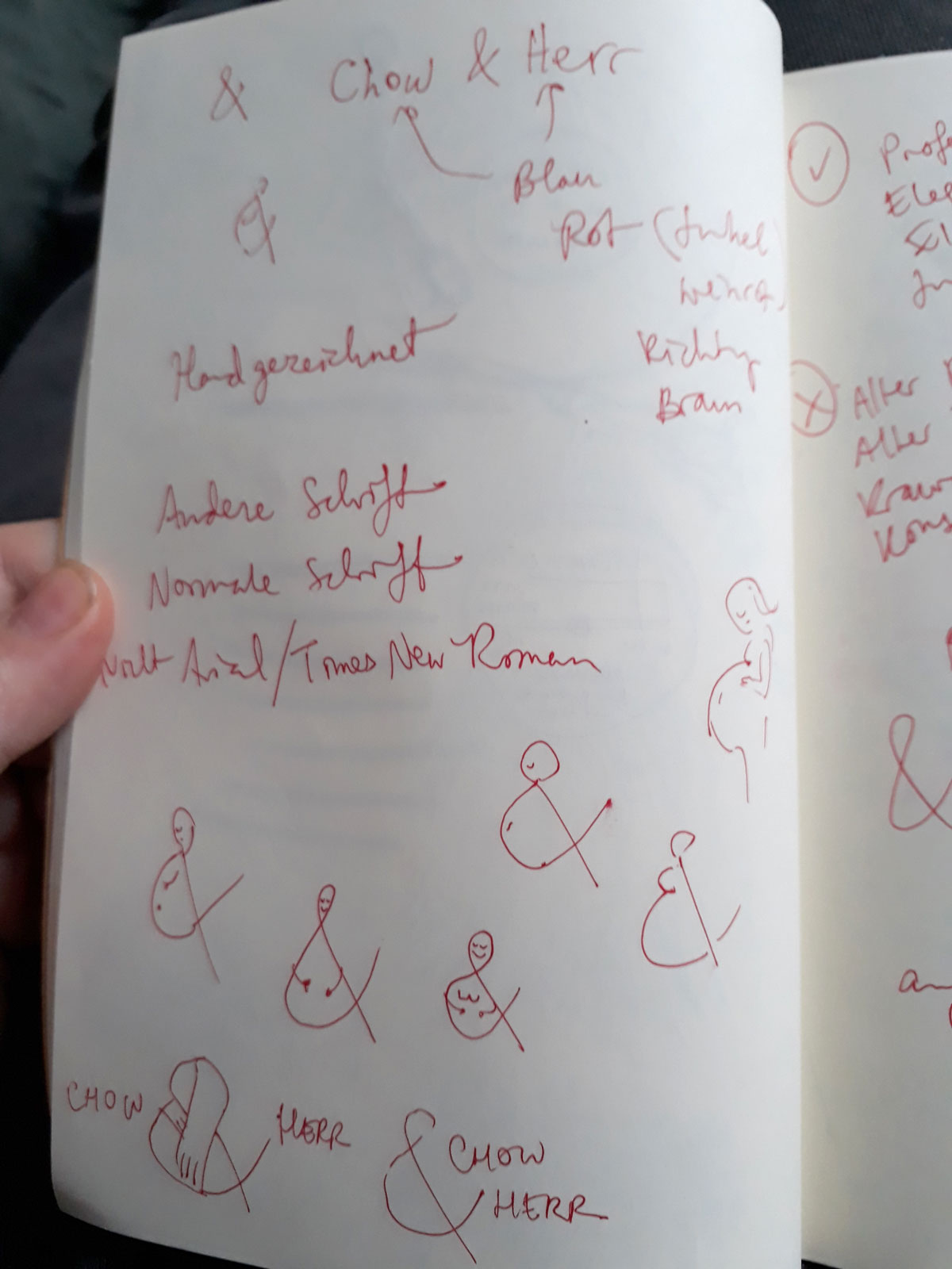
After many pages of rough sketches, I chose the sketches that I felt were the strongest and produced refined versions of them.
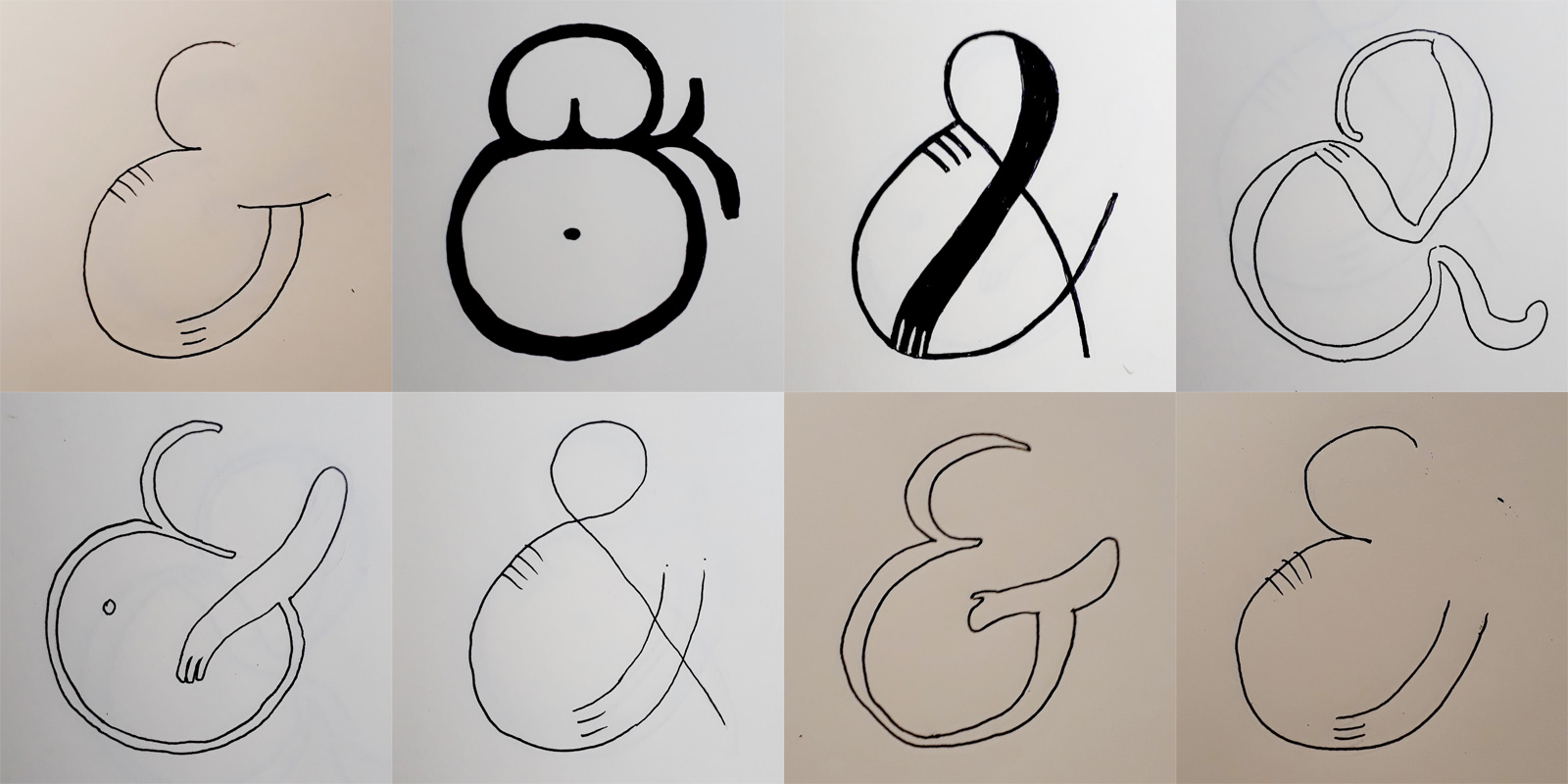
Once the client had decided on a direction, we went through many iterations.


Eventually they decided they wanted the fetus to look more developed and less embryo-like.


Then we experimented with colors. The client initially wanted blue and reddish hues, but we settled eventually on pink and dark brown.


