
GrantSolutions
The U.S. Department of Health and Human Services owns a program called GrantSolutions, which is responsible for distributing grants to many federal departments. My team and I were contracted to redesign their website, which helps get teams started with GrantSolutions and also provides training resources. I oversaw the vast majority of the design from beginning to end: ideation, analysis of the existing website, competitive analysis, web strategy, sitemap, information architecture, user flows and journeys, and visual design.
Categories
UI/UX design, grants management, federal government, comprehensive design overhaul
Contents
Discovery phase
My first aim was to gather as much information as possible about what had precipitated the need for this redesign, what our client’s goals, wants and needs were, and to try to understand what the existing problems with the website were. I used the following in order to conduct that research:
- Stakeholder interviews
- UI/UX analysis of the existing website
- Competitive analysis
My first step was to conduct an in-depth analysis on the existing GrantSolutions website. I spent days combing through every screen on the website, carefully compiling notes, then piecing together big-picture takeaways from that. After days of analysis, I concluded that the general areas requiring the most focus were:
- Content and messaging
- Navigation and information architecture
- UI/UX
- SEO and analytics
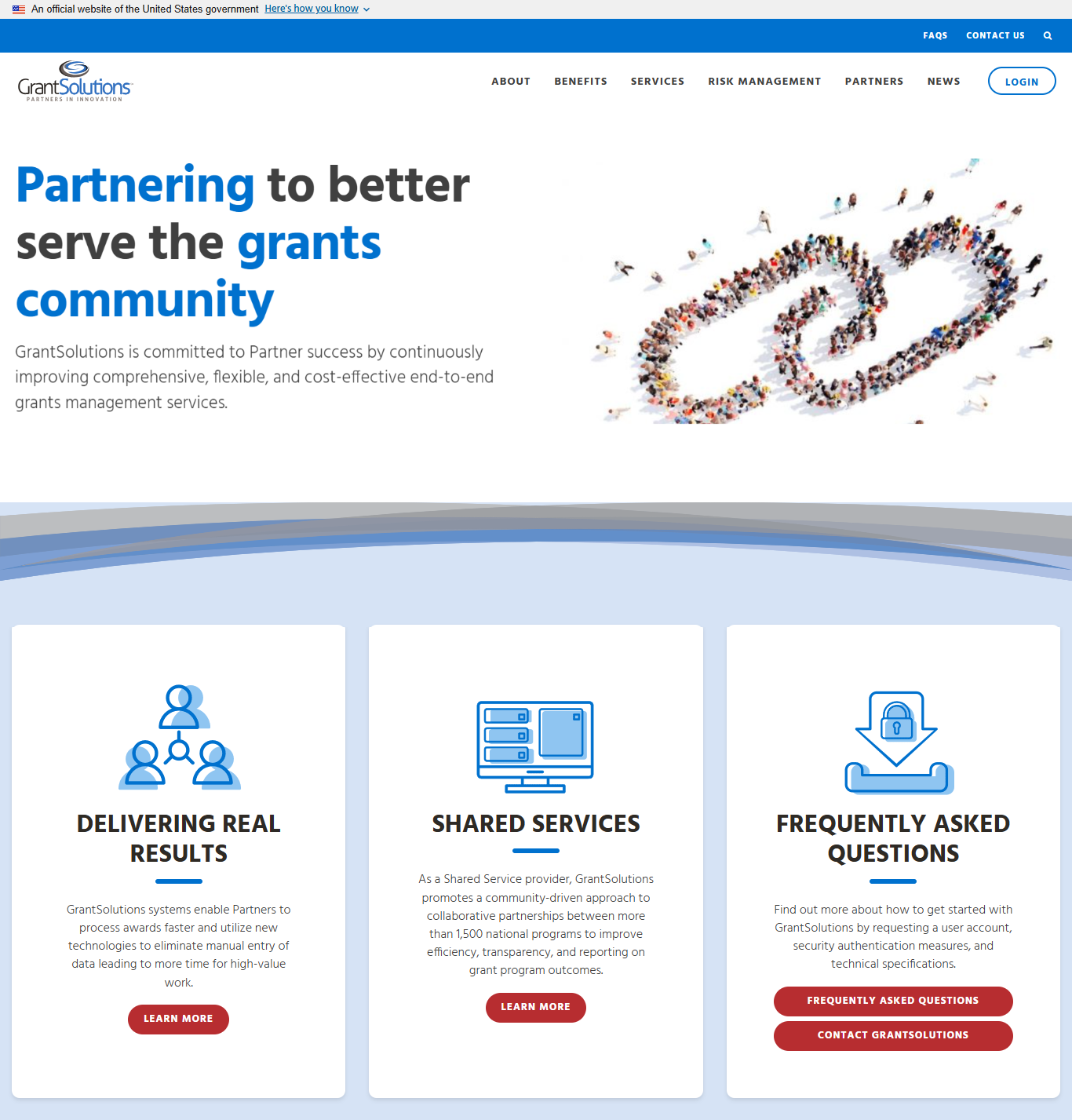
Glaring issues were apparent from first glance: the entire website design felt dated and inconsistent, it was clear that design principles and best practices weren’t being followed, and the branding felt uninspired and generically corporate. It was therefore unsurprising that upon conducting further research, a multitude of UI and visual design issues came to light: inappropriate use of UI elements, a design that did not feel unified across the entire website, and in some cases, instances where the layout was so confusing, it was unclear how users were supposed to parse the information on the page. The graphics and illustrations being used also did not have a cohesive look and feel; they felt bland, and contributed to the overall generic feeling of the website.
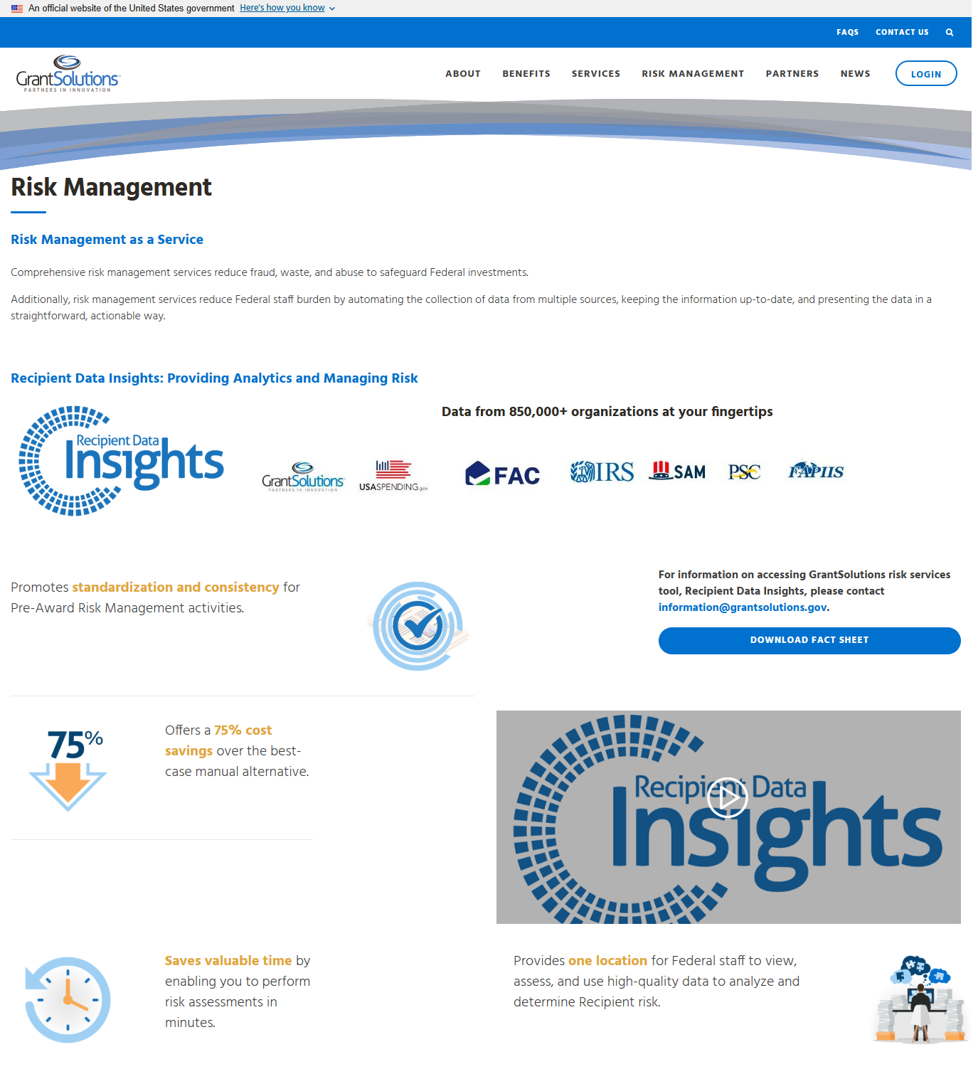
The other largest issue of focus was the experience of navigating through the website to complete specific tasks or learn information. The information architecture was disorganized, and it felt that there was no intuitive flow to the content of the website; I was confused about what tasks I was supposed to perform on the site, or what the purpose of the website even was. The website was heavily lacking calls to action; it left me confused as to what steps I was supposed to take next after reading pages of information—was I supposed to sign up? Contact someone? Buy the product?
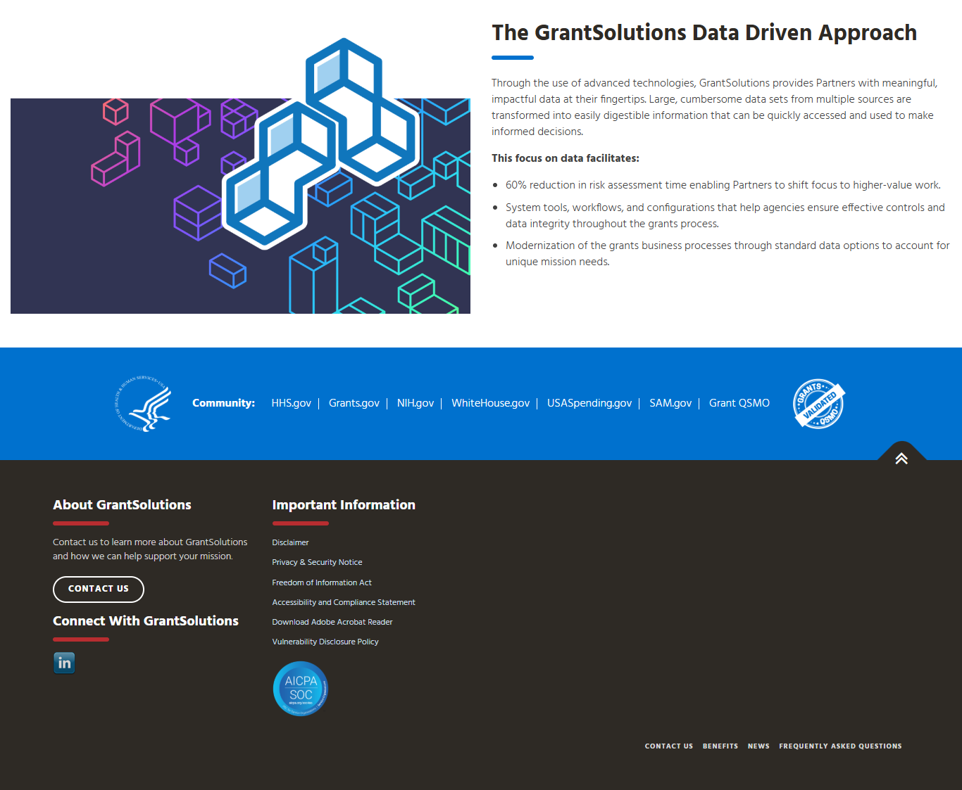
The content strategy and copy also needed work; it took me—and the other members of my team—a very long time to figure out that GrantSolutions wasn’t a program for awarding grants, but for managing them. SEO optimizations needed to be made as well.
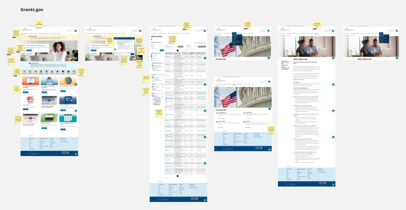
After concluding my website analysis, I performed a competitive analysis, studying three websites with similar products in order to get a better sense of trends, marketing, content strategy, and other elements of UX design in the space of grants management software. The term “competitive” analysis is a bit of a misnomer here, because these weren’t really competitors in the sense that we risked losing users to them. Our user base was already fixed and cut out for us: various federal agencies were instructed to use GrantSolutions in order to manage grants they received from the government. What’s more is, there were heavy restrictions in place regarding which agencies were even allowed to use GrantSolutions; they needed to undergo an entire approval process.
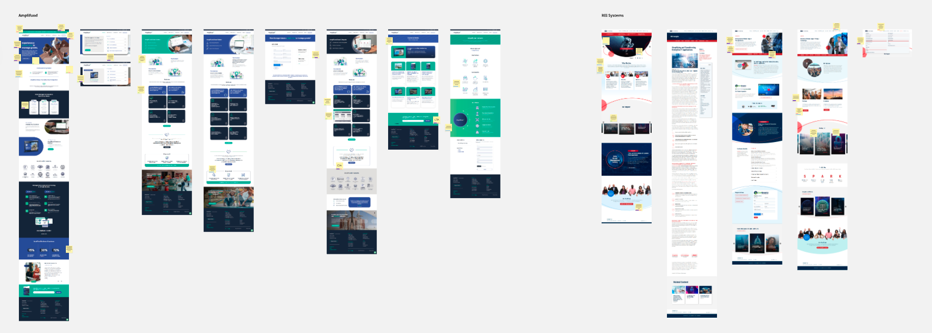
My manager had already conducted stakeholder interviews and put together several tables full of notes containing the stakeholders’ thoughts on the existing website design, their business goals and priorities, and their future vision. I reviewed them and saw that most of their complaints, priorities, and general needs that had precipitated their request for a website redesign aligned with the conclusions I had drawn in my analysis. Because the user base was already fixed, the goals of this entire project were not to win new users so much as they were to make the website easier for representatives from assigned federal agencies to navigate; this included activities such as signing up to use GrantSolutions, logging in to GrantSolutions, and finding information how to use the product.
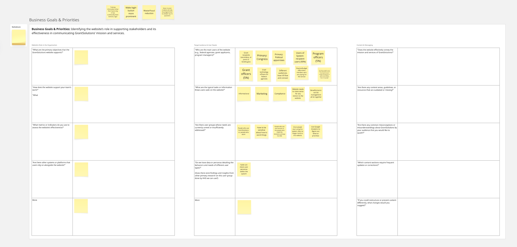
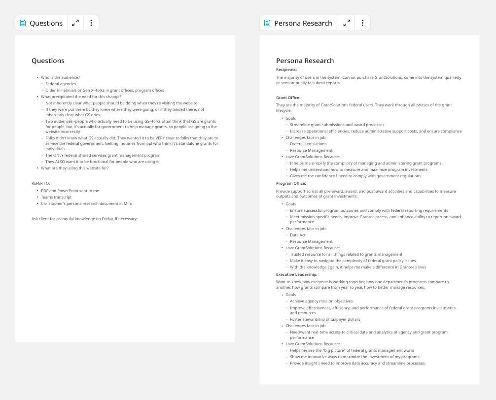
This document also contained persona research that my manager had performed. I wanted to get a better sense of who the audience and target users were for the website, so I reviewed that. I also conducted my own research, compiling a list of questions on who the main target groups were and each of their individual needs and goals, then answering them through discussions with project managers and stakeholders.
Sitemap and information architecture
My team and I organized many discussions and brainstorming sessions to plan out the content for the site, taking into account all the goals and wishes specified by the stakeholders, as well as our own findings from our analyses. In addition to my UI/UX analysis, a team member who was responsible for writing copy had also performed a content analysis throughout the site. We collaborated to determine what the new information architecture for the site should be, and as such, what copy needed to be written for the pages that would subsequently be created or updated.
I assessed all the content to decide what the navigation and sitemap should look like. Certain pages on the existing website weren’t providing much information of value, could be easily combined with other pages, or could exist under a parent link in the navigation bar.


I came up with initial drafts of how the new sitemap and navigation could look. One addition my team and felt was imperative to make to the site was to add more material to help users actually get started using GrantSolutions—whether it was in the form of a signup link, instructions, calls to action, or all of the above. I made sure to have the new sitemap reflect that. There was already a link on the existing website for users to request an account, but it was virtually impossible to find, and the process was not very streamlined.
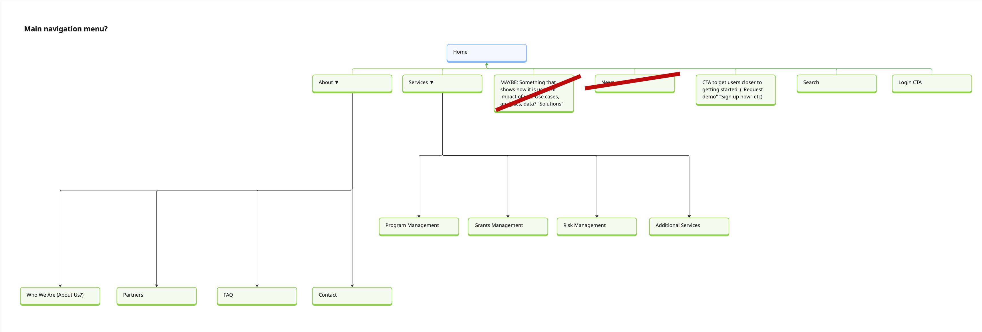
Before proceeding with the sitemap and information architecture, I needed to take a step away and rethink the Services section of the website. During my analysis it had become clear that this section would require a special amount of optimization, more so than any of the other areas on the site. I knew that the changes I intended to make would be so great, it could end up ultimately shaping the direction of the information architecture itself.
Rethinking the Services section
The information in Services served an extremely important function; it listed which services GrantSolutions offered for grants management, from data analytics, to training and support, to announcements, and many, many more. It told users exactly what they could expect from using the product, and whether or not they would be able to use it to meet their specific needs. At that point, Services was divided into several child pages: program management services, grants management services, and additional services.
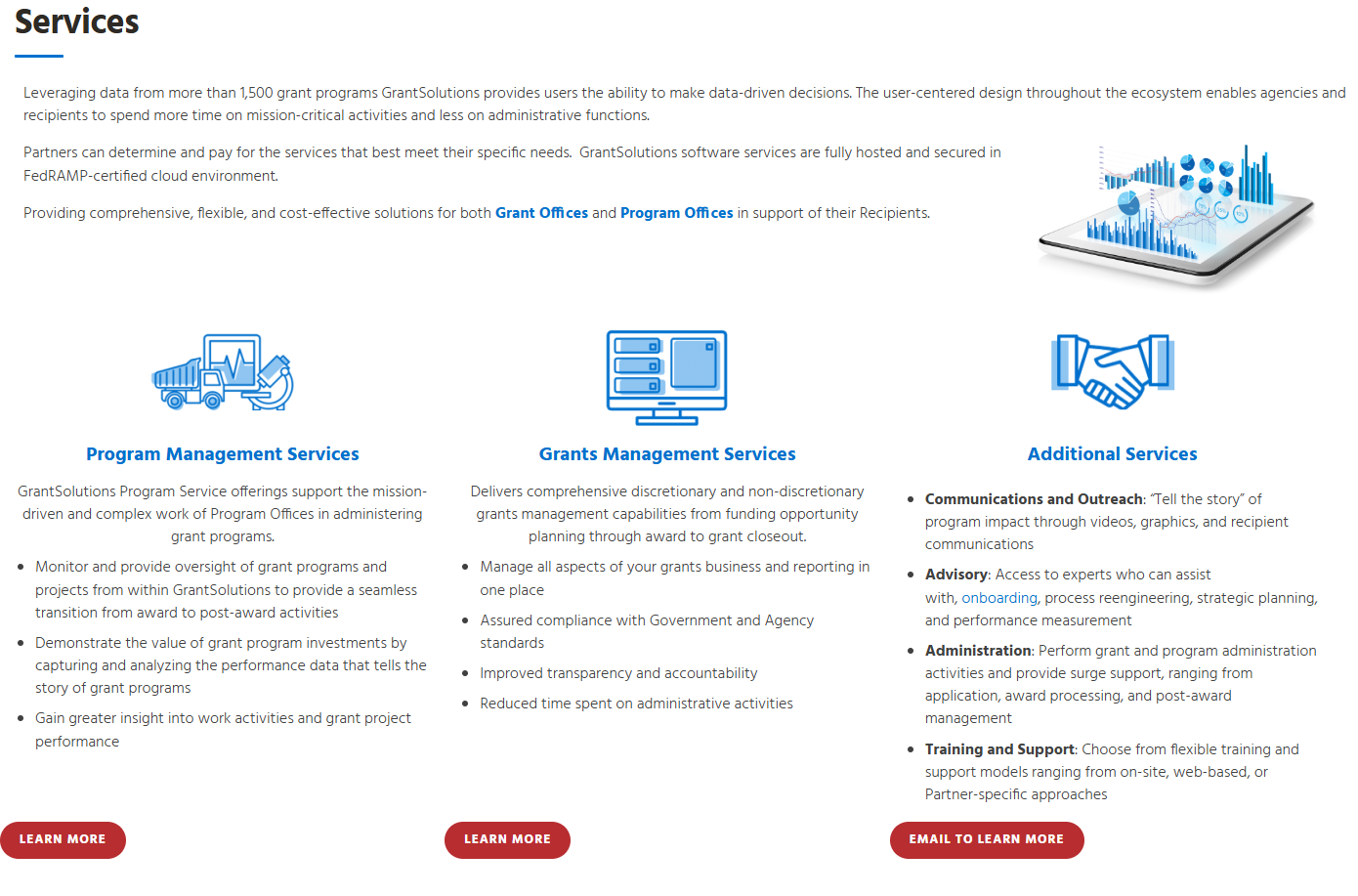
The child pages for each category were text-heavy and chaotic, filled with cursory blurbs on the different services, and subsequent links to PDFs containing more elaborate information. The same services were listed repeatedly on multiple pages, making me wonder if there was a more efficient way to have them categorized. Some services didn’t have any information at all, just a link telling users to email for more information. Furthermore, the Grants Management Services page had many more services listed than the Program Management Services page, which were broken down into sub-sections by different stages in the grants lifecycle: pre-award, award, and post-award. Often, the same services would be listed multiple times under different sub-sections.
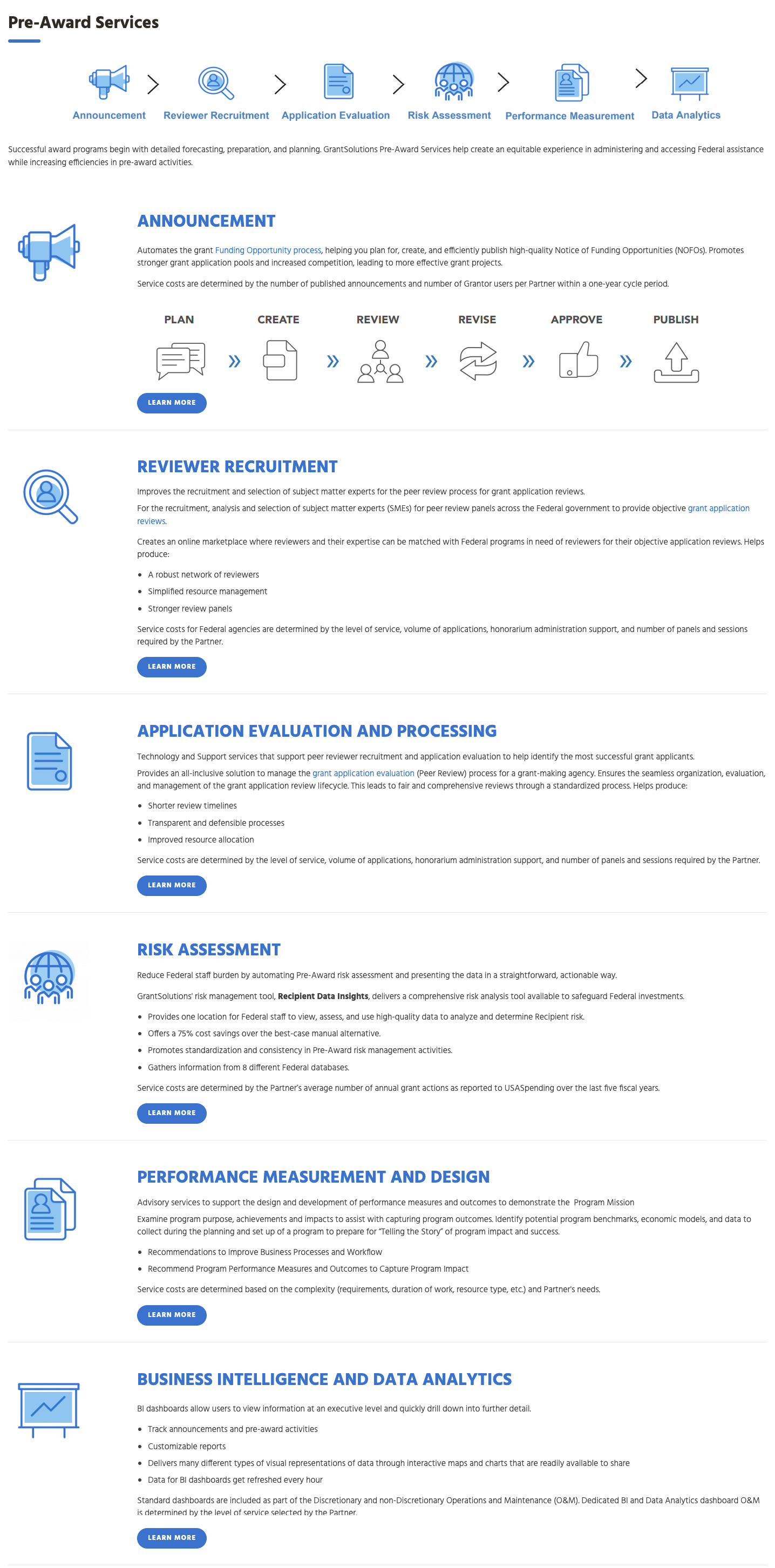

Since the same services were frequently listed on multiple pages and under multiple sub-sections, I wondered if there was a way to contain all services on one page, and have them filterable through buttons, a search, or some other method. It would also save users the trouble of having to click through multiple levels of pages in order to find what they needed. I began to seriously contemplate all the different possible ways that the services could be organized in a way that was more palatable, where the content was more easily discoverable, and where the users wouldn’t have to click through so many layers of pages, sift through PDFs, or scroll through walls of text.
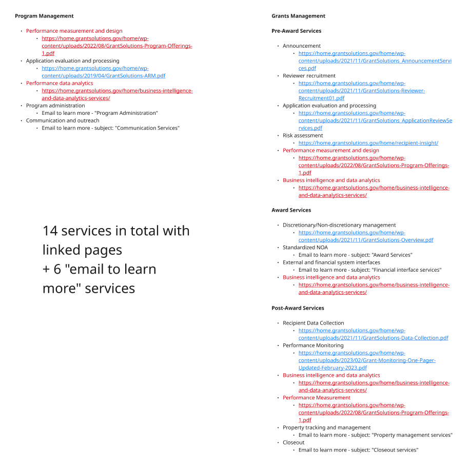
In order to lay down the groundwork for this process of optimization and re-organizing, I made a list of every single service listed on every child page, then highlighted which services appeared on multiple pages. I also tracked which services had an “email for more” button in lieu of a description. I narrowed it down to only 14 services in total with full descriptions. What had initially seemed like an overwhelming, messy, often redundant abundance of information was actually far more palatable than I’d found it to be at first.
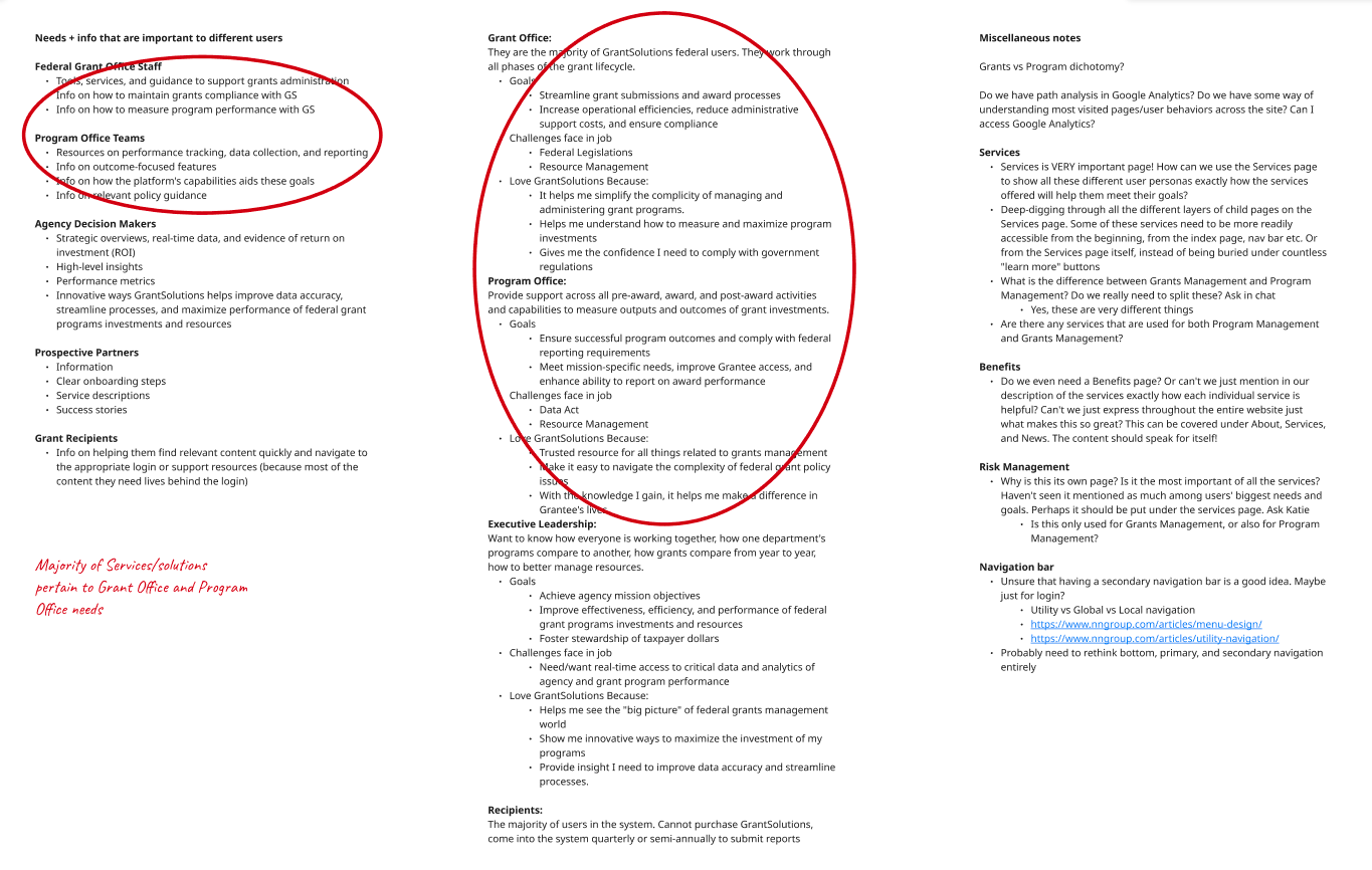
I also did research on who was using the different services, for which purposes, and what each user group’s specific needs were. One piece of feedback that had come to light during the discovery phase of this project was that users were often having trouble finding the information that they needed; as such, I considered it important to identify the types of information our website’s users were generally looking for the most frequently. I already had my manager’s stakeholder interview document, plus the research I had conducted earlier on different users’ needs, but now I needed to gather information on our users specifically related to how, when and where they were using the individual services themselves. I considered whether there were ways to divide and categorize the different services according to user types and needs.
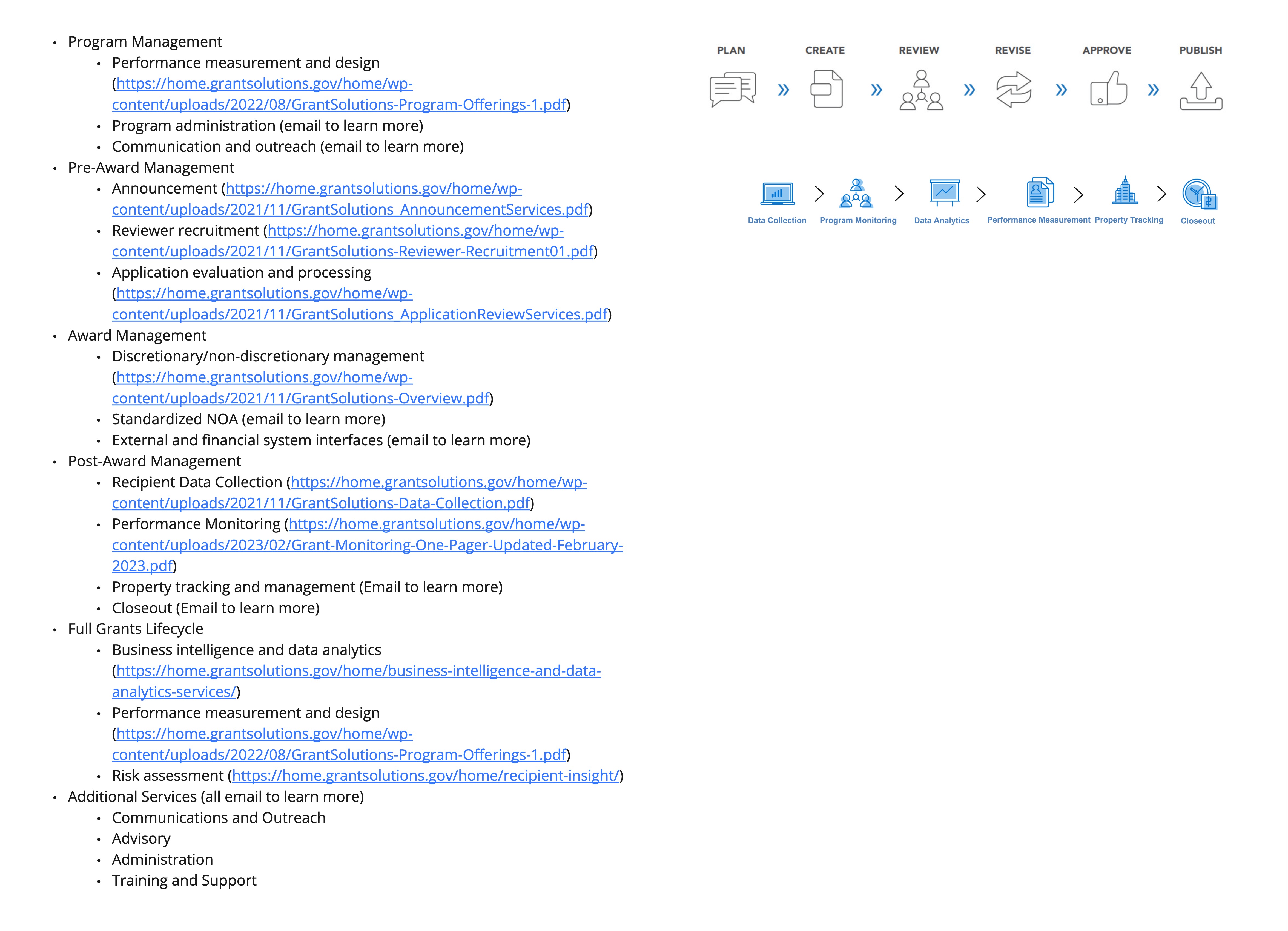
I also categorized the services according to where in the grants lifecycle they fell. Looking into all these different possibilities for how to categorize the services and analyzing what type of information users were searching for the most helped me to lay down the groundwork for re-organizing the entire Services section. Once I had done my research there, I put together some wireframes to help me envision various possibilities for the redesign.
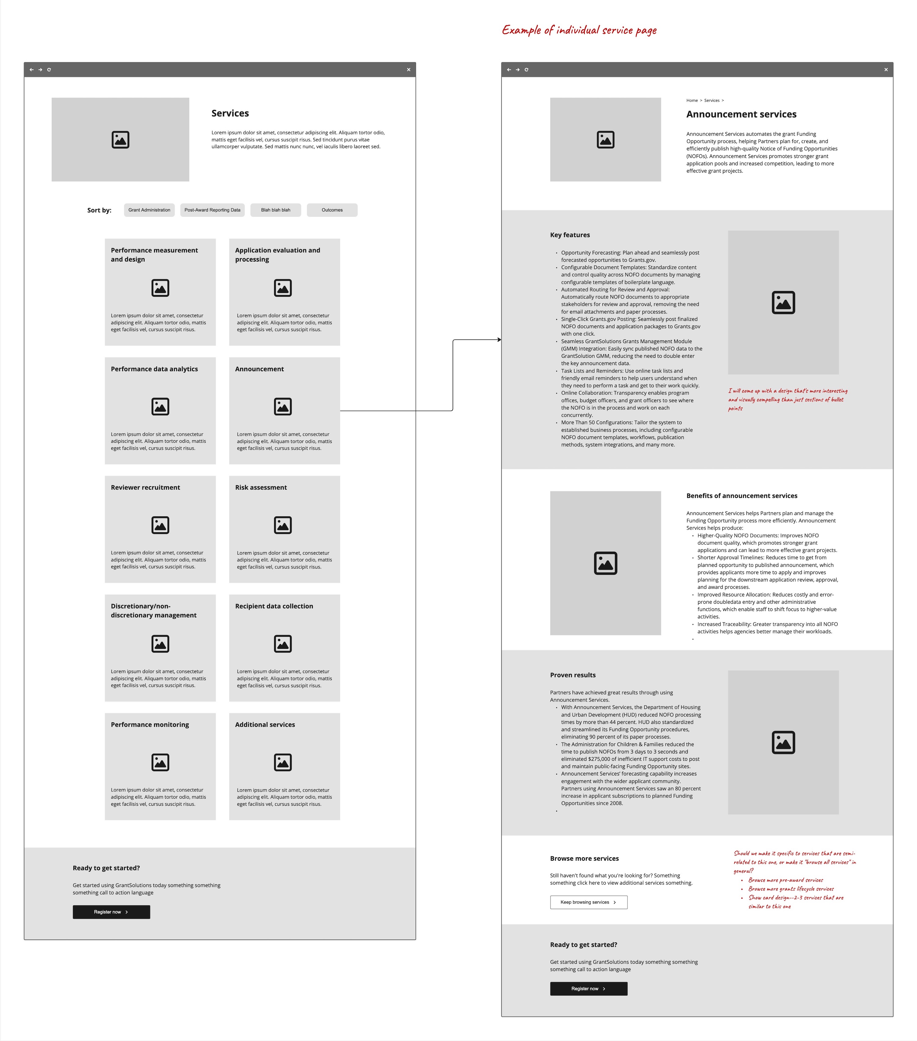
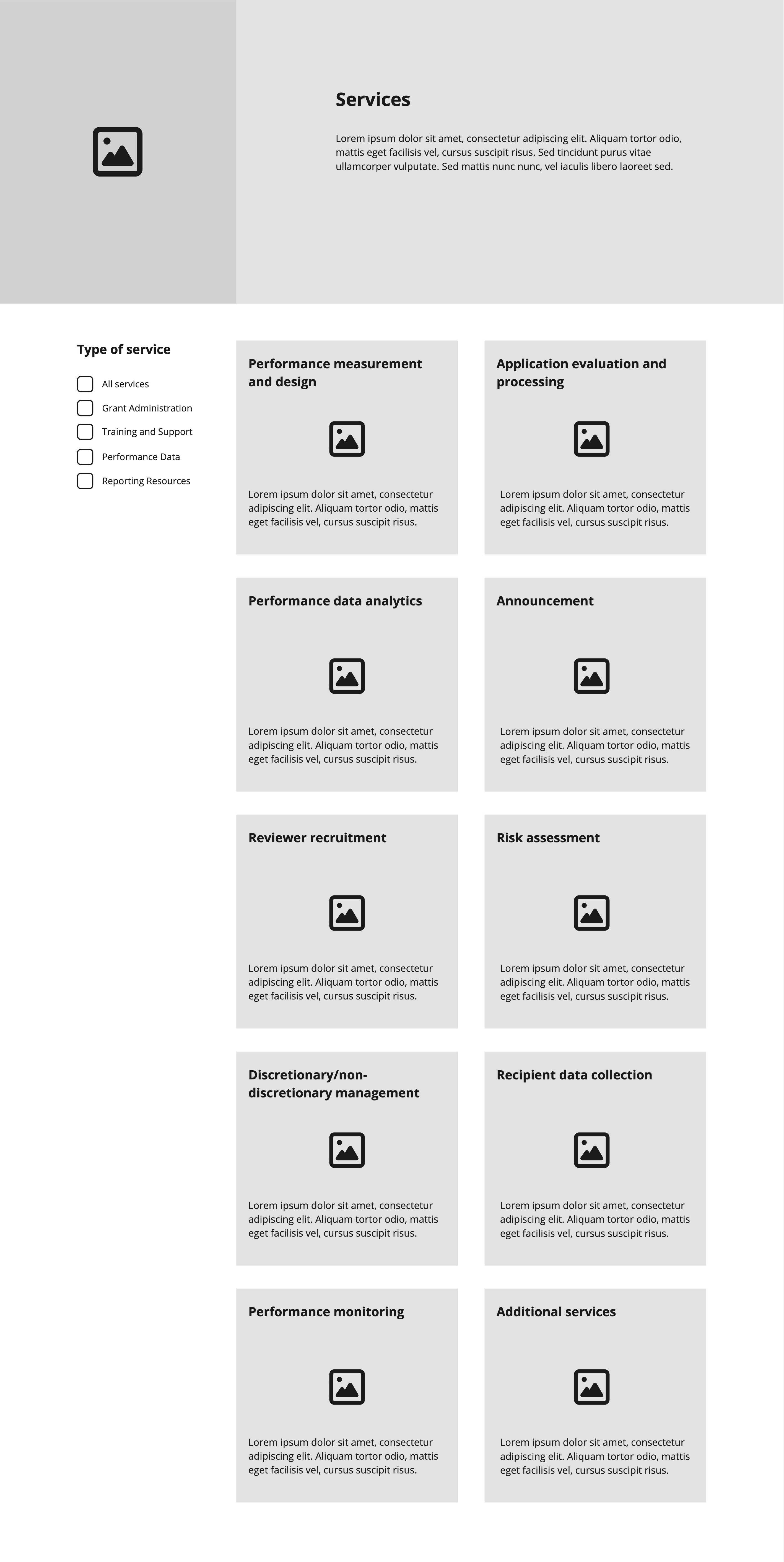
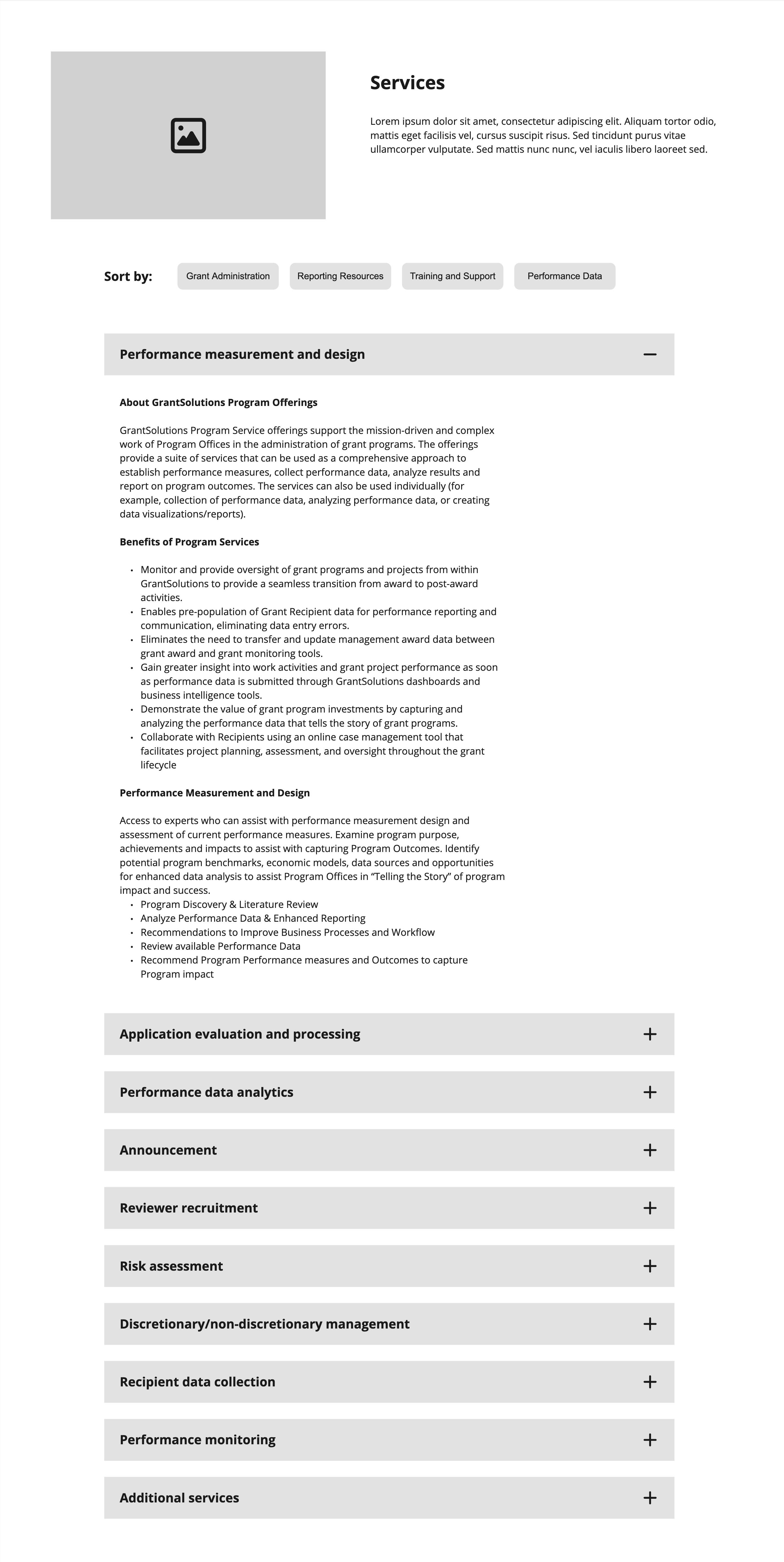
Since there were only 14 services, and so many different ways of categorizing them, as well as different types of user needs, I believed the most straightforward solution was to include all the services on one page and have them be filterable using different categories. I created versions that used clickable chips as filters, and versions where the services were filterable via checkboxes. I was trying to decide whether the services should be categorized according to stage in the grants lifecycle, purpose of service, or type of user. I envisioned versions using small clickable cards that would lead to pages with more information, and versions containing all that information within accordions on that same page.
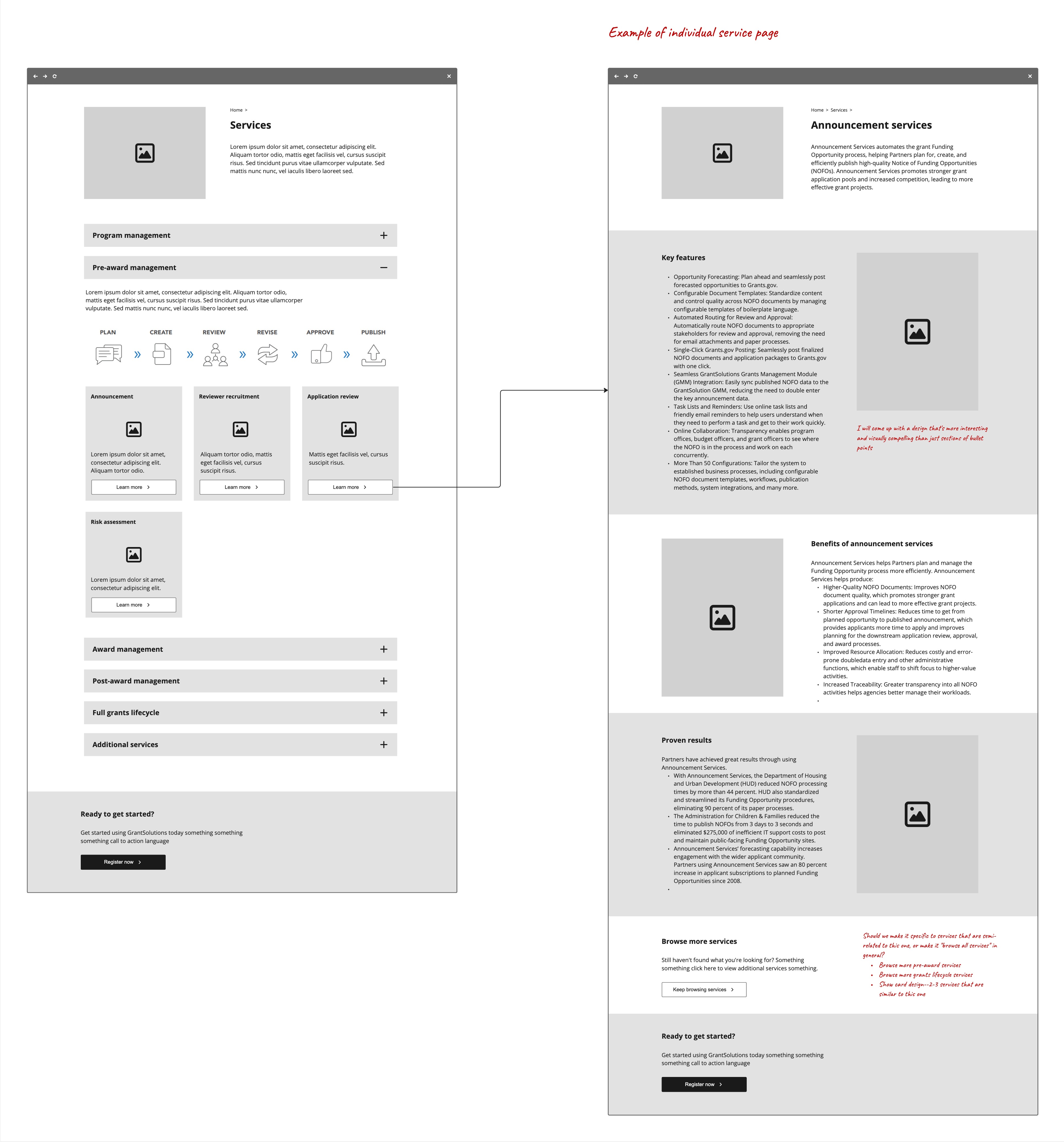
The people on my team weren’t convinced by my idea at first. Some of them didn’t understand how my idea would work, and my manager at first didn’t think it would be technically feasible to develop. I consequently tried out a version where instead of using filters to sort out categories of services, the services would be pre-divided using accordions. However, I did not like this version because it didn’t solve the problem of including the same services under multiple categories. Ultimately, the client strongly preferred the same one that I did, thus solving the problem.
Creating a user flow
As mentioned previously, on the existing GrantSolutions website there was a distinct lack of a user journey—namely, there was no flow leading users to complete a specific goal. My team and I spent a lot of time discussing and thinking about what that flow could possibly look like, as well as where the main call of action should lead. In order to solve these problems, we needed to analyze what users’ overarching goals were upon visiting the website. We knew there were several predominant types of users with differing goals visiting the website; as such, I contemplated how best to come up with intuitive user flows to accommodate them all. For this, I referred to all the research I had gathered on our different users. With more information on how the users needed to flow through the site, as well as more of a sense of which content needed to be added to the site, I also revisited the sitemap during this phase and refined it into a more finalized state.
The main goals users had upon visiting our website were:
- Grant recipients looking to log in to access training resources
- Federal agencies and grant recipients who had received approval to use GrantSolutions and were now looking to request account access
- Federal agencies who were looking to become a partner with GrantSolutions (thereby gaining access to use the product)
We had a login link for grant recipients to be able to access training resources, and we had the Request Account section for users who had received approval to use GrantSolutions but still hadn’t received an account. What we were still missing was information on how federal agencies could become a partner with GrantSolutions—thereby receiving approval to use the system.
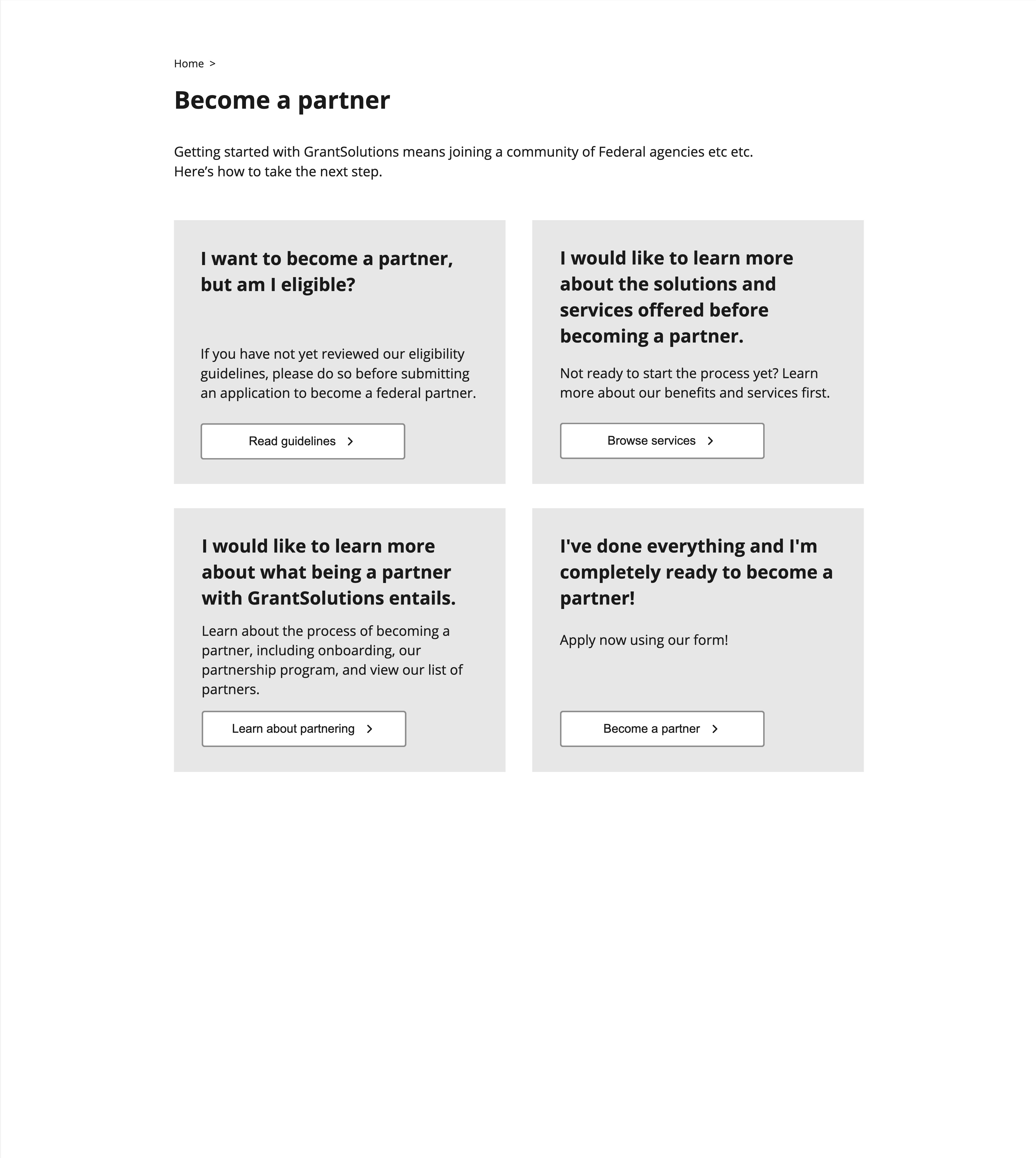
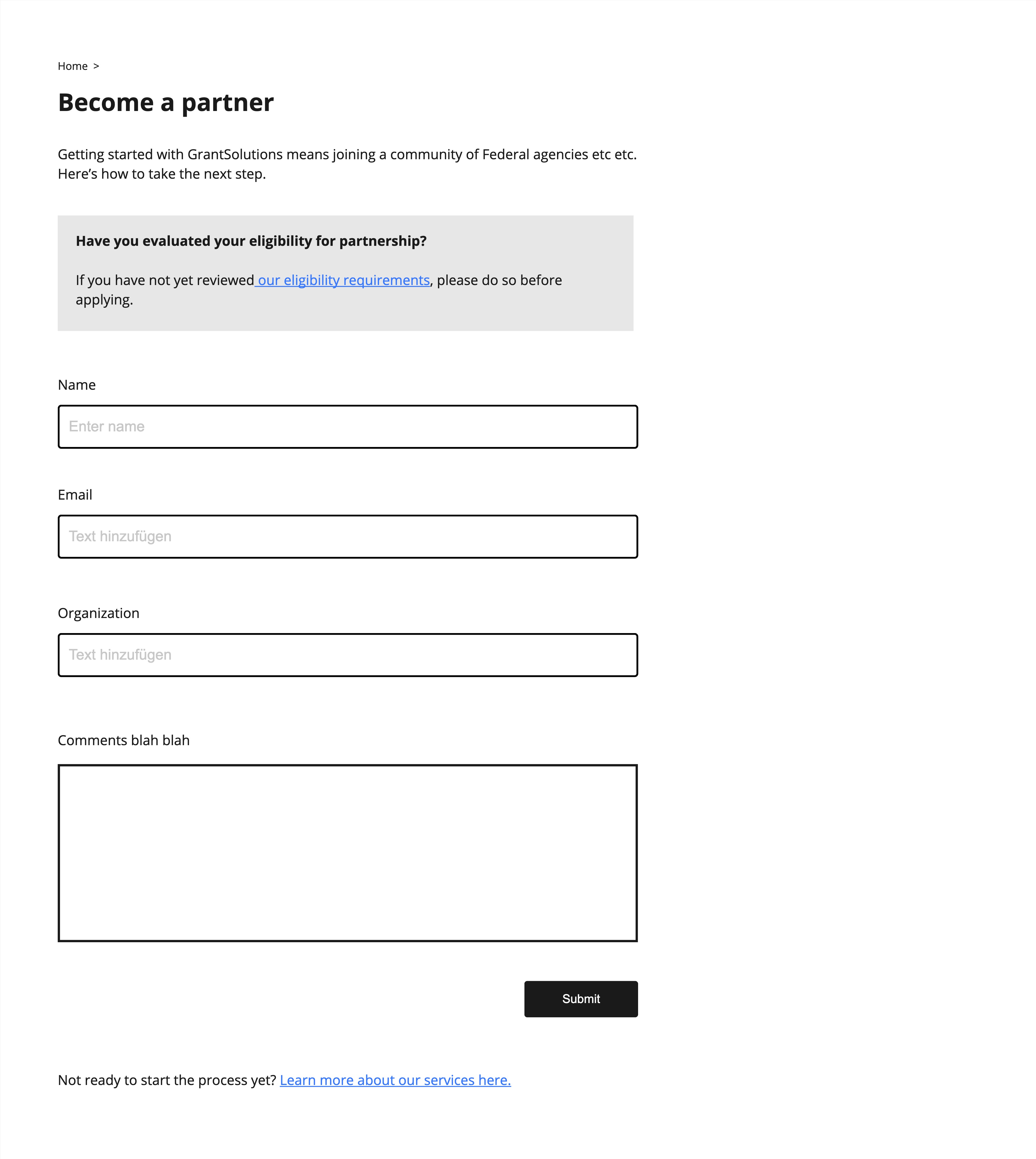
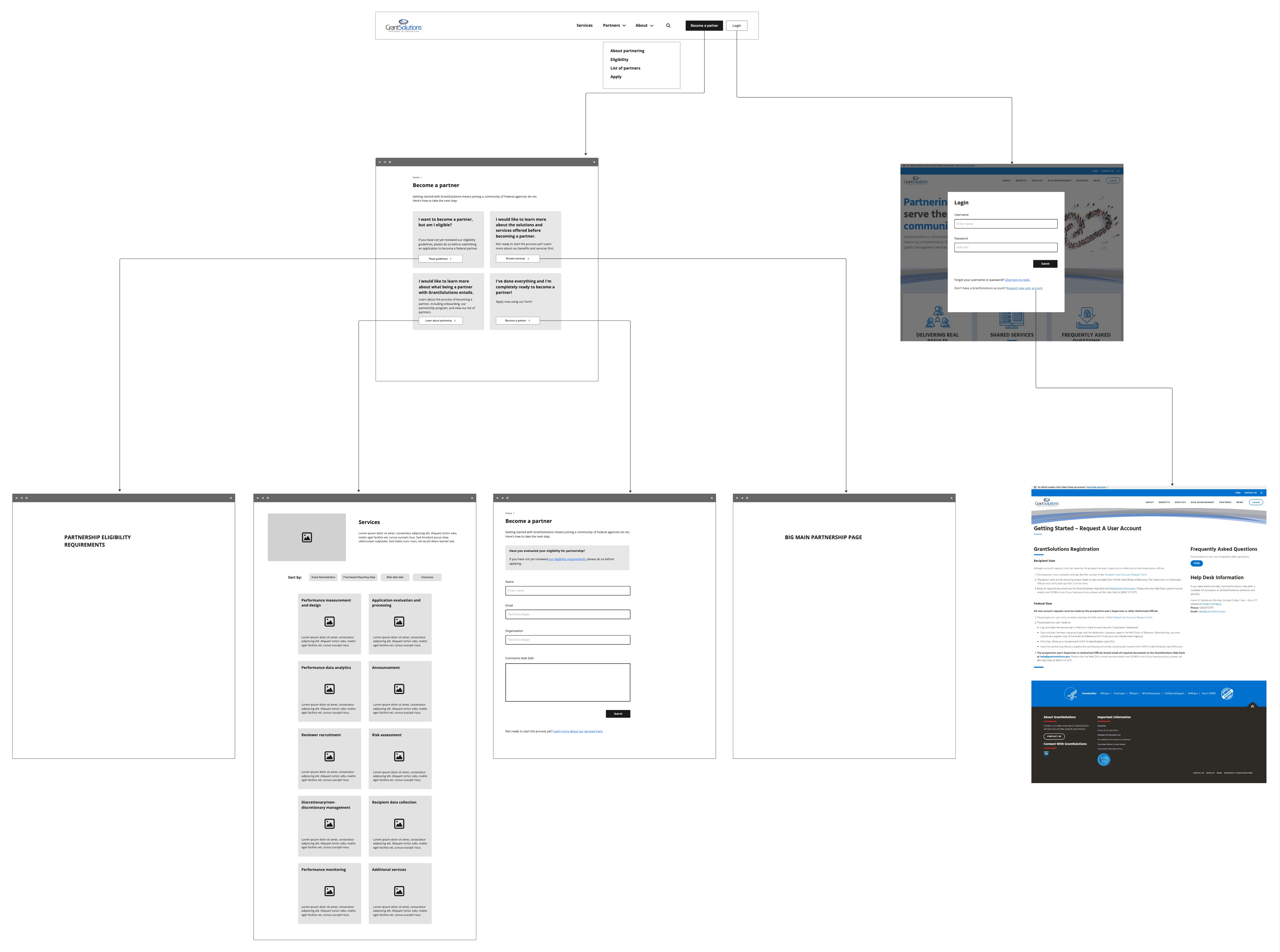
There was a lot of back-and-forth on how best to organize the information and user flows for all the different respective user groups. For a while, we considered having a generic Get Started page and call to action in the navigation bar, where different users would be directed to different places on the site, depending on whether they were looking to become partners, request an account, or log into the training resources. We even had a message to address the users who had mistakenly wandered onto the site thinking they were going to find a list of federal grants for which they could apply—informing them this was a product for managing the grants lifecycle, not an agency that awarded grants.
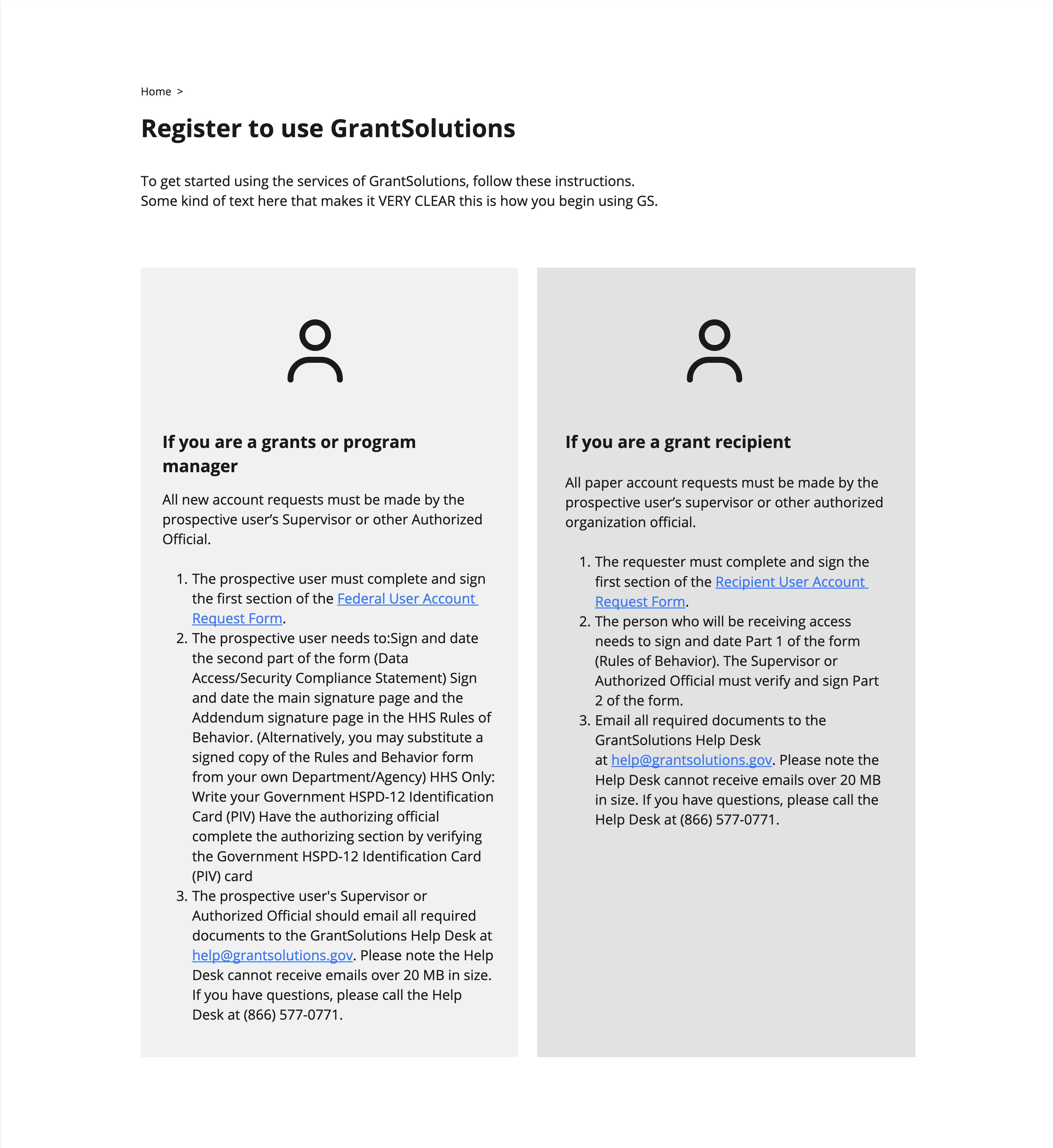
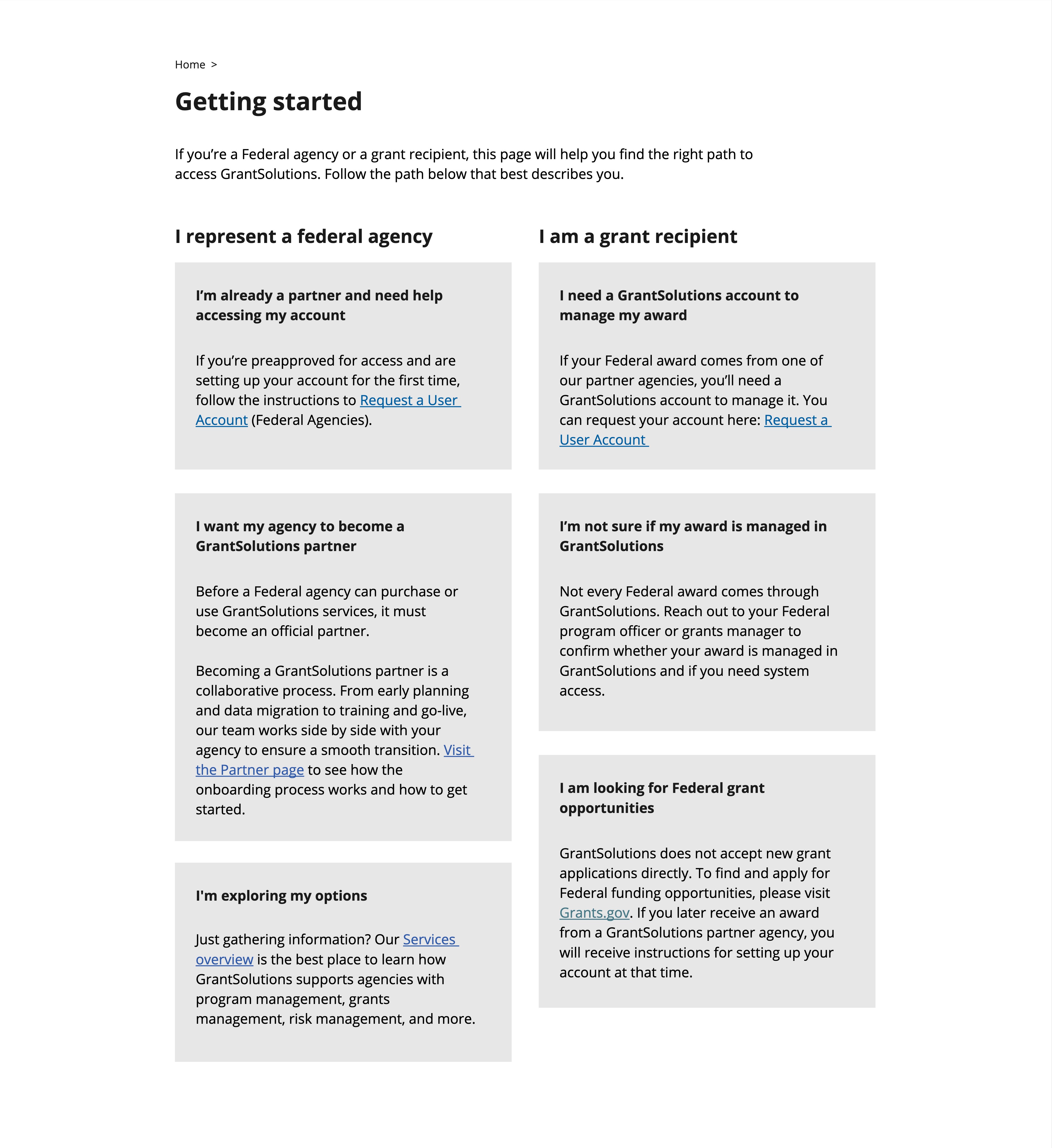
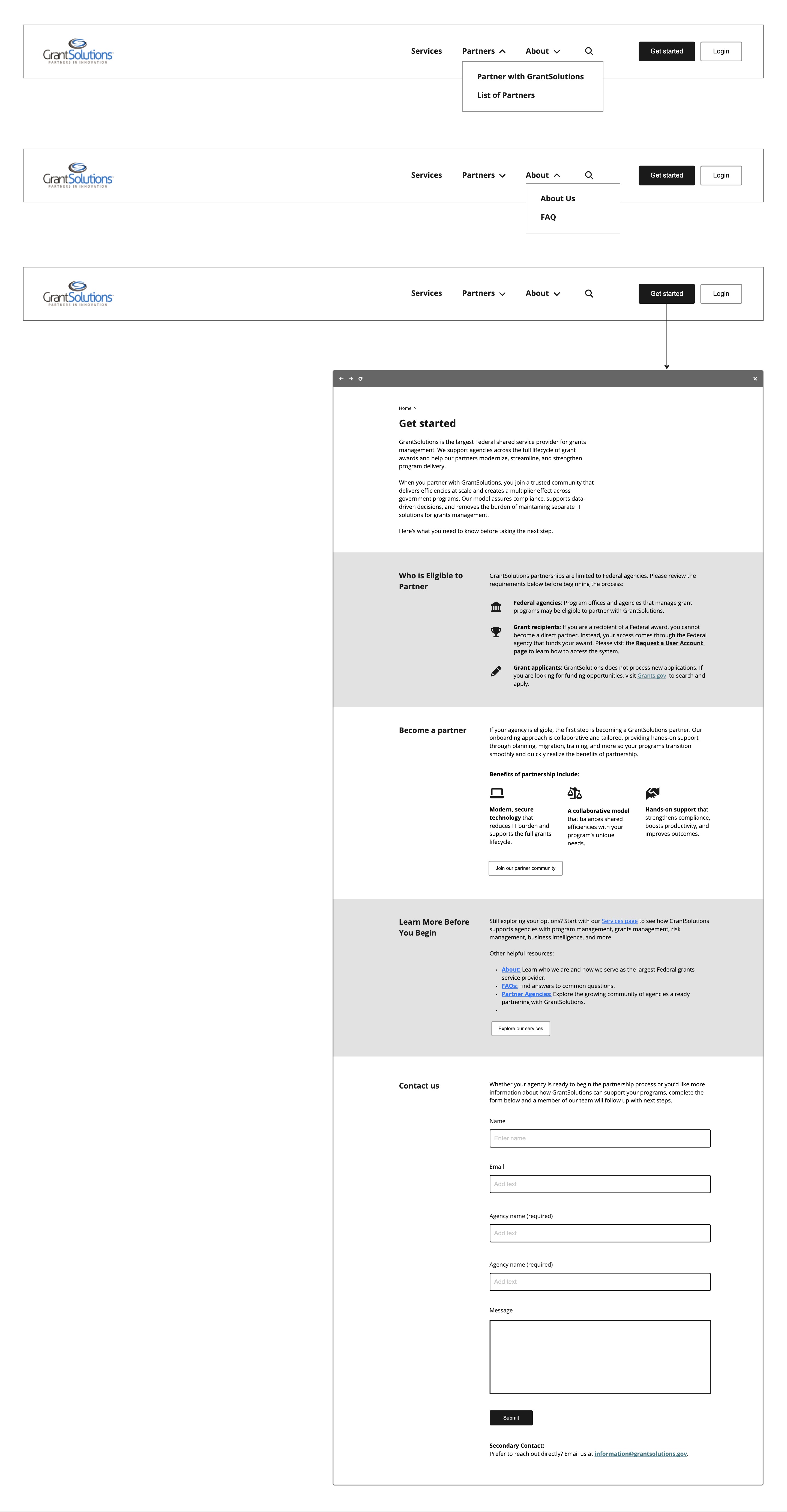
Then we wondered whether it would be better to have the main call to action be related to becoming a partner. We also wanted the main call to action to exist by default on the bottom of every page on the site, to leave users with somewhere to go once they had finished reading through a page. We weren’t sure how exactly the content related to becoming a partner and getting started should intersect.

To complicate things further, our client did not want becoming a partner to be so discoverable. GrantSolutions has a strict approval process where only certain federal agencies are eligible to join, and this client had encountered problems in the past where they would be bombarded with partnership requests from agencies who were completely ineligible. The client found this annoying and fatiguing and was trying to avoid having it happen again.
We found ourselves in a situation where we needed to make the content discoverable for the right people, but not for everyone. In order to achieve this, I needed to somewhat disregard the UX best practices for conversion rates that I’d internalized over many years, and consider the problem from a completely different angle. The goal was not to make it as easy as possible for any visitor to the website to sign up or log in to use the product, it was to create a funnel only for users who were eligible. In a way, it was counterintuitive to what most product design projects are: rather than converting the highest possible amount of users, we were aiming to restrict them—GrantSolutions wasn’t trying to earn money off of their product, so the incentive was completely different.
In order to achieve this, my team and I set up a user flow that deliberately contained roadblocks: calls to action led instead to a page where users would be forced to read about GrantSolutions and how the process for partnering worked, and only at the very end would they be presented with a link to submit their information for approval.
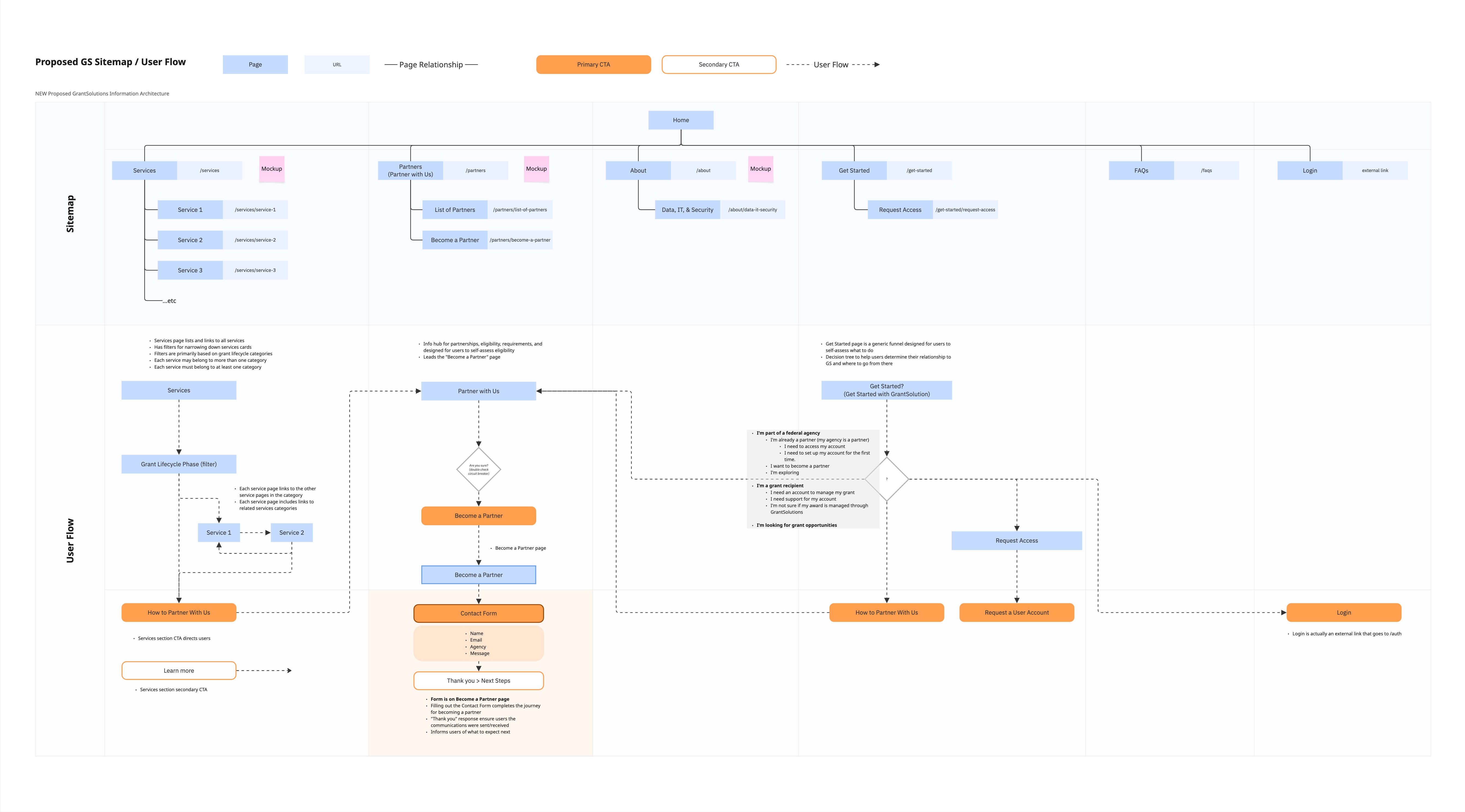
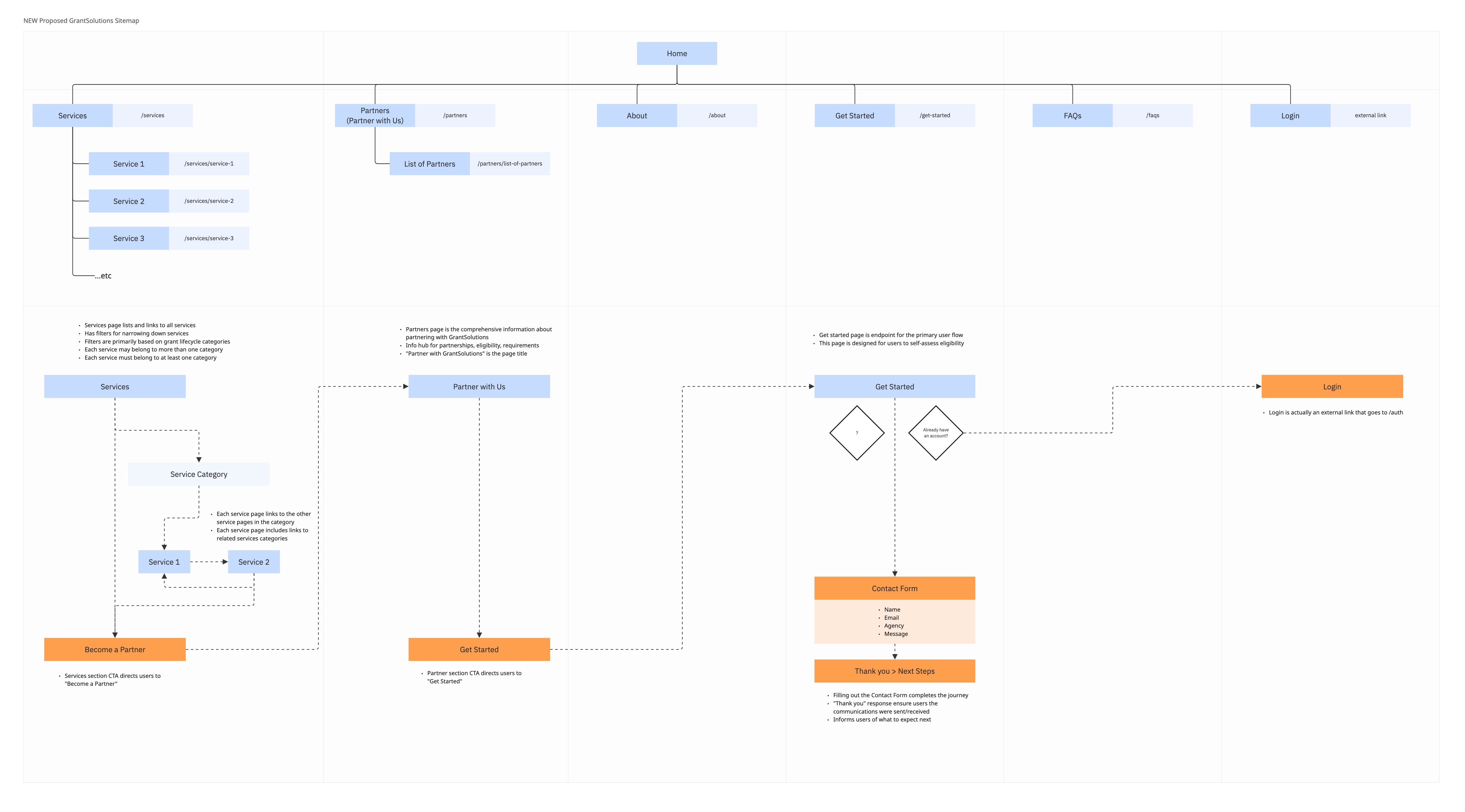
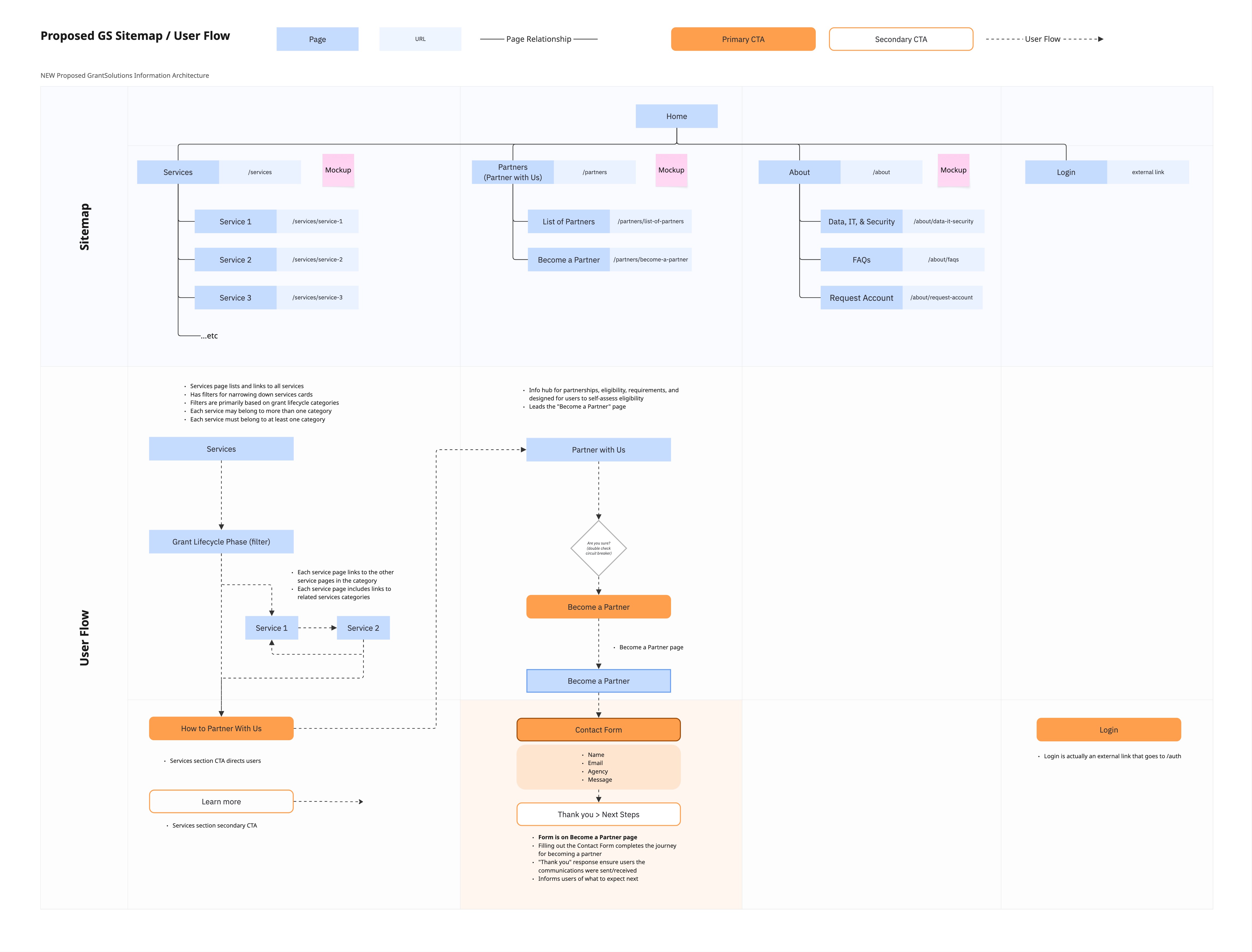
We worked through several iterations of user flows and sitemaps, until we arrived finally at a simplified version:
- A Services section with child pages for each service
- A Partnership section with all information relating to partnerships underneath it: how the partnering process worked, how to become a partner, and list of partners
- An About section with a basic About page, FAQs, Request Account, and a page on technology, data and security practices at GrantSolutions
- Login
The main flow of the site would lead to a page describing how the partnering process worked, to ensure that users would read it before applying. At the bottom of that page, users would then be led to a section where they could email GrantSolutions to apply for partnership.
Visual design
Initially, I was given an extremely tight deadline of only two weeks to work with for visual design mockups. I pulled them together at a frenetic pace, working off of existing design guidelines that had been given to me by the GrantSolutions stakeholders. The guidelines were minimal, focusing mostly on basics such as color and typography. They listed several acceptable fonts, and for the sake of consistency, I selected only one to work with: Avenir.
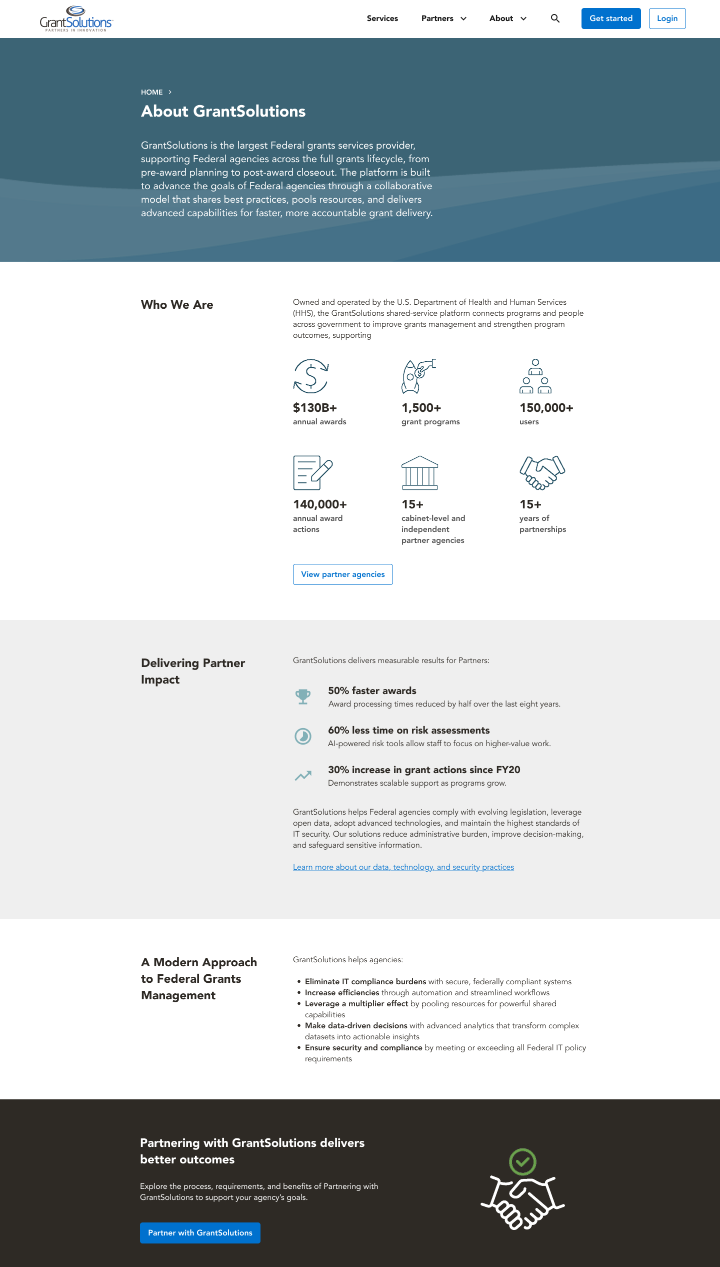
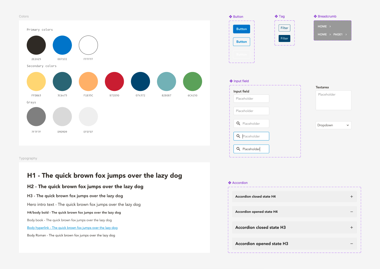
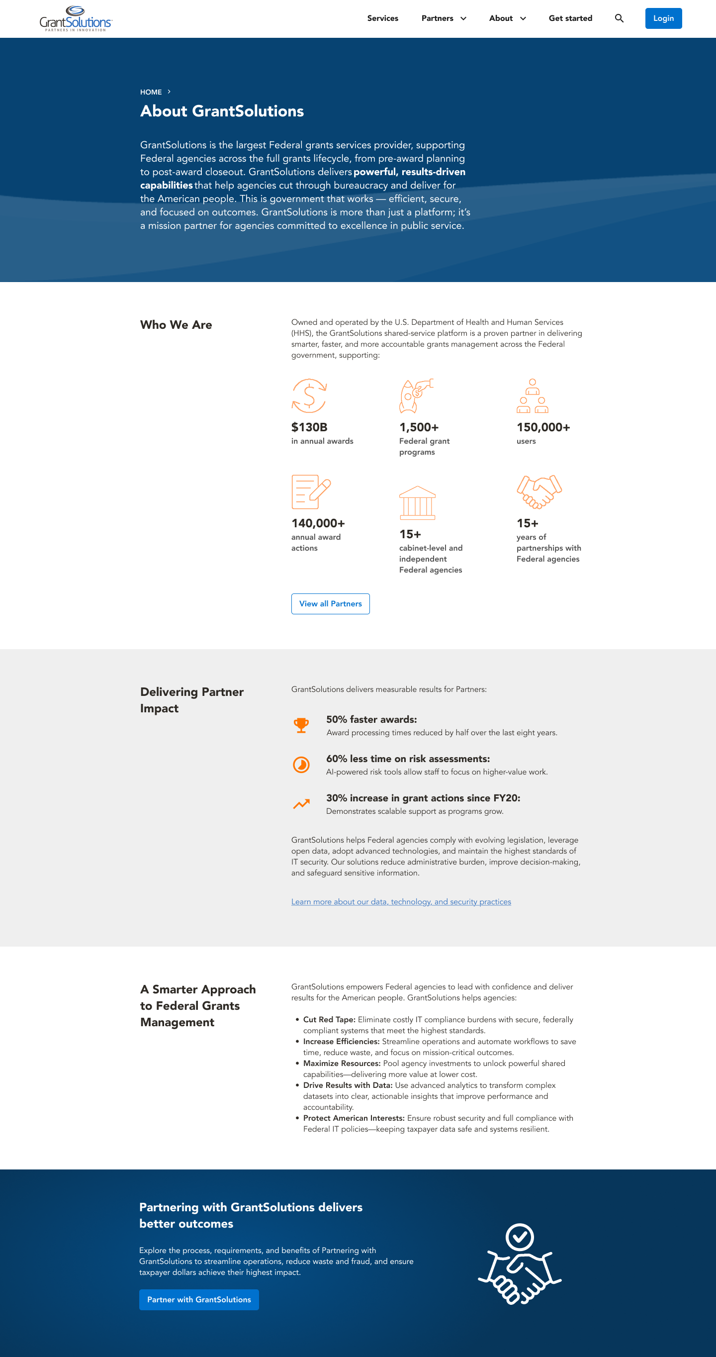
As I designed the screens, I simultaneously built a design system out of Figma components. This iteration of mockups was experimental when it came to color. The stakeholders extended our deadlines, thus giving me more time to improve and refine the designs. For the dominant color, they wanted me to stick to only one shade of blue, and they wanted me to make the graphics and iconography orange. They felt that the website was a little too blue, and wanted a brightly contrasting accent color to break the monotony of the color palette. I was not fond of the look, feeling that the line drawings were not visible enough in such a bright color. I explained the visibility issues to the stakeholders, but they were set on the decision, so I went with their request for the time being.
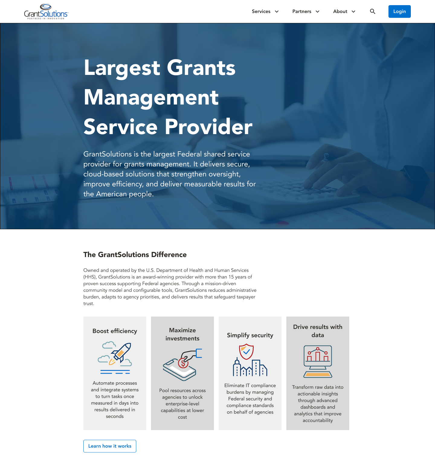
For the hero section and homepage, I needed to come up with something that felt distinctive from the rest of the site, but still felt like it belonged to the same design system. I experimented with many different iterations.
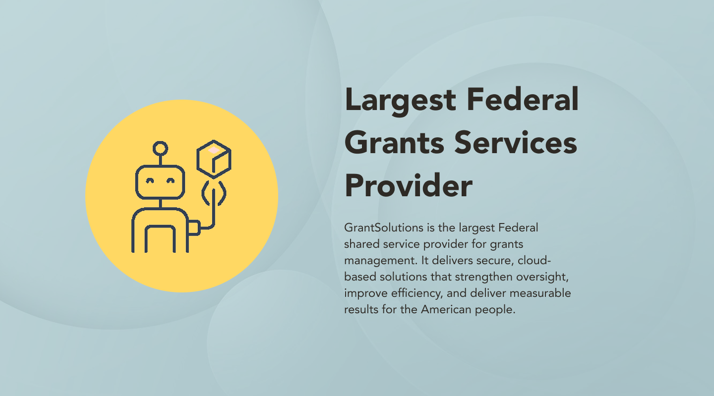
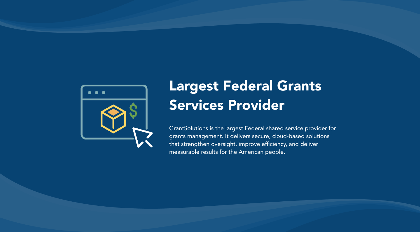

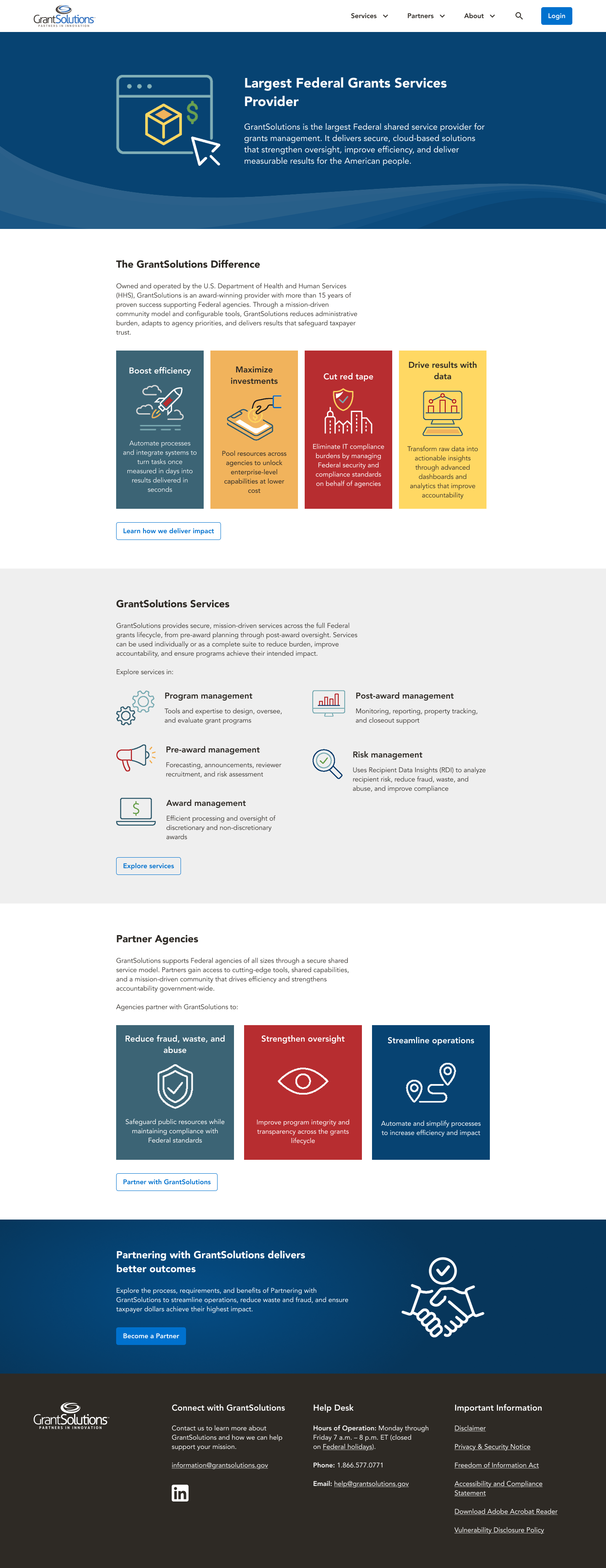
The stakeholders requested that I restrict my use of the GrantSolutions brand colors to just blue and gray as the predominant hues and keep everything else solely as accent colors. Because this was a government website, they wanted a more subdued and conservative look. I also did not feel the use of the existing graphics library was appropriate for the hero section, as it made the website feel too cartoonish. Ultimately I decided on a photograph as a background for the hero section. It gave the website the serious feeling we all were looking for, and also distinguished this section enough from the rest of the website, since no photographs were used anywhere else.
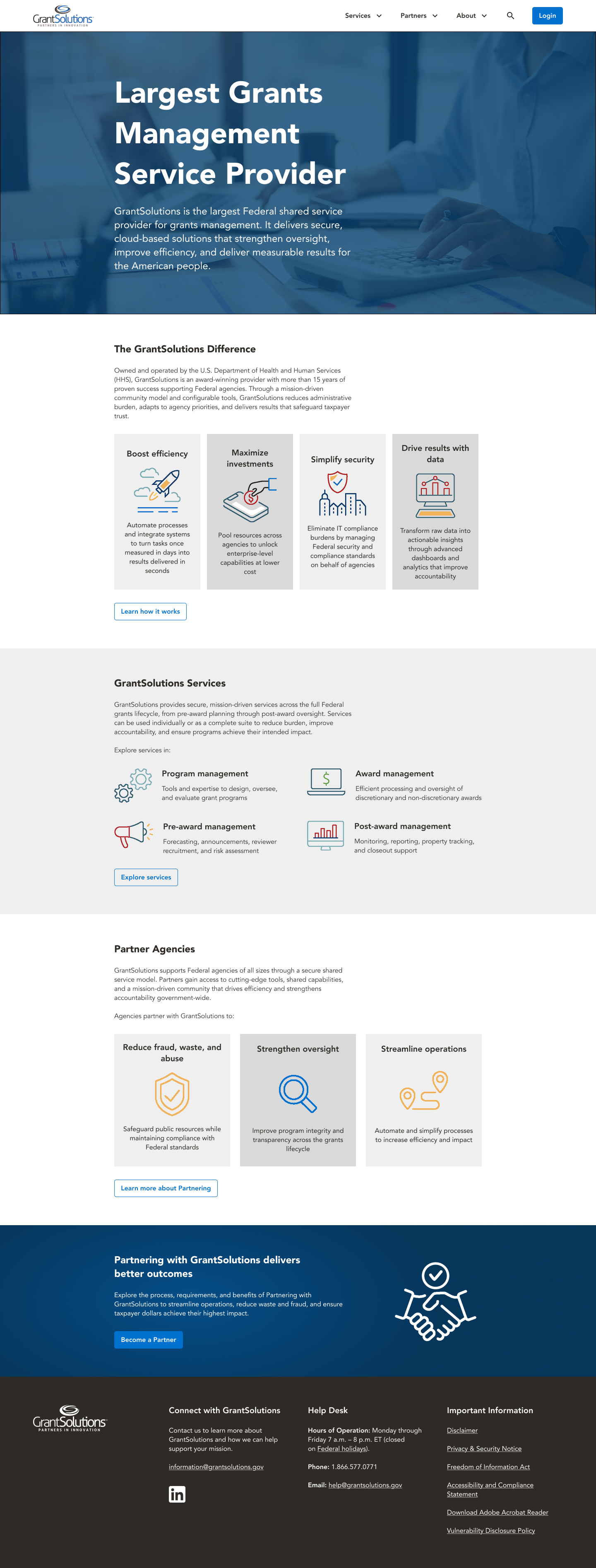
Every design detail was taken seriously. Nearly every page and every section went through multiple iterations of design. The call to action that was repeated at the bottom of every page was an example of this.


During the process of visually designing this component, the information architecture was also revisited several times. During the phase of the project where the information architecture and sitemap were being designed, it had been decided upon that the main call to action would guide users to a page where they could learn more about becoming a partner with GrantSolutions. However, during the visual design phase, the idea of having it lead to a generic Get Started page was revisited a few times. Eventually I decided upon a blue background, because the footer for the site was going to be in black, and the rocket was deemed a little cartoonish, so I went instead with a handshake icon to demonstrate trustworthiness and reliability.
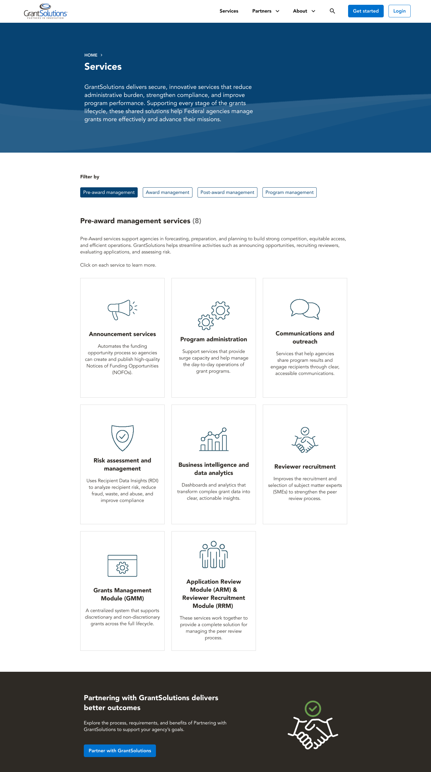
The Services page was one of the more heavily-iterated upon pages. I wanted initially to have each service listed as a clickable card, but my manager and another developer who had been assigned to the project midway through wanted me to experiment with a design that used buttons, because initially they thought that clickable cards might be too tricky to implement within the framework they were using.
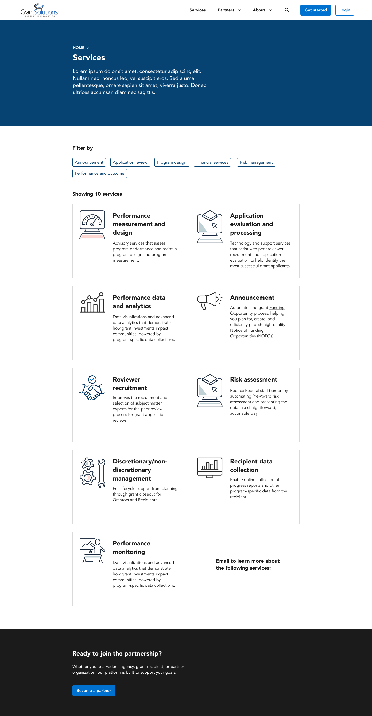
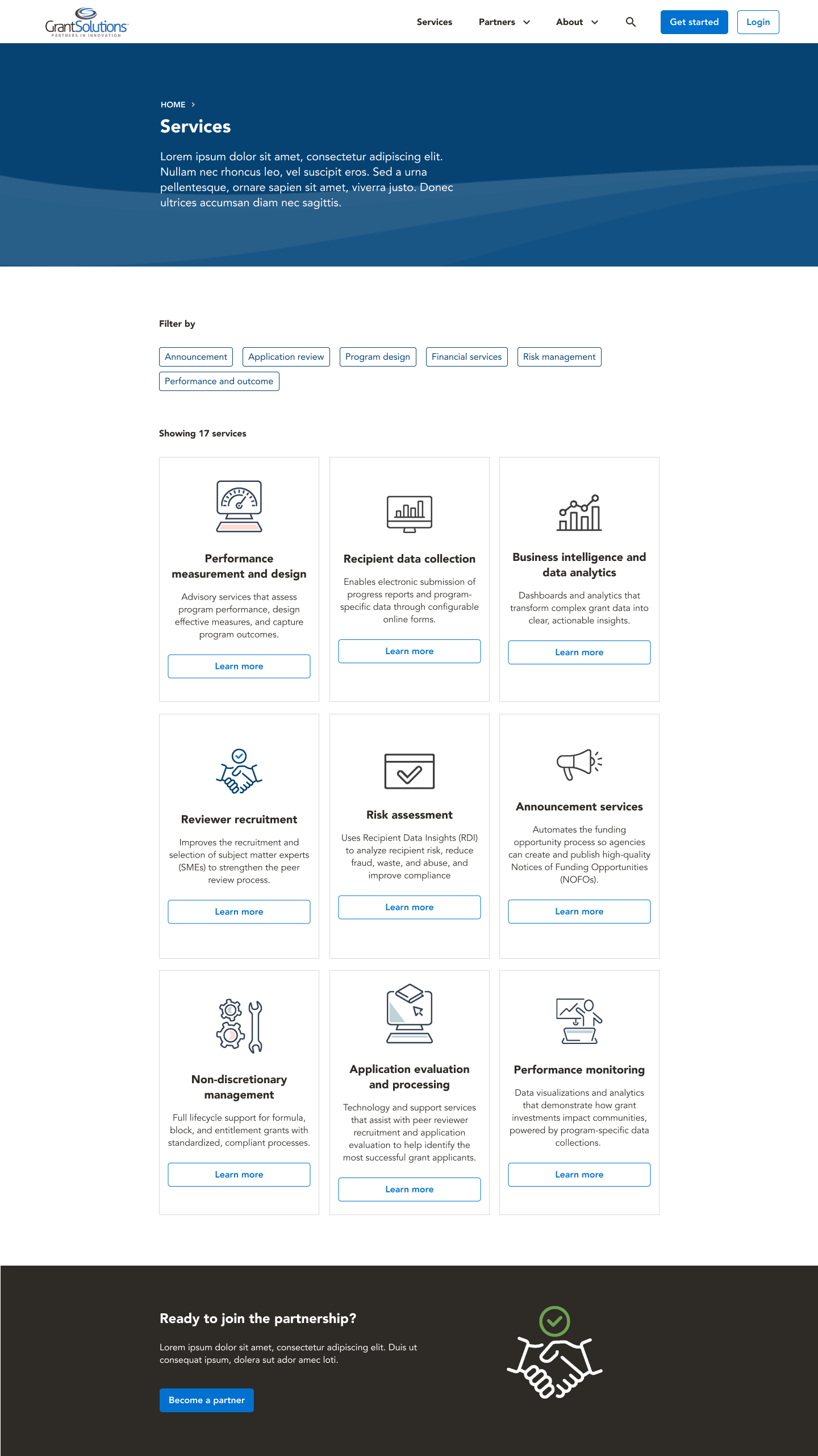
However, I heavily pushed for use of clickable cards, because I thought including that many calls to action on the page looked too cluttered and chaotic. Eventually, they figured out how to implement my original design idea of clickable cards. The final iteration of this page also featured icons that made use of all the accent colors in GrantSolutions’ branding guidelines. I was never fond of using only orange for the icons, as I found it monotonous, yet somehow simultaneously jarring to look at, and there were also visibility and contrast issues. In order to solve these visibility issues, I also darkened the orange and gave the icon drawings thicker lines.
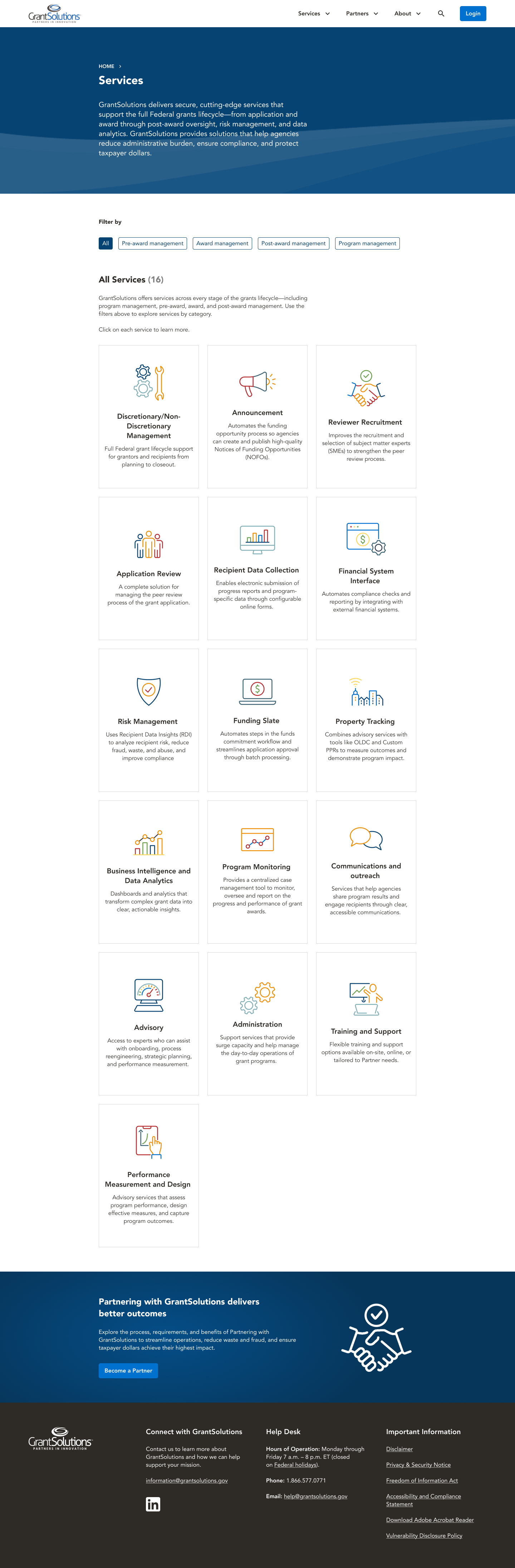
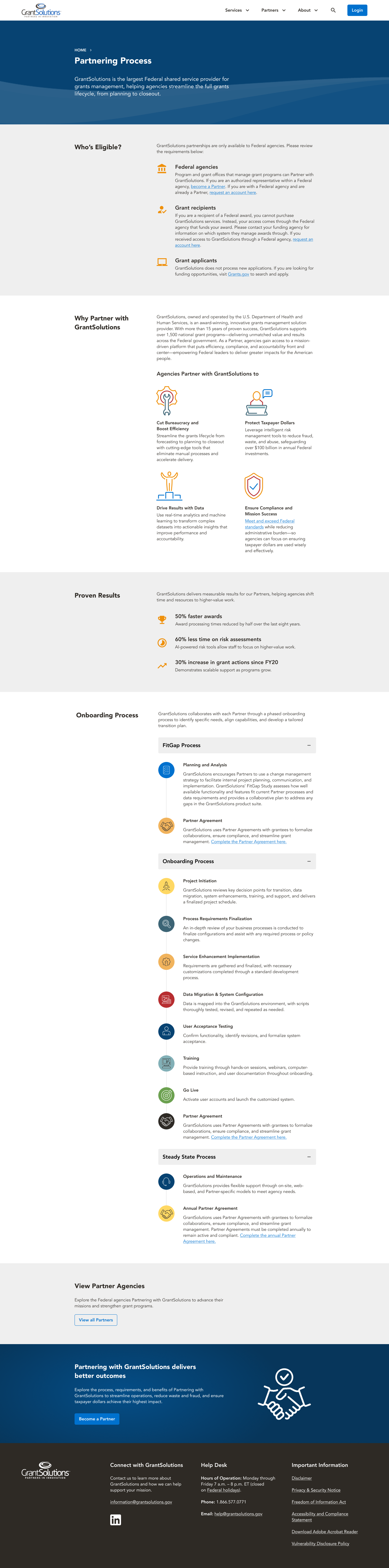
I made ample use of the accent colors throughout the iconography and graphics on other pages, such as the page where users got to learn more about the process of becoming a partner with GrantSolutions. It was all about striking the right balance between keeping it feeling subdued and conservative enough for a government website, while making it feel fresh and distinctive compared to other government websites. The final result was a meticulously crafted visual design that conveyed the sense of credibility and dependability one would expect from a government institution, and also felt modern, sleek, and tasteful.

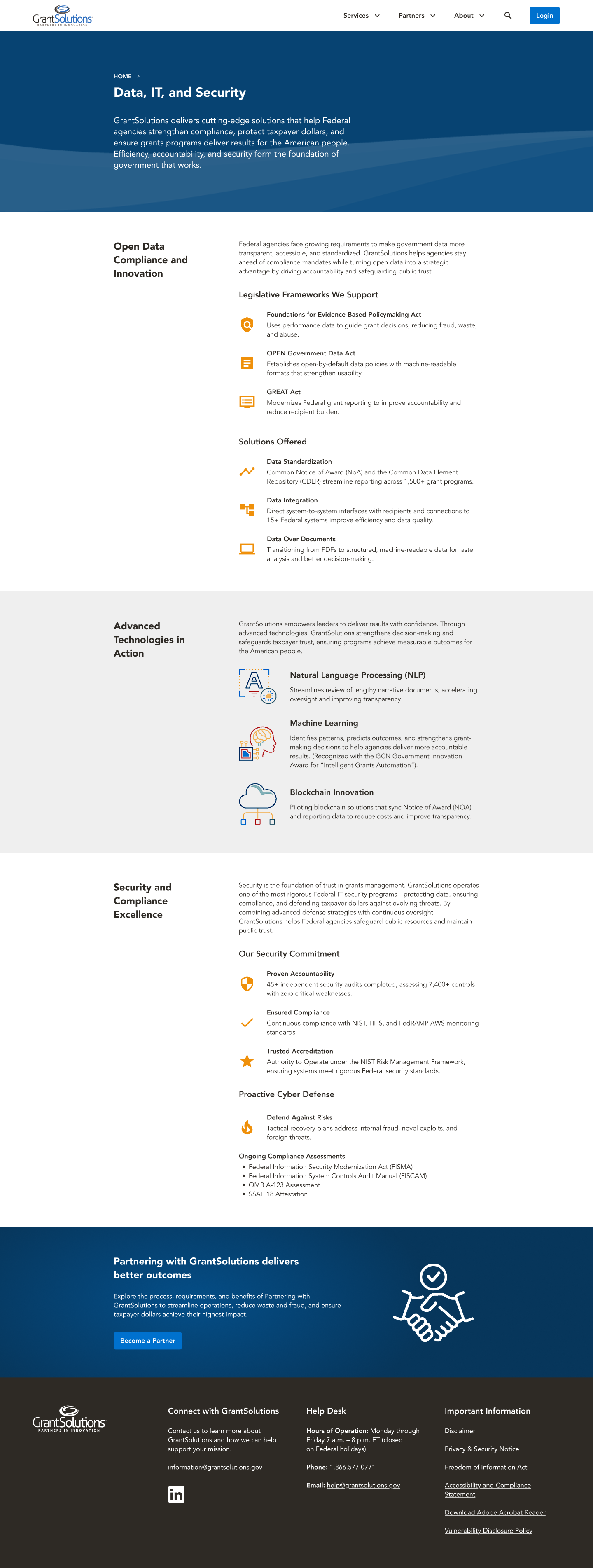
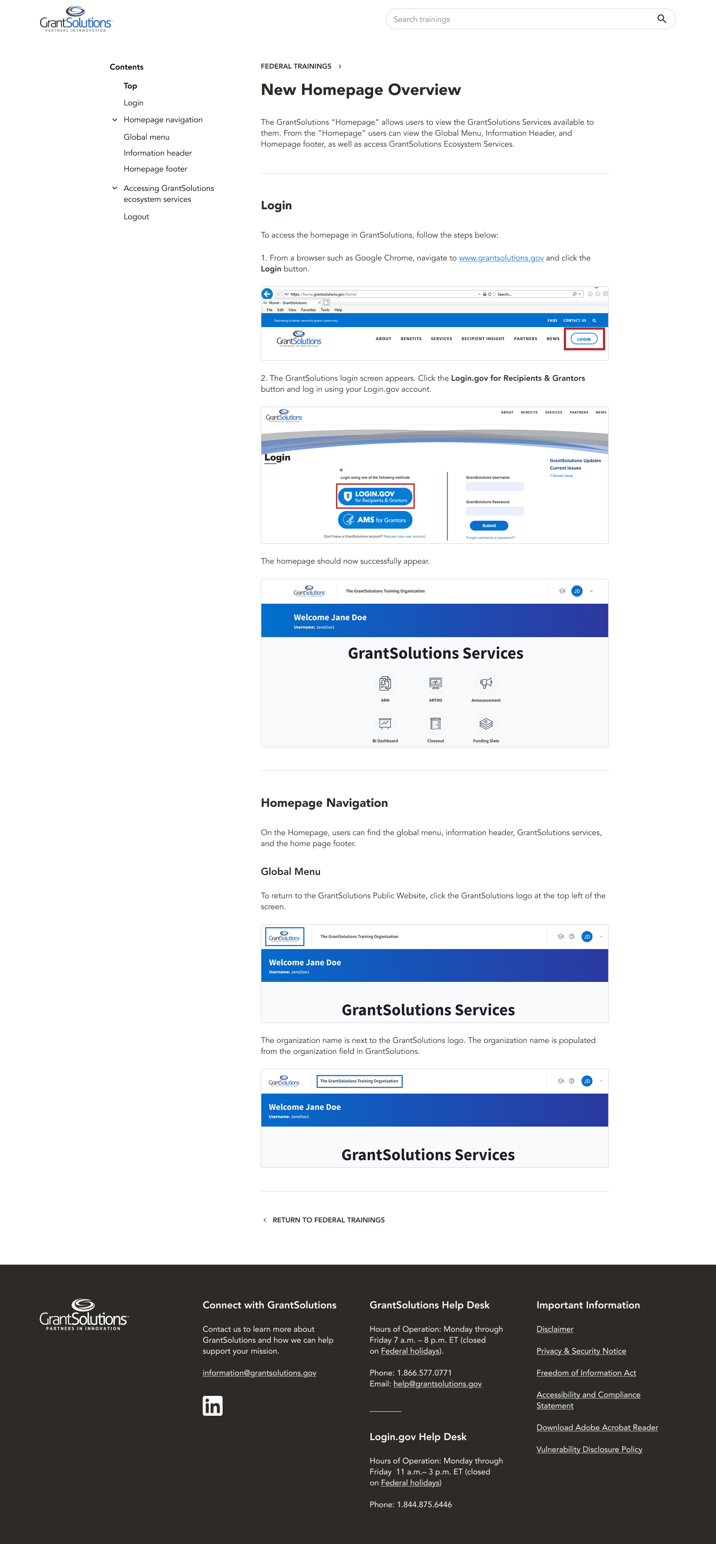
Once the external-facing website was done, there was one other section that still needed to be designed, and that was Training Resources. This was a section that could only be accessed by users who were logged in, and it included tutorials, articles, and videos on how to navigate using GrantSolutions. Because it was internal and had a completely different navigation from the external website, it necessitated a look and feel that was distinctive from the public-facing website, yet still belonged to the same design system.
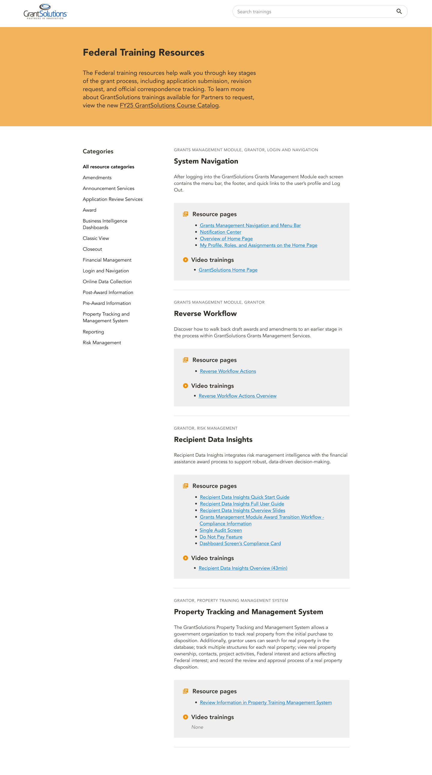
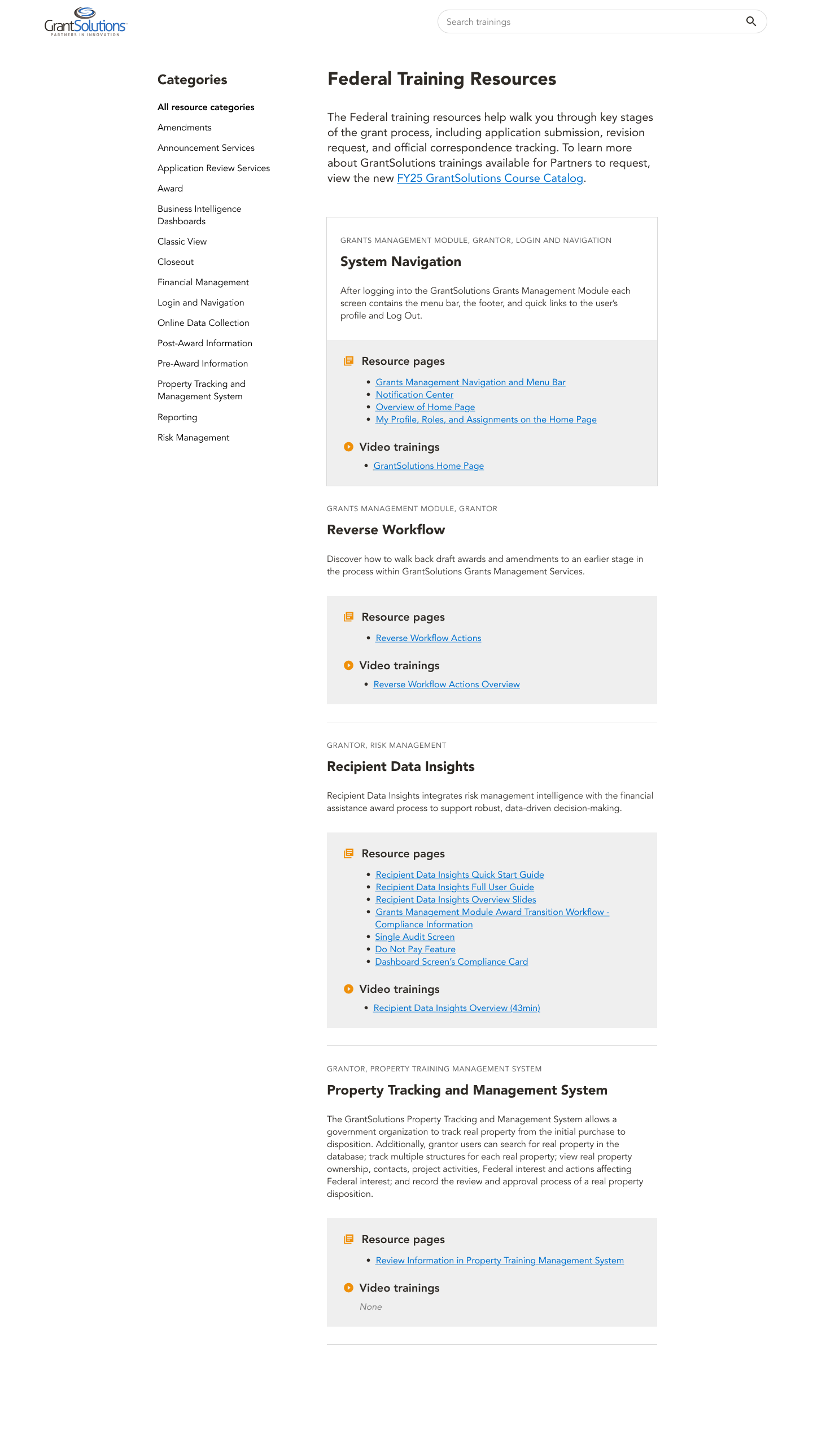
I went through upwards of 10 different iterations before arriving at one with which I was happy. I looked at several different websites for inspiration and research, including Wikipedia and YouTube, to see how they displayed videos and dense amounts of hierarchical information. This was the end result:
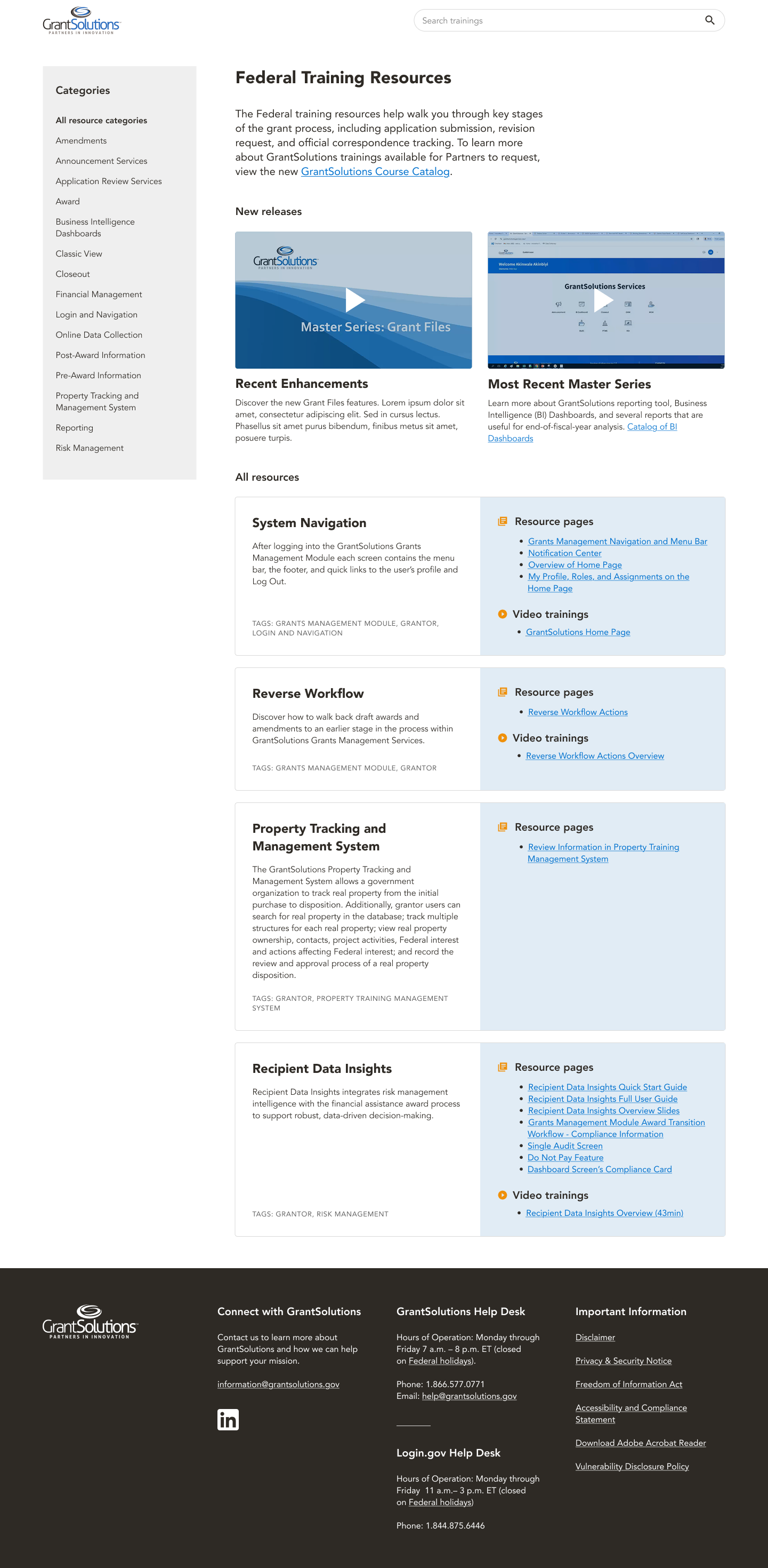
For the page design for individual training resources, I also looked to Wikipedia for design inspiration, with the vertical, hierarchical navigation scheme.
Improved metrics
GrantSolutions launched their new website in early February. A month after its release, we surveyed the analytics that had been recorded during user sessions for that time period, and what they revealed looked promising. The total amount of users visiting had increased by 26.26 percent, and the amount of new users visiting had increased by 33.11 percent.
What told the most encouraging story of all was user engagement and session duration patterns. The number of pages viewed per session had increased by 0.84 percent, the average session duration had decreased by 35.04 percent, and the engagement rate had increased by 11.11 percent. This combination of metrics suggested that users were finding what they needed on the website more quickly than before. Our improved design led to users rapidly clicking through more pages, efficiently finding the information they were looking for or completing the tasks they had set out to accomplish, then ending their session in a timely manner. The high engagement rate suggested that the shortened session duration was due to users quickly clicking through buttons and links and submitting forms, rather than quitting and leaving in frustration.
This was definitive proof that our optimized information architecture and sitemap, intuitive layout designs, parsable content, and carefully planned out user flow were all generating the tangible results the GrantSolutions stakeholders had contracted us to achieve. It is a testament to the power of good UI/UX design, that these decisions not only make a product more aesthetic and usable, but can also mean the difference between success and failure.