
Managing Usability Barriers on TK eCoach
The objective of the barrier management project was to design a tool for TK eCoach users to help identify and manage various impediments to their progress using the eCoach app.
Categories
UI/UX design, healthcare, usability, chatbot, web app
Contents
Introduction to the project and TK eCoach
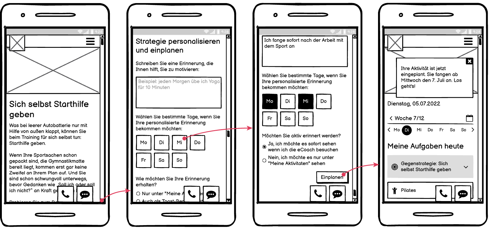
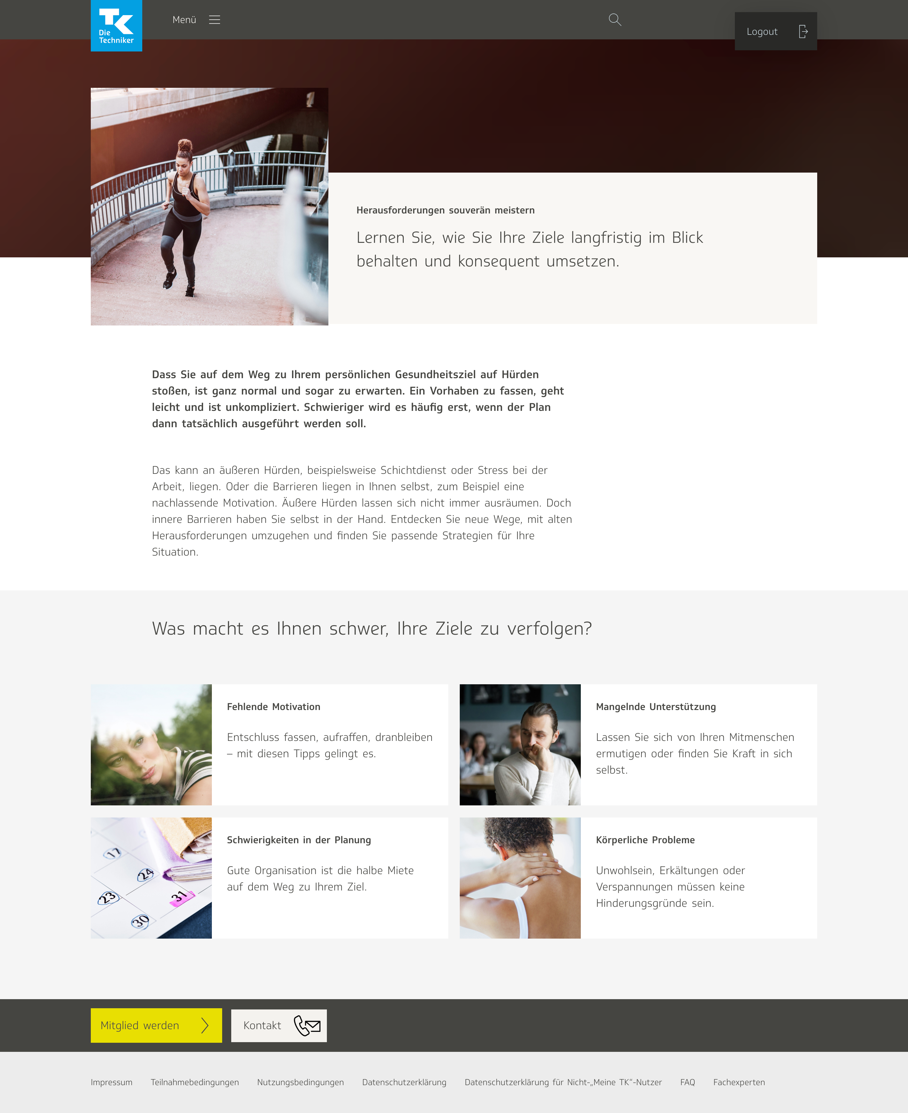
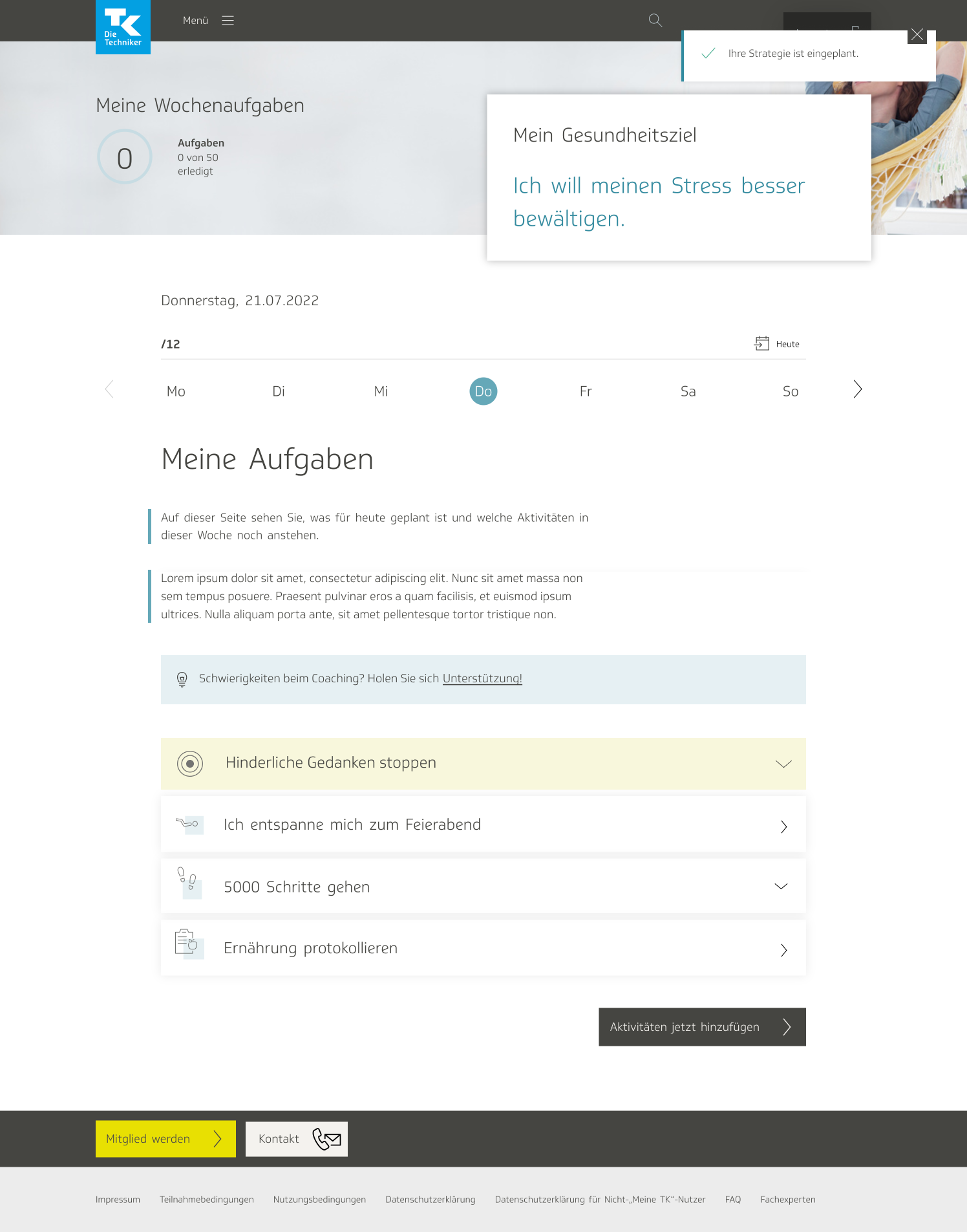
The barrier management tool presents various strategies for users to combat their obstacles. It allows them to create a personalized plan using the strategy of their choice. Users plan out which days of the week they want to carry out that strategy, and write out a personal message to help them stay on track.
During my nearly two-year-long period doing UI/UX design at the healthcare agency Vilua, I worked exclusively with one client—the Techniker Krankenkasse, also known as TK. With over 11 million users, TK is Germany’s most widely used social health insurance. They are also Vilua’s biggest healthcare client. The TK eCoach exists as a virtual coach to help users achieve a variety of goals for physical and mental health improvement. Users may choose from five categories: nutrition, fitness, weight loss, anti-stress, and quitting smoking. New eCoach users are given a walk-through where they set their specific goals, then are put on a program that gives them different exercises every day for a set period of time.
In 2022, Vilua embarked on an optimization project: determining the various barriers that TK eCoach users might face using the app, as well as solutions for overcoming them. Their mission was to design a tool that would offer strategies and guidance to help users address those barriers and achieve their health goals. Our content team conducted research and presented a spreadsheet of barriers for each respective health category, and corresponding strategies to address them.
Brainstorming and scribble sessions
I met with a product owner and a member of our content team in order to conceptualize the app. We hosted “scribble sessions,” virtual meetings in Mural where we would brainstorm and host workshops to conjure ideas. We drew user flows and maps, using post-its in Mural.

Some months prior, our other designers had generated a rough concept for a chatbot that would help users address barriers and strategize against them. We decided to continue with the work they had already done, and meticulously planned out the various stages of the userflow for the chatbot: how users would be directed to the chatbot, how they would be led to an appropriate strategy once they were inside the chatbot, and so on.
Eventually we arrived at the following scheme for organizing the barriers and their corresponding solutions:
-
Technical problems
- Read FAQs
- Call hotline
- View slideshow for how eCoach works
-
Lack of vision, goal is unclear
- Get directed to WOOP course
- Lack of motivation
- Disappointment in oneself; expectations too high
- Other issues
In the last three cases, the flow is as follows:
- Remain in chatbot; asked: “Which barriers do you perceive the most strongly?”
- Barrier 1
- Strategy 1
- Strategy 2
- and so on…
- Barrier 2
- and so on…
- Barrier 1
Utilizing this user flow, I created a low-fidelity click dummy for how the product could function.
Wireframes and interaction flows
Chatbot interaction flow
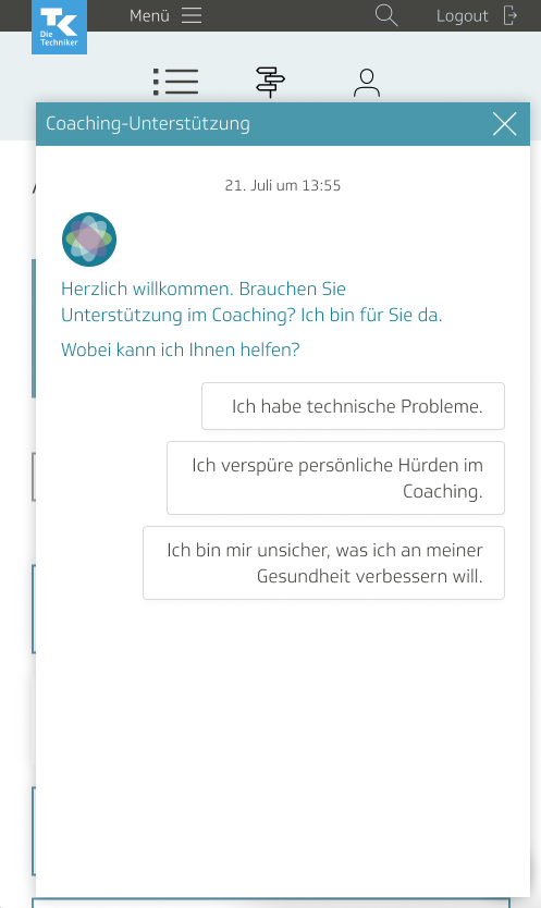
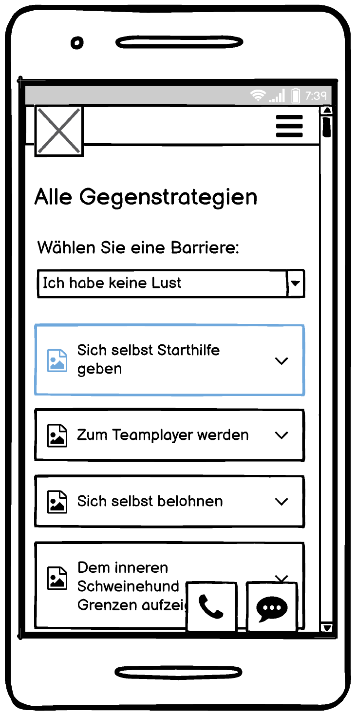
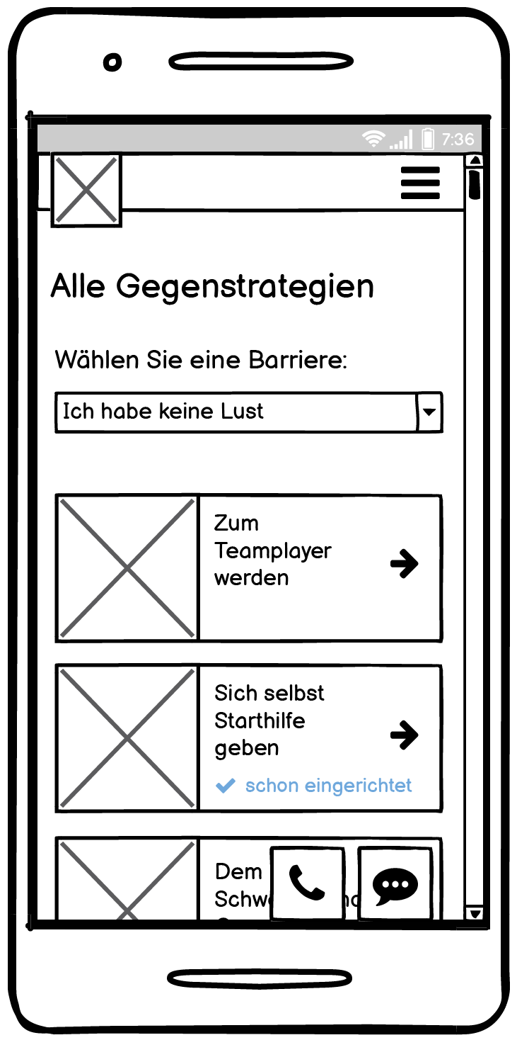
The user would be able to access the chatbot from anywhere on the website simply by clicking on a small speech bubble icon located at all times on the bottom of the screen. These are a couple of screens from the initial iteration of wireframes:
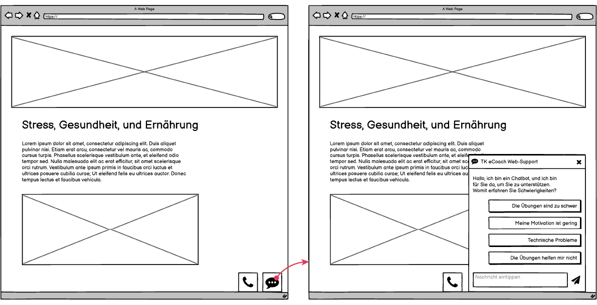
Our technical team told us they would be unable to implement a chatbot where users could enter free text, so I scrapped that in the next iteration. I also made it mobile-first. In the initial welcome screen, the user is greeted with a “What can I help you with?” message. The user may choose from a set of options: technical support, lack of motivation, expectations too high, or other problems. When the user chooses technical support, they receive the option either to read the FAQs or call a support hotline. There is also a “return home” option included at all times.
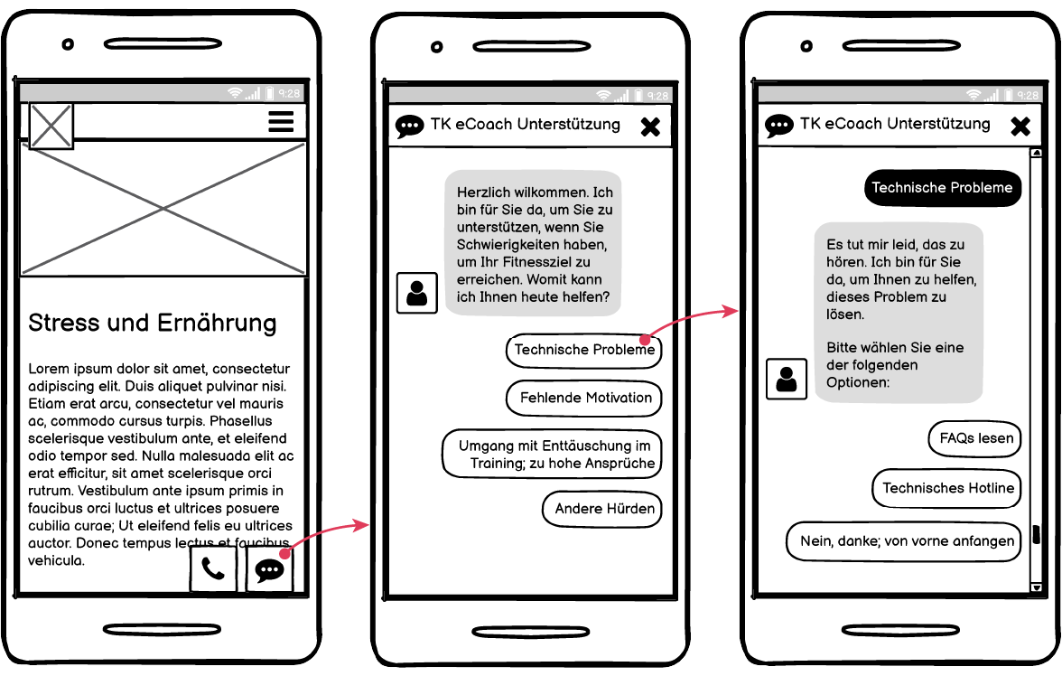
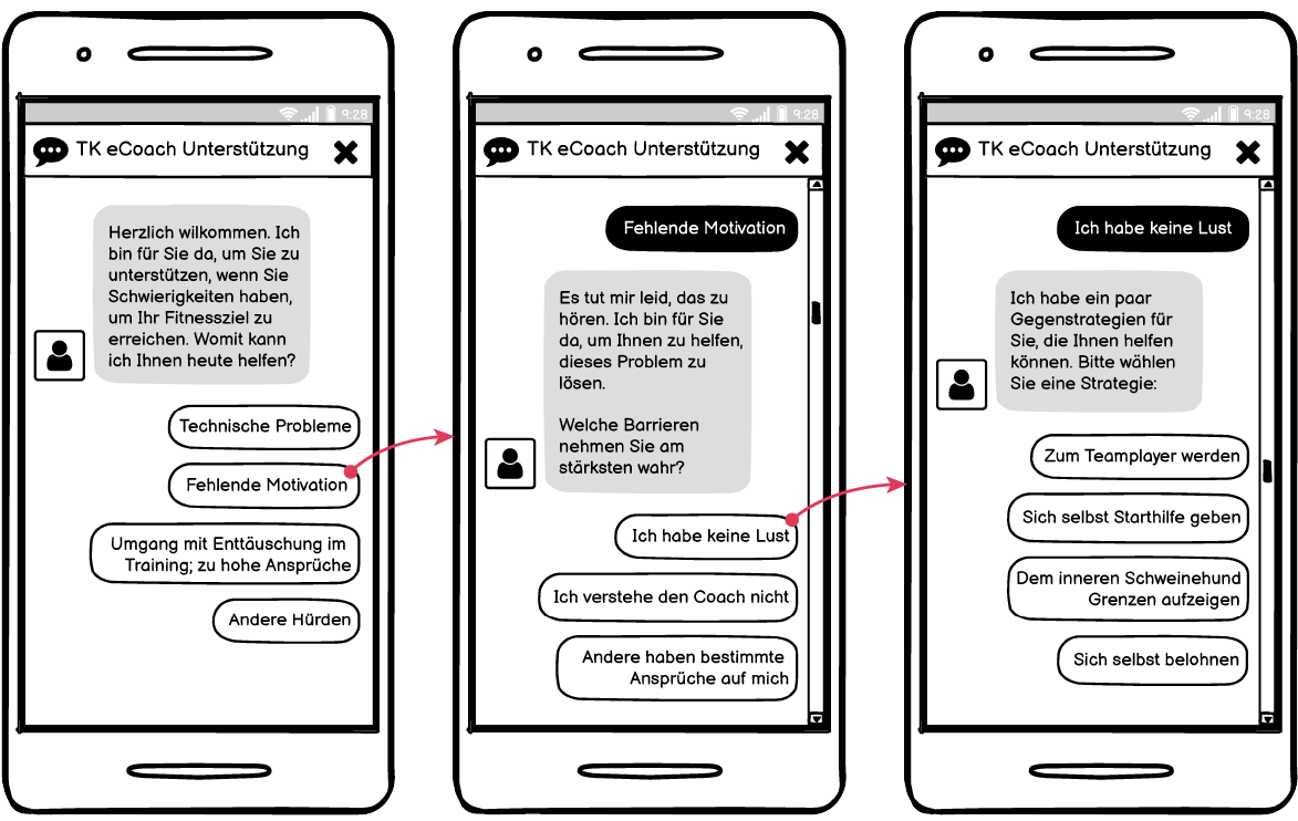
For the other three options, the user flow was the same: user chooses the barrier that’s impeding their progress the most user selects an appropriate strategy user gets redirected to page for that strategy.
Strategy interaction flow
I needed to plan out what the user experience would be for the strategies themselves. Would they simply show up in the chatbot, or would the user be redirected to a separate page for the strategies? Would the strategies show up together on one page, or would each strategy appear on its own page?
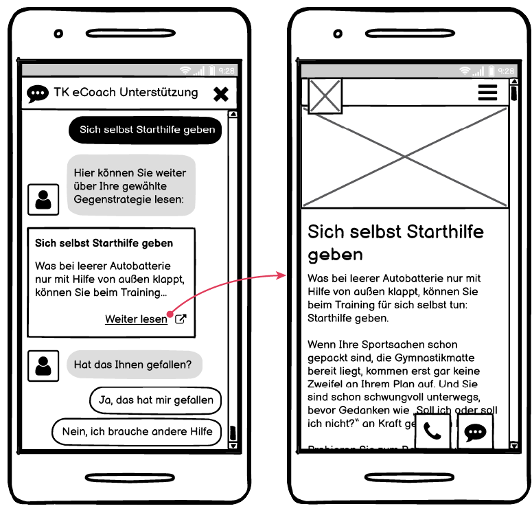
I decided it would make no sense to have the strategy show up in the chatbot, and it would eventually need to lead the user to an external page. The strategies themselves were small, but the user would also need to be able to plan the strategy out and write a customized reminder for themself. It would be too much content to put in the chatbot itself.
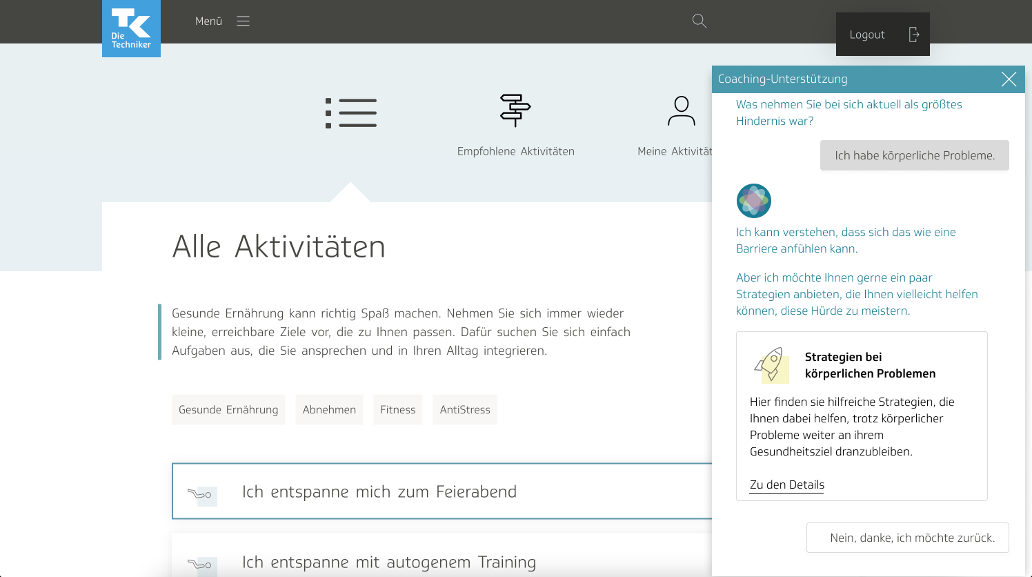
I studied what other chatbots did, trying to stick to best practices and behaviors that users already know. In the end, I had it link to an external article, with a little preview text at the beginning:
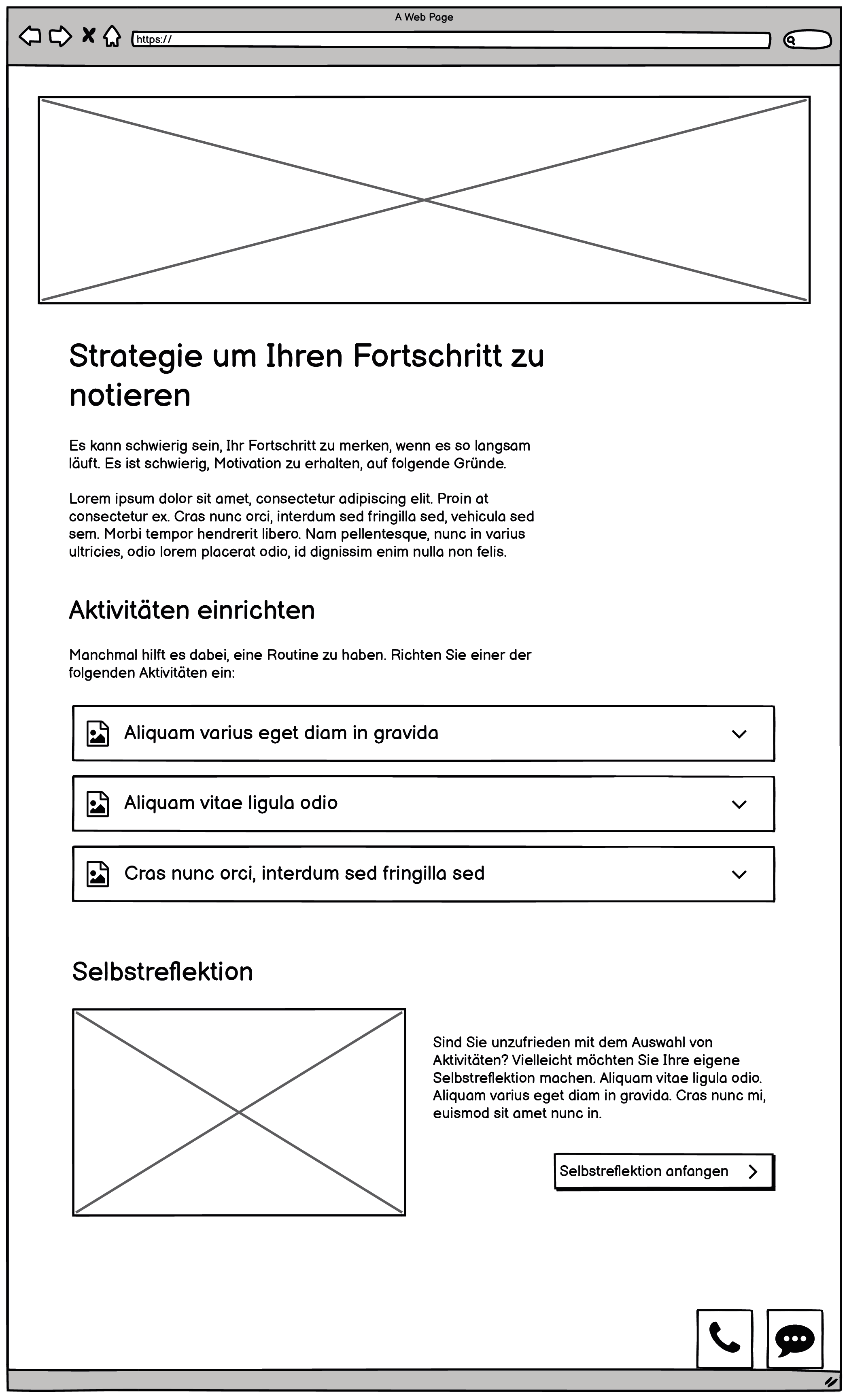
As I considered the problem, I decided that in addition to the chatbot, we would definitely need a centralized location where users could access all strategies, a link to a specific page on the website. I discussed this with our product owner and content team. Having to navigate through the chatbot each time to access a specific strategy would be annoying, I said. The user should be able to easily access it, especially if they are going to be incorporating it into a regular weekly plan; the strategies weren’t designed for one-time use. Thus I foresaw the user needing to revisit it often.
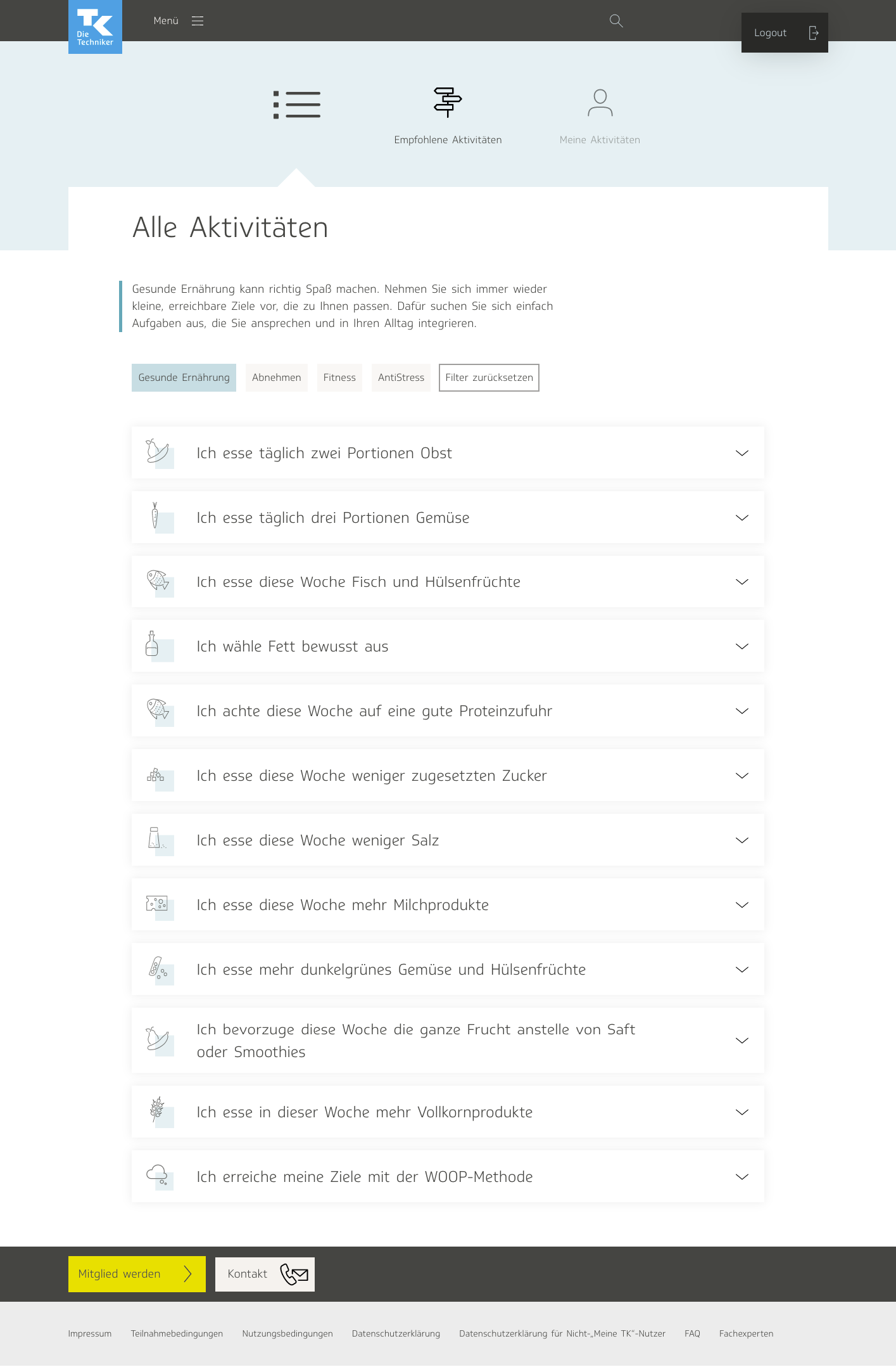
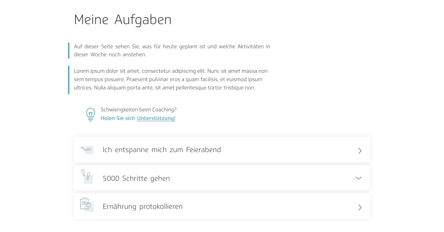
Whenever possible, I always tried to use existing layout elements and templates when designing new features for the site, because I knew the users would already be accustomed to the behavior. We had lots of different UI designs, and it was always a question, which ones made more sense to use, for activities, versus articles, versus media, versus tools, and so on. In this case, since the strategies were meant to be planned, almost similarly to activities, I decided to make it resemble the activities page in the eCoach:
I took the general idea of the design and adapted it to serve the purposes of the barrier management tool, in a low-fidelity mockup:
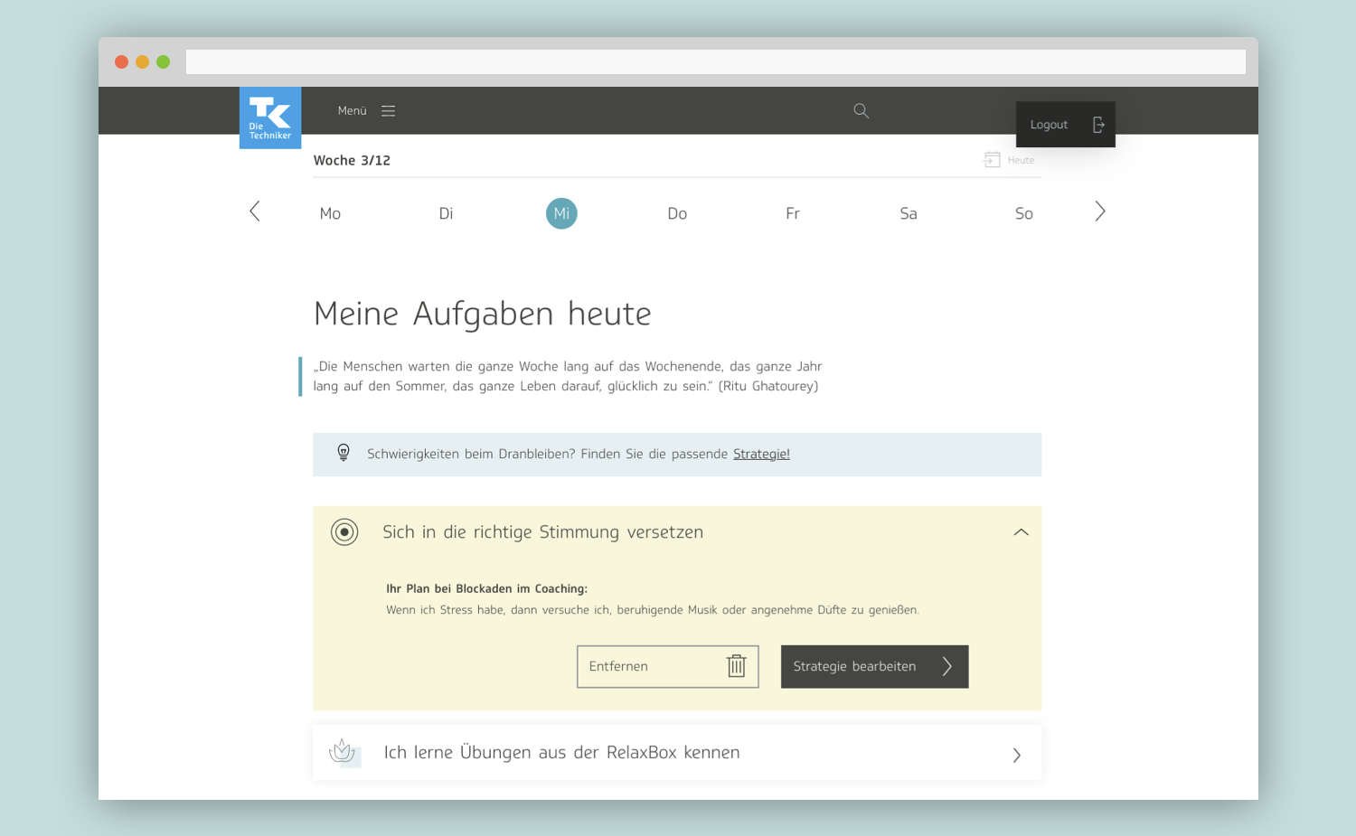
The behavior was nearly identical to that of the activities page. Each strategy was contained within an expandable accordion:
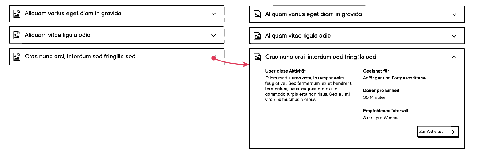
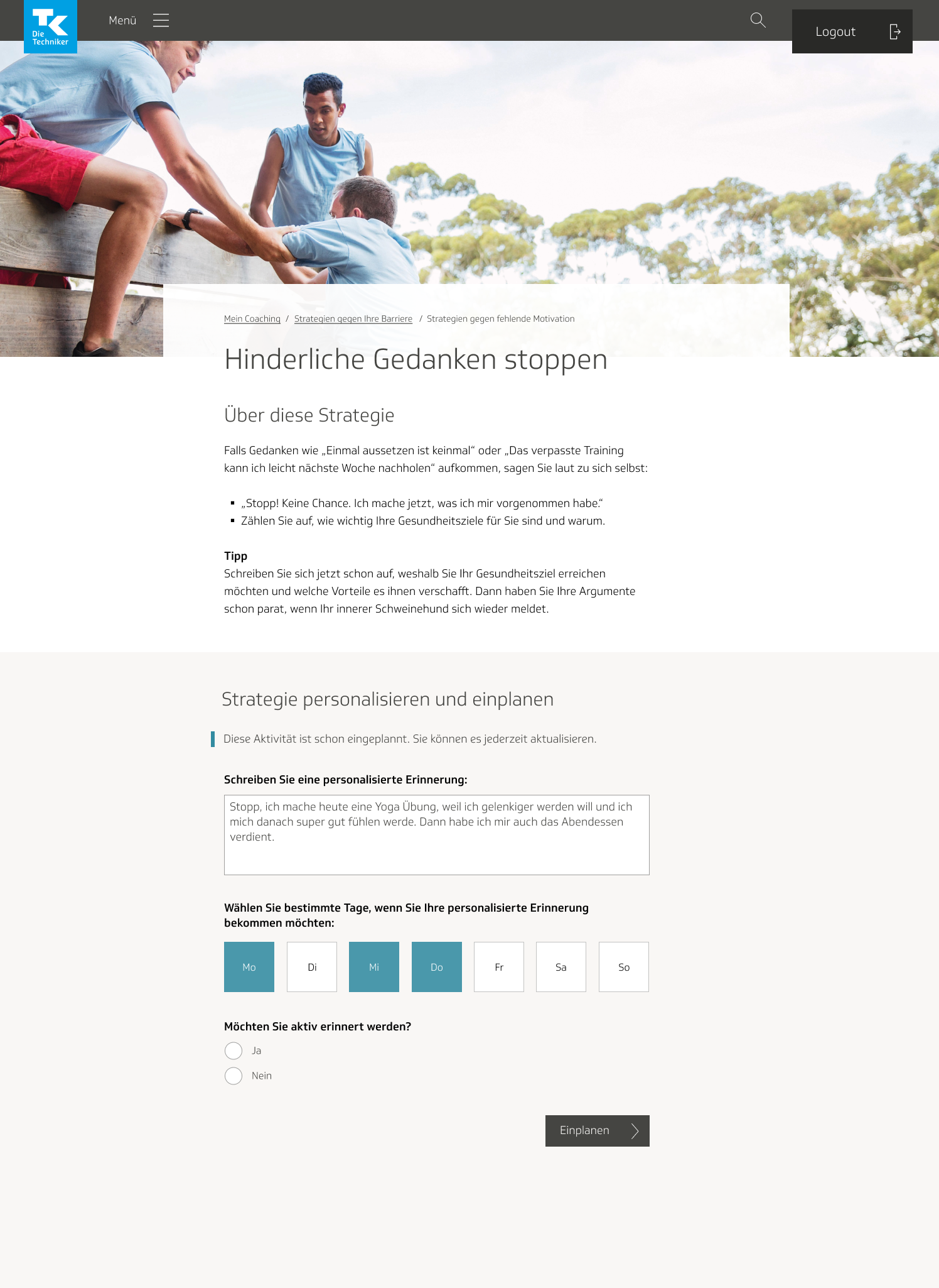
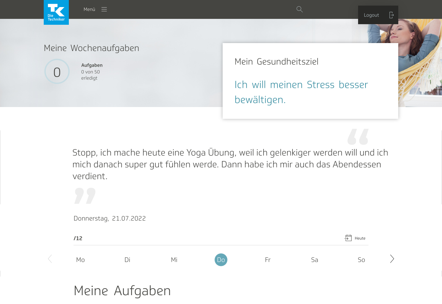
Clicking on a button at the bottom of the foldout for each strategy would lead the user to an entire page for that strategy, where they could read a description of the strategy, add it to or remove it from their activity programming, plan out which days of the week they were going to implement it, or log it for that day. When the user clicked on “plan strategy,” they would be redirected to the My Activities page from the eCoach, with a toast notification, letting them know that their strategy was just programmed.

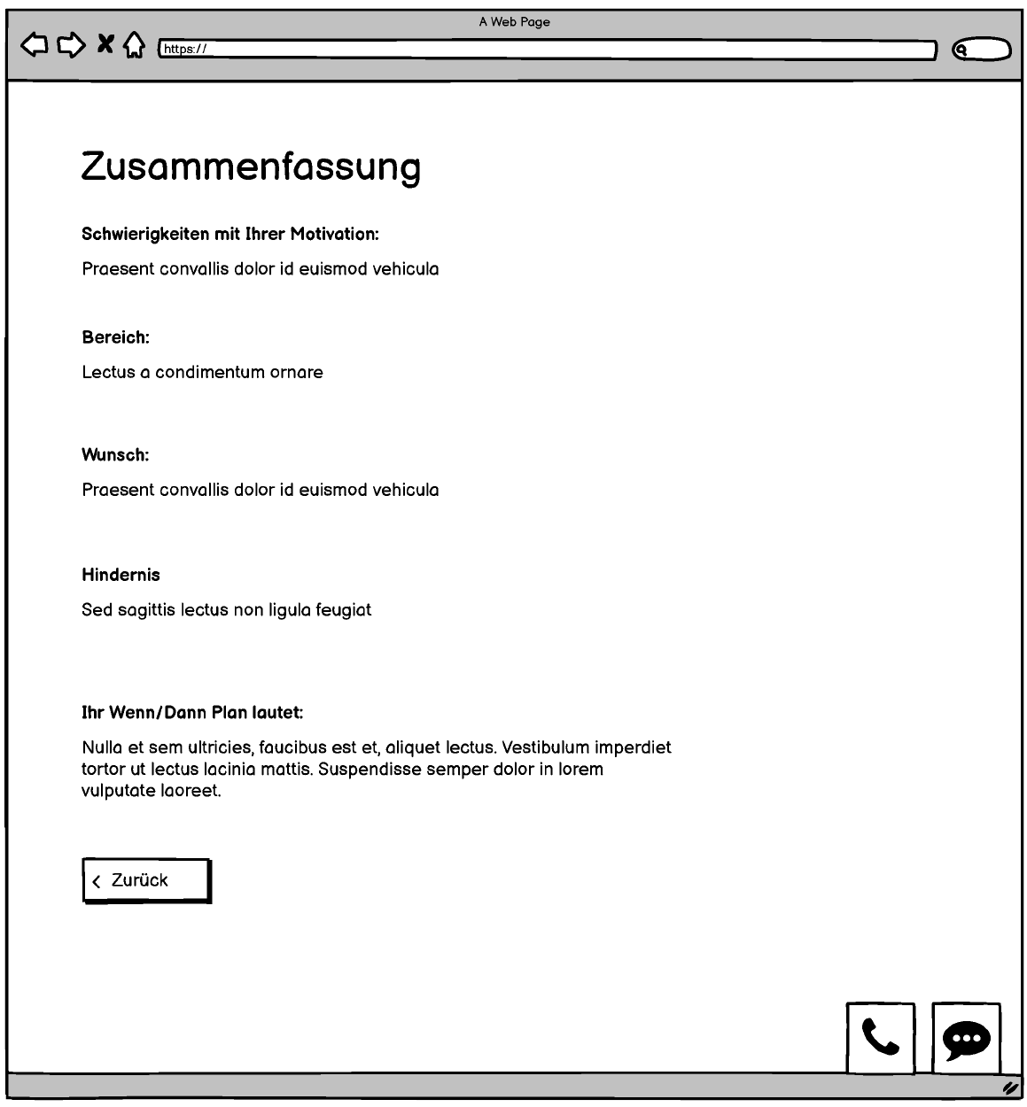
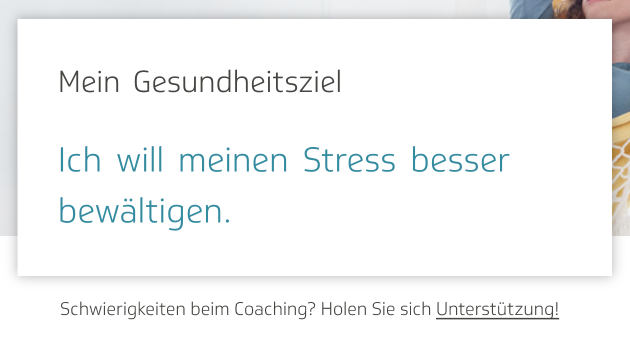
The main difference between this and the activities page on the eCoach was the section that allowed users to include a personalized note with their strategies. On the eCoach, there is also a WOOP course. The acronym WOOP stands for “Wish, Obstacle, Outcome, Plan,” and it’s a program meant to help eCoach users figure out what their life goals are and how they can better be reached. The product owner, content team, and I talked about drawing inspiration from the WOOP course for the personalization section of the barrier management tool, so initially I conjured up a multi-screen process, that allowed for detailed reflection on one’s problems—why the user had trouble feeling motivated, in which areas they were experiencing this lack of motivation, and so on.

It ended with a summary screen showing the user what they had written, and giving them a chance to go back and edit it if necessary.
In later revisions, we reenvisioned this section such that it was no longer an involved, reflective process that overarched every strategy the user was implementing. We instead planned it such that the user would simply write a short note for every strategy they selected, and it would show up whenever they went to check on the strategies that were included in their programmed activities.
The final iteration of the page for every individual strategy ended up looking like this:
The wireframes went through a handful of iterations. I communicated back-and-forth constantly with our product owner, the developers, the content team, and another designer, long before breaking ground on the visual design or before we presented the product to our client. For the final iteration of the full, interactive click dummy, click here.
We also ran internal user tests using the click dummy. Once we had a high-fidelity click dummy in place, we also conducted user tests with TK employees.
Eventually, it was time to begin the visual design phase.
Visual design, round 1

Another team was concurrently working on a chatbot for the TK’s native app. I met with them to discuss what they had done so far, took their designs, and adapted them for web. They informed me that it was still in a state of development, and gave me a degree of free reign on the design, so I added a bit of my own stylizing and embellishments.
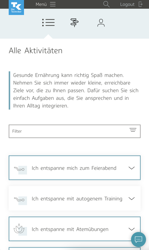
I employed UI elements from our library; I wanted to make sure we used a look and feel that was already established to our users. On the page showing all the strategies, I used a thick blue border around the accordions containing strategies that were already planned, as well as a notification label saying “planned.” I included a header image to differentiate it slightly from the activities page; I didn’t want to risk users getting confused between the two.
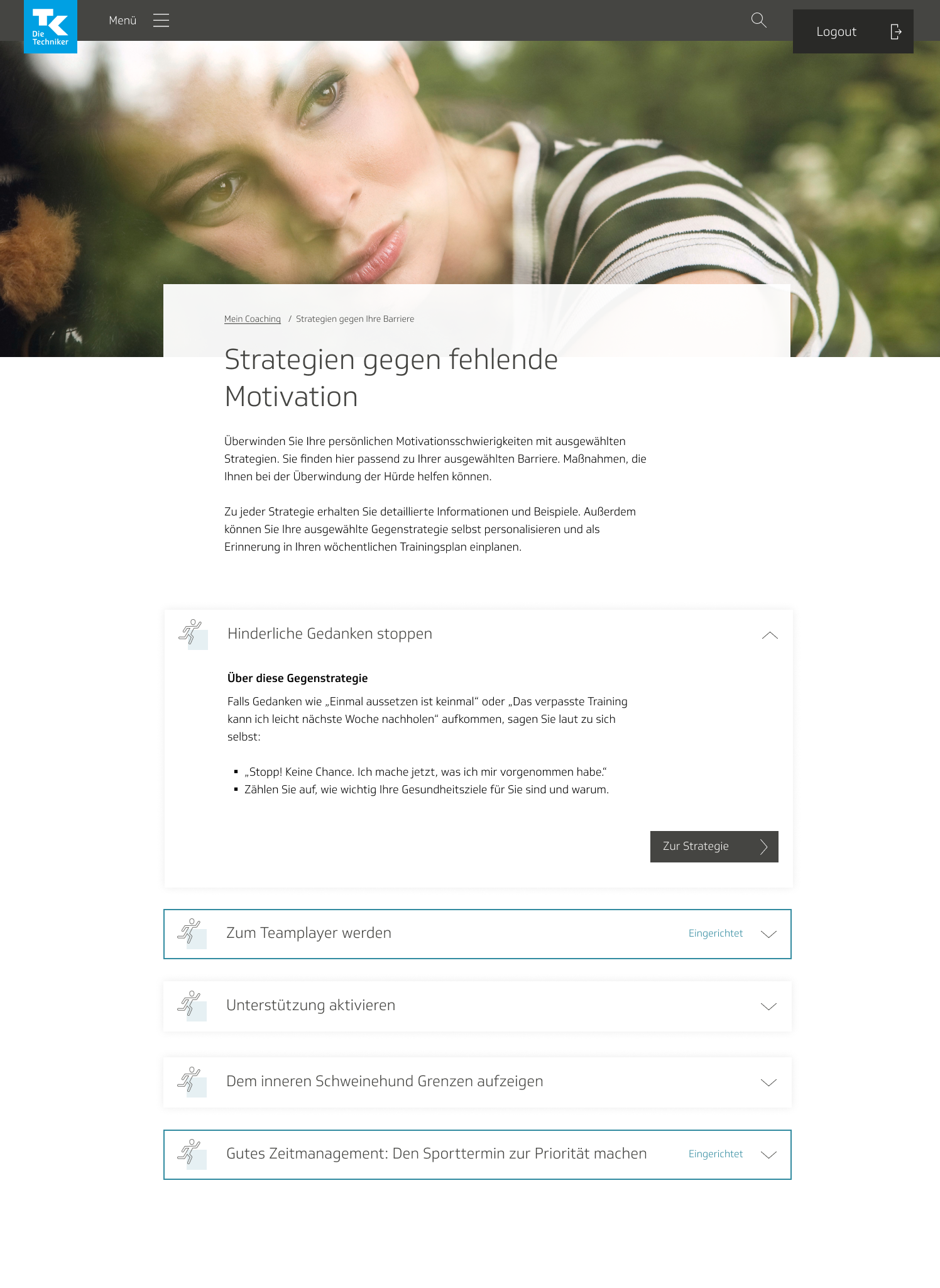
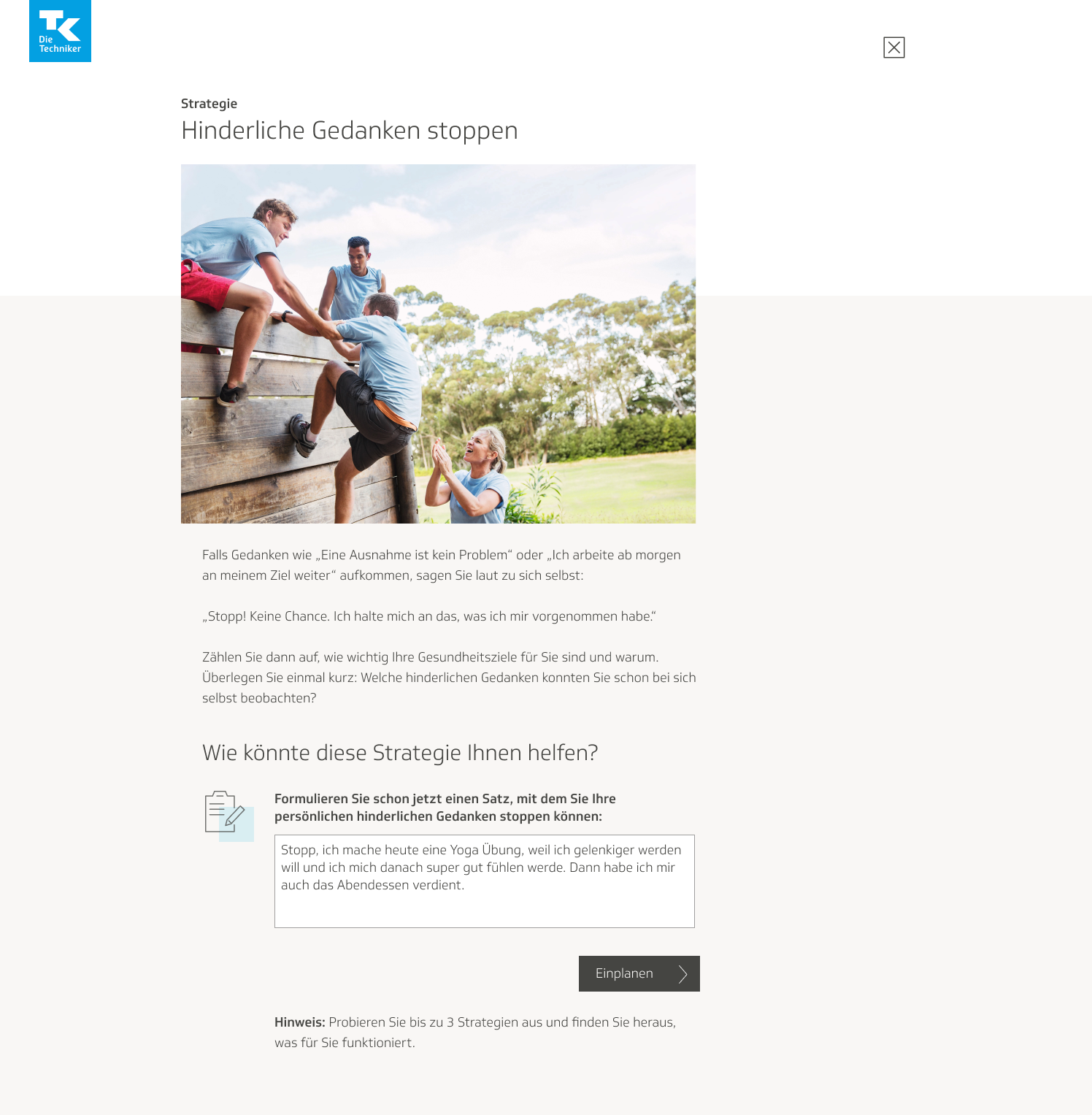
The individual page for each strategy, I modeled after a mixture of the design for individual activity pages and another feature we had called “Tip of the Day,” a collection of small health tips, one of which would be featured daily on the eCoach welcome page. I chose the tip page because strategies aren’t very long in text; thus I thought it made more sense to use that format, rather than the design from our article or course pages. It followed the same basic structure as the tip page, but included a section for planning out which days of the week the strategy would show up on the activities page. The user would also be asked if they wanted to receive active reminders of their strategy; that is, have a toast notification arbitrarily pop up from time to time, reminding them of their strategy.
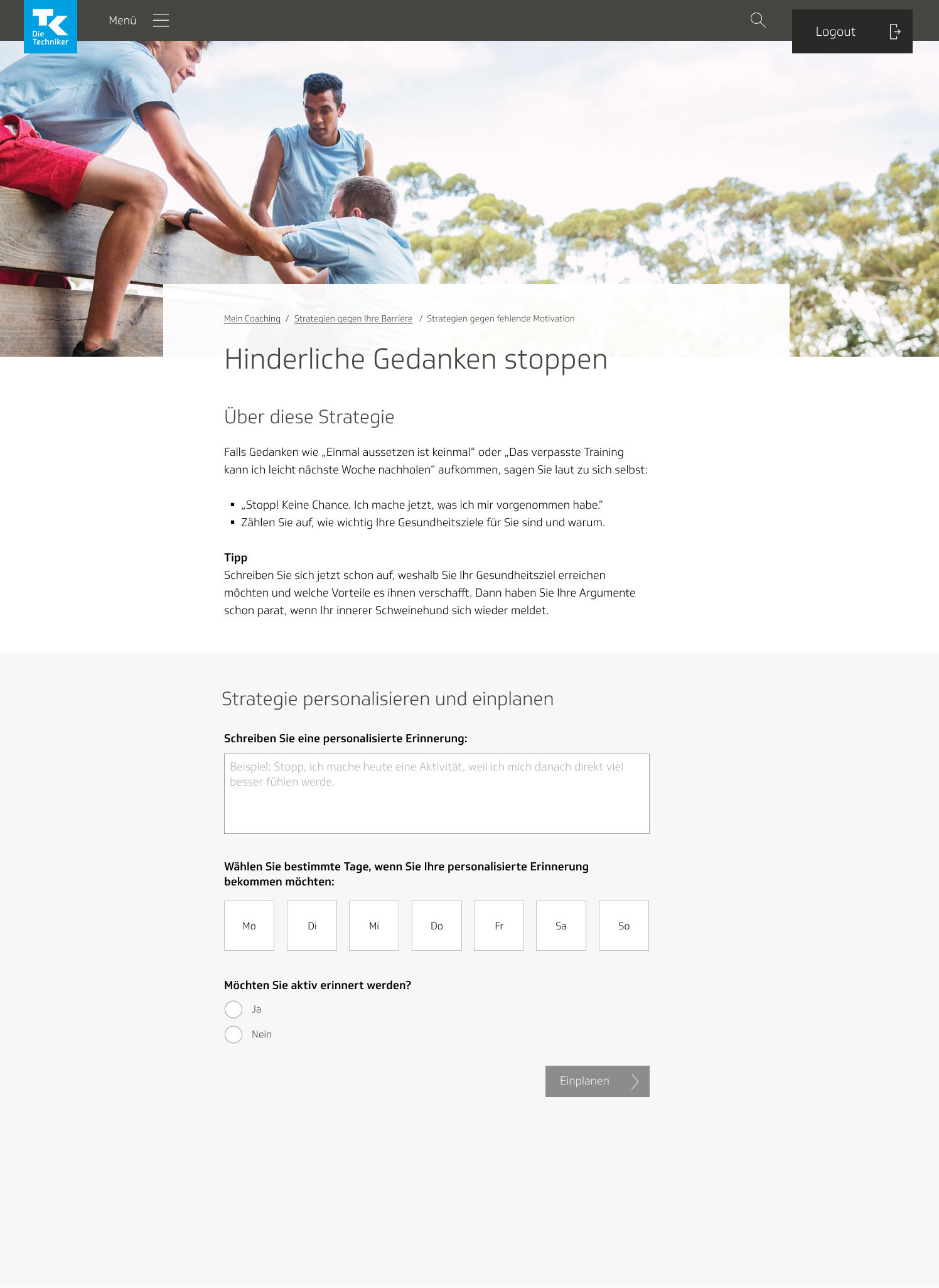

Upon planning and personalizing the strategy and hitting submit, the user would be redirected to the My Activities page, with a toast notification indicating success. The strategy itself would appear there on the page as well. We wanted a way to differentiate the strategy from the rest of the activities, so we made the foldout box yellow and included an animated bulls-eye icon, which we borrowed from the WOOP course.
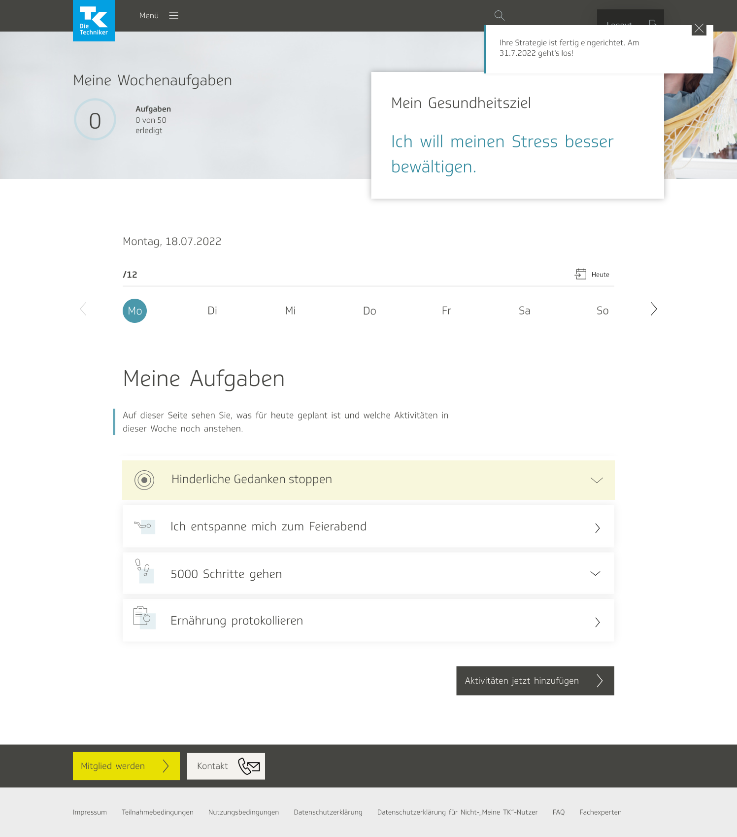
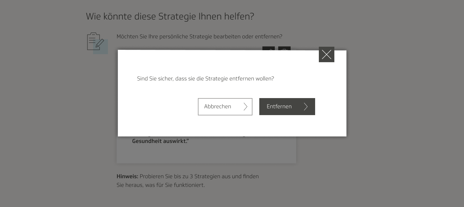
Opening the accordion would reveal the description of the strategy, the personalized reminder, the days of the week for which it had been planned, a button to edit the reminder and days of the week, and a button to delete the strategy entirely.
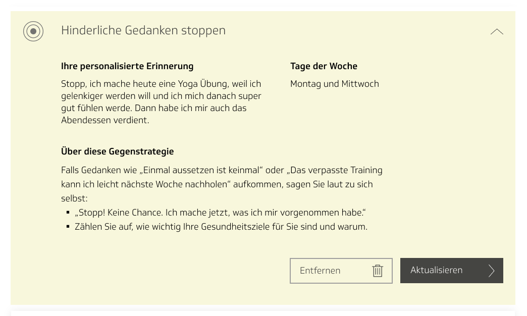
To update the strategy, the user would get redirected to the page for the strategy itself, where they would be able to update the information they had previously entered. I also decided to include a note on the page for an already planned strategy, informing the user that this is the case.
User testing
My team and I hosted a round of user tests with employees of TK using these mockups. We put together a clickdummy, which we presented to about six users, and observed them as they navigated their way through. The product owner and I designed the test ourselves; we gave the users the following tasks to complete:
- Imagine that you are experiencing problems or difficulties in the TK eCoach. Find where in the app you can receive support for these problems.
- Try to find help in the eCoach for the personal barrier of your choice.
- Personalize your counterstrategy and plan it for Monday and Wednesday.
- Try to edit your planned counterstrategy. Plan it for Thursday too.
We also asked them follow-up questions after, pertaining to the ease of the process and how the users found the experience. We divided the questions into five categories: entry, barriers, counterstrategies, chatbot, and general.
During the test sessions, one of us would walk the user through the test and address them with the questions, and the other would sit and take notes. We also asked the users to narrate their entire thought process to us as they navigated their way through the app. I strongly believe that it is important to include both a quantitative and a qualitative component to user tests; the quantitative aspect came in our observing and note-taking, and the qualitative came from users’ replies to the follow-up questionnaire.
After the test sessions, I filed through our data and arranged it in a results matrix, with one axis representing how heavily the issues found would impact usability, and the other axis indicating amount of effort it would take to fix said issues. We used this to determine which issues were highest priority.
One of the most important results to come out of this round of user testing was that we did away with the chatbot. In addition to the chatbot, we had a second location in the click dummy where the users could access the strategies page, in the main menu:
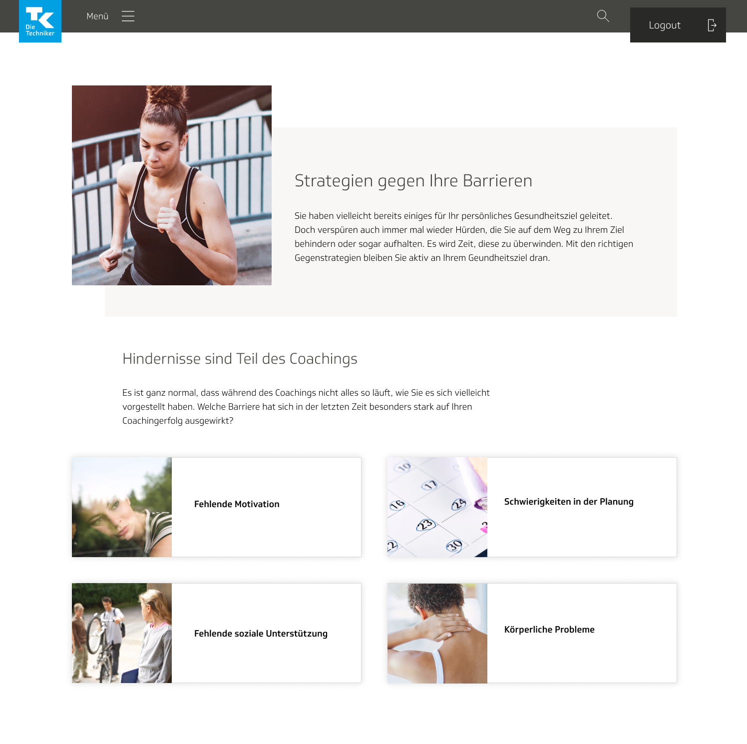
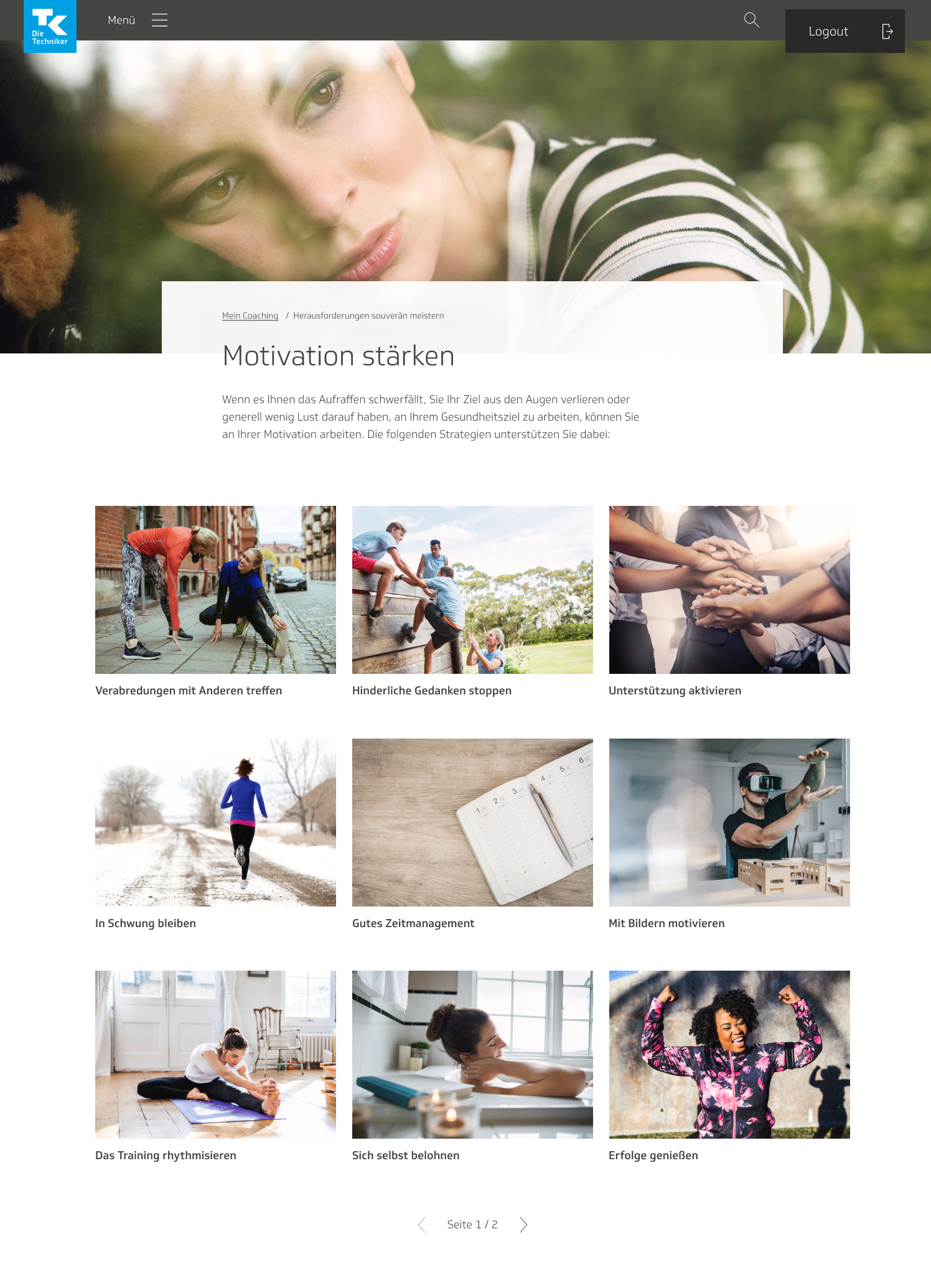
The link led to this page, with all the different categories for the strategies:
During the user test, we paid close attention to where the users sought answers for their problems. It was more intuitive to the majority of them to click on the navigation menu than on the chatbot. Some users were a bit confused by the chatbot, since it seemed too multifaceted in purpose, being used to address technical issues and also personal problems. Even prior to the user tests, my team and I had started to wonder if the chatbot was truly necessary, since we also had a central navigation page. The product owner wanted to try and find an argument to keep the chatbot, and asked me if we could have it pop open from time to time. I’d never heard of a chatbot that behaved that way, so I was skeptical that it was a good practice.
Due to these issues, as well as due to budget concerns, we decided to shelve the chatbot project, for now, and focus exclusively on the pages for the strategies.
Visual design, round 2: implementing feedback
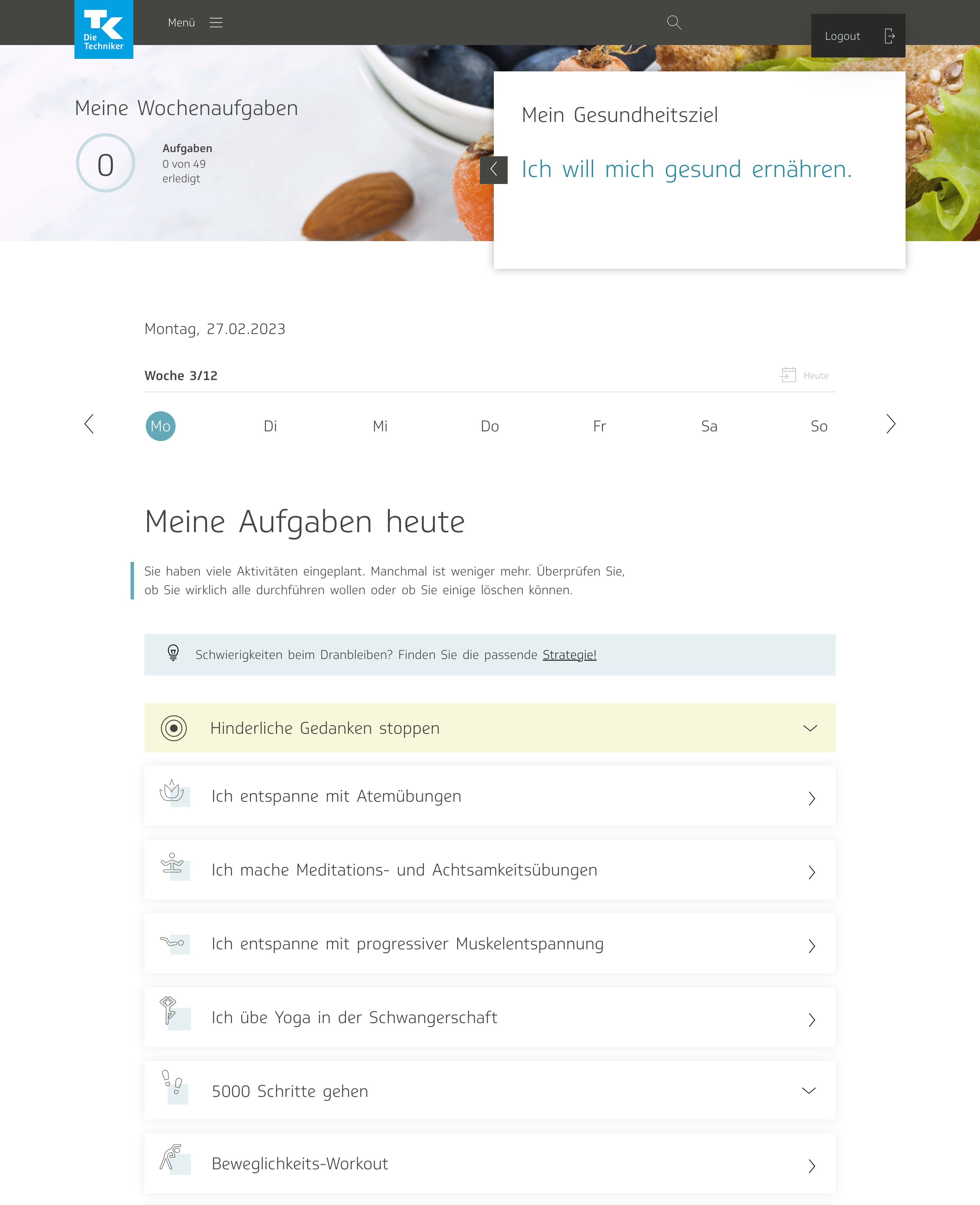
Another major result of the test was that we ended up getting rid of certain features on the strategy planning pages and reformatting the entire page that showed all the strategies. Users pointed out that an overall motivational strategy differed from an activity in the sense that it was more of a reminder they would want to have at all times to help them get through their eCoach program, not a specific task to complete, such as a workout, meditation, or eating enough servings of vegetables. Therefore it made no sense to have users plan it for specific days of the week, but rather, to just have it constantly visible on the site somewhere.
We also decided to remove the active reminder prompt, because it confused users and wasn’t really necessary any longer, since the strategy would always be visible and not only on certain days of the week. Here is the resulting design:

Once we gutted those features, I realized that the strategy page no longer behaved similarly to the activity page at all. I began to question how appropriate it really was anymore to have the page with all the strategies resemble the activities page. The format seemed to no longer make sense.
I threw together a new wireframe showing my vision for the new and updated strategies page, with thumbnails and previews for the strategies, as though they were articles or tips. I placed each wireframe side by side, so that we could compare the two.
The team agreed with me that the second version made more sense, and so I proceeded to mock that up. I made it also mimic the look and feel of our “Tip of the Day” feature.
I also mocked up various states for the individual strategy page: one where the user has typed out their reminder but not yet submitted it, one where the strategy is already planned and has a reminder filled out, a delete screen, and so on. I designed every possible state the developers would need to implement.

We decided to limit the amount of strategies the user would be able to plan to three. We included a small note at the bottom of the strategy screen to let users know, as well as a count of every strategy the user had already planned. I also designed a state with a notification to inform the user that they have already planned the maximum number of strategies and thus would not be able to write a reminder for a new one.

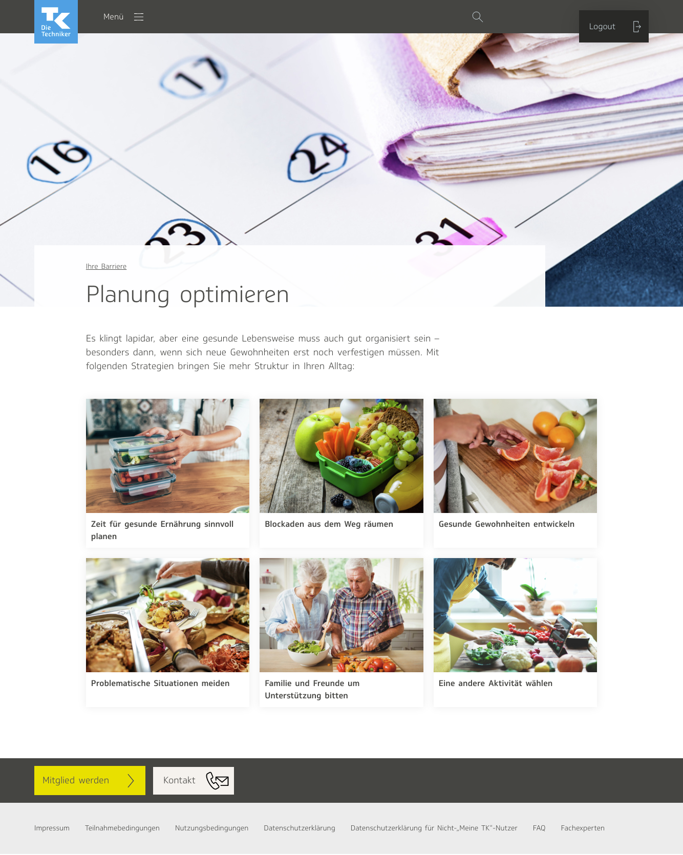
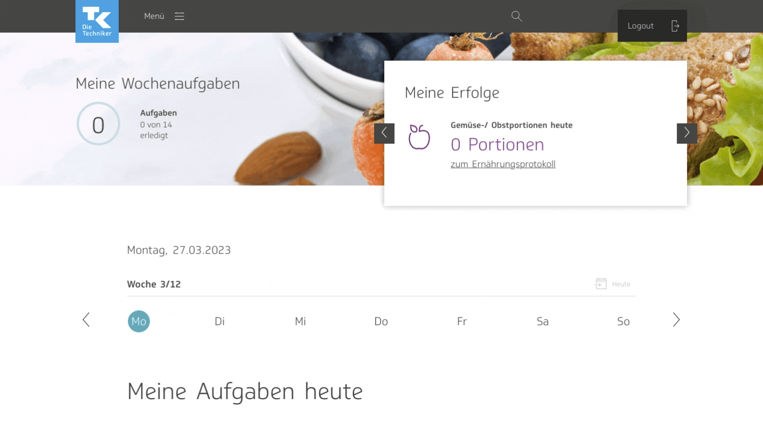
We dolled up the strategy categories page with a blurred background image at the top:
The My Activities page ended up requiring a lot of rethinking as well. Now that the behavior of the strategies differed significantly from that of the activities, I questioned whether it still made sense to have it shown in the accordion with the activities.
I tested out a few alternative concepts. I liked the idea of having it splashed across the top of the page, so that it would jump out at the user immediately when they visited the page. The My Activities page is the most highly frequented section of the the eCoach; it is the most personal, the most significant. It lists what the user’s activities are for that day, as part of their health program. It displays where they currently are in their journey to better health. Therefore, the notion of having it as an overarching banner, a compass of sorts, appealed to me. I liked the idea that if the user was staring at their list of tasks to complete and feeling overwhelmed, they would see the message and once again feel inspired.
However, there were issues. The big text pushed down the rest of the content a lot, so having to scroll further may have been annoying for the users. It took up too much space. Also, what would we do if the user had selected several strategies to follow?

At the end, I decided to remain with the yellow accordion and bulls-eye icon, exactly as it was before. The differences in background color and icon choice marked it distinctly from the activities in the accordion, and showed that it was not the same type of content.

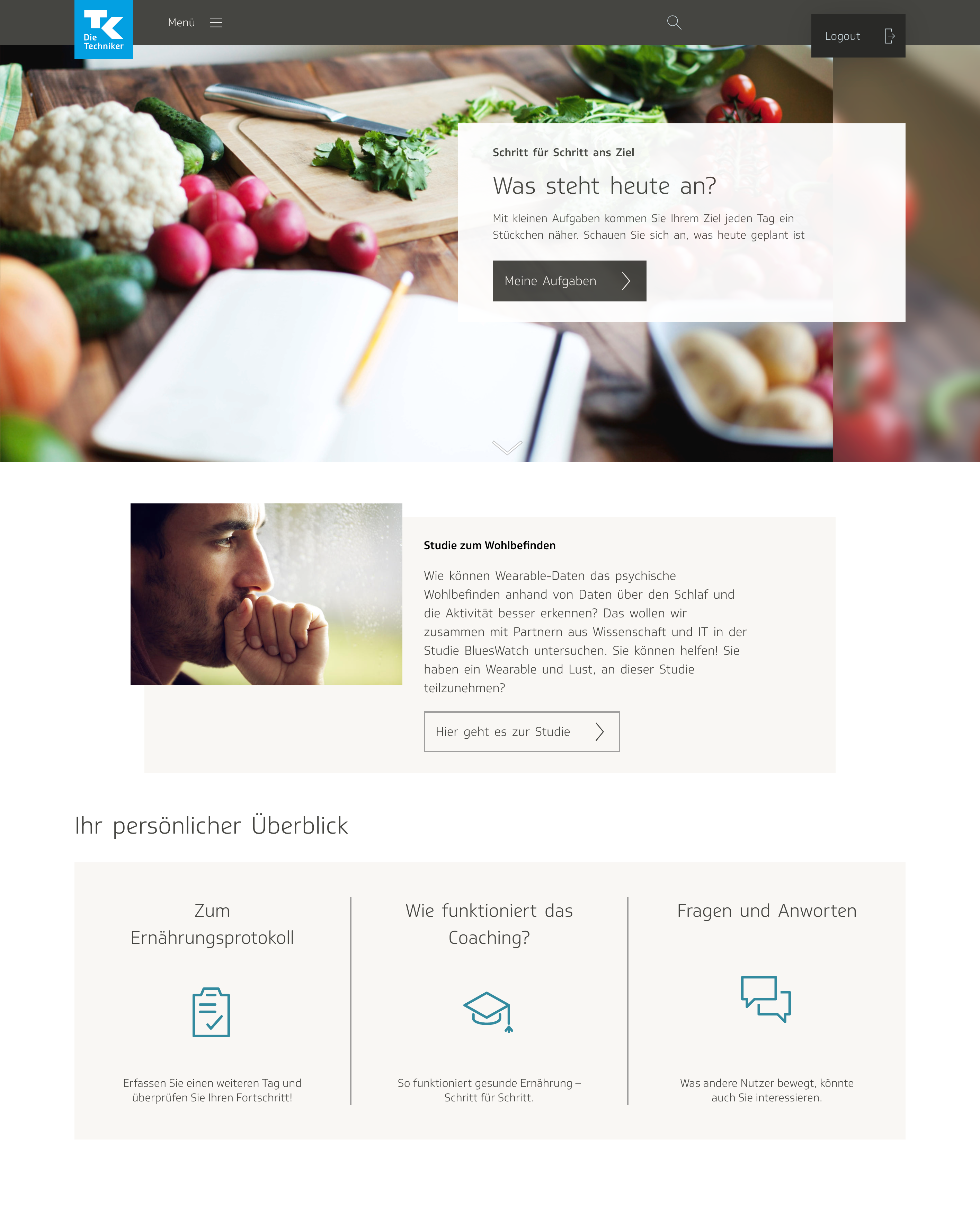
We also needed to consider where to link to the strategies page, especially now that the chatbot was gone, and there were fewer paths of entry. It didn’t feel important enough to include in the main menu, so it would need to be accessible from one of the pages linked in the menu. After giving it some thought, I decided it also made sense to include it on the My Activities page, since the users visit it the most frequently, and might find themselves needing precisely that kind of assistance while perusing their list of tasks.
I experimented a lot with the style and positioning of the link to the strategies page. We considered making it an extra slide in the carousel, but then weren’t sure whether enough users would be able to find it there. In one mockup, I put it right above the list of activities for the day, but was concerned that it pushed the activities down too much and would annoy the users with the extra scrolling, especially if the user received flyout notifications.
I preferred placing it directly underneath the carousel at the top of the page, but the feedback from TK was that it wasn’t noticeable enough.
TK requested that the link be placed directly above the daily activities. I wanted it to stand out on the page and be differentiable from the accordion with the activities, so I gave it a soft blue banner.
The end result, with both the selected strategy and link to the page with the rest of the strategies, came out like this:
When the user opened it, they would only see the personalized reminder, a link to edit or view the strategy itself, and a delete option.
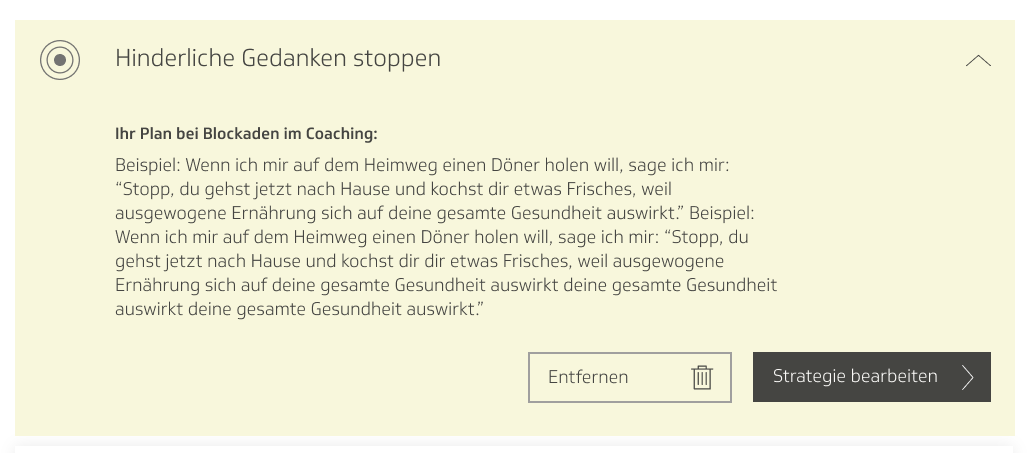
Image research
Once all the layouts were completely finished, I did research to find appropriate images for every strategy. I love image research because, as a comics artist, I’m interested in how pictures tell stories. Images can contribute significantly to the narrative of the text attached to them.

I was mindful of the visual language on TK’s website. I would place all the images side by side to see how they looked together, and also to avoid redundancy. I had to do photo research for four health goals: fitness, nutrition, anti-stress, and quitting smoking.
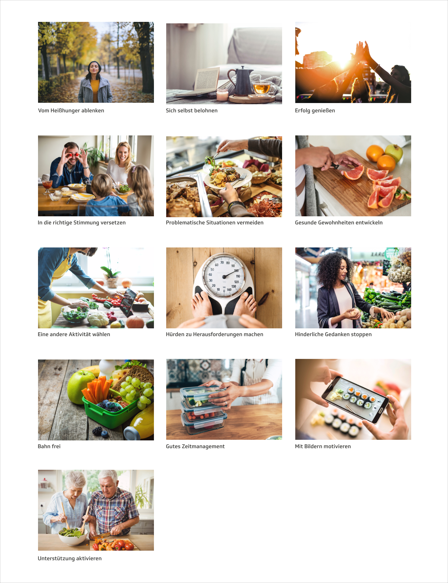

The health goals often shared the same strategies, but slightly tweaked in order to be relevant to that specific goal. I’d often have to perform image research twice for the same strategy. For example, both anti-stress and nutrition contain time management as a strategy, but for nutrition it’s planning time for cooking and grocery shopping in the calendar, whereas for anti-stress, it’s setting time aside for meditation. The image on the right is what I chose for anti-stress, and the one on the left is for nutrition:


Conclusion
All the assets and mockups were turned over to developers, and the barrier management tool was implemented into an elegant, intuitive product:
I enjoyed this project because of the emotional intimacy involved. I think sometimes people forget how intimate of a job UI/UX design can be. One of the most interesting facets of my job is taking tech and making it personal, designing a product that connects directly with users’ feelings. While working on this product, I needed to understand users’ needs and desires on an even more profound level. The barriers that prevent someone from reaching a state of better health are often deeply personal. It’s rewarding to know that this product may help thousands of users improve their health, and consequently, their lives.