
VA Careers
As part of a massive initiative to recruit new talent, I designed an interactive job search map for the U.S. Department of Veterans Affairs careers website. I collaborated with my manager, who did the programming and assisted me on the UI/UX design.
Categories
UI/UX design, healthcare, job searching, careers, web app
Contents
Addressing a hiring shortage
For over a decade, the Department of Veterans Affairs, or VA, has struggled with a hiring shortage. As a VA subcontractor, I was involved in several web initiatives to increase hires, the most impactful of which was an interactive job search map on the VA’s careers website.

Every single open role working for the federal government is listed on USAJOBS, the government’s job search engine. However, users don’t always go there to look for these jobs. Users who are interested in working for VA often go directly to the VA’s careers website in order to look for information on these roles. In order to make job hunting more accessible to these users, thus increasing conversion rates and closing the hiring gap, the VA made the decision to include an interactive map on their careers website, showcasing all their open roles—particularly in the medical field. These roles would all link to their counterparts on USAJOBS, thus funnelling users directly there.
User testing an existing map
I took an existing job search map that my manager had developed and conducted user testing with it. While developing it, my manager had focused almost solely on functionality and very little on the UI/UX design of it—delegating the UI/UX heavy lifting to me. Thus, it was in serious need of testing in order to figure out where and how to optimize the design.

I tested ten users of diverse ages, genders, ethnic backgrounds, locations in the United States, and career stages. Because the primary focus of the map was medical professions, I made sure to search for users from within that pool. Five of them were tested with the desktop version of the app and five with the mobile version. I wanted to pay especially close attention to the mobile user test sessions, because I knew how difficult it could be to design interactive maps and searches with limited screen real estate.
I watched how each user interacted with the map upon first opening it—what caught their eye? Where did they intuitively gravitate first? After a minute or two of that, I gave each user defined tasks to complete, such as searching for a specific category of job, or searching for a job in their town of choice. I recorded each test on video and had AI transcribe the call.

After going through each test case, I summarized key points on post-its in Miro, then looked for patterns in the feedback I had received. Were there any particular feedback items that kept being repeated over and over again from multiple users? I then grouped the post-its according to where I saw common themes emerge.

From this, the top three priority categories to focus on emerged:
- The link between the map and the search fields was not apparent enough
- The search wasn’t “fuzzy” enough, thus forcing users to enter very specific terms
- Unsurprisingly, there were challenges regarding being able to parse all the information simultaneously in the mobile view

Other areas were important as well, particularly related to visual cues from the UI and setting up proper expectations for users:
- At times it was difficult for users to tell exactly where roles were located, especially when zoomed out on the map
- Micro-interactions made users stumble, such as expecting popups on the map to appear upon hovering instead of clicking, not knowing how to exit popups, and being confused about how to zoom in
- Users wanted specific types of information to be visible, such as a small job description, or whether a role was part-time, full-time, or per diem
- Facets of the query process were confusing, such as having to re-enter the location for a new search each time, and not having separate form fields for location and job title
There were some notes that I deemed not a priority, namely, changes that would not have had as drastic or essential of an impact, especially if they would have taken a lot of effort to implement. Certain suggestions also wouldn’t have been possible within the scope of the project, such as allowing users to apply for roles through means other than only USAJOBS.
Data-informed wireframing
Armed with this information, I set out to redesign the existing map. My first step was to conduct a competitive analysis, researching apps with similar maps, to assess any patterns with which users might already be familiar. I looked mostly to mobile web, noting how other designers had solved the issues that came with limited screen real estate. Mobile native wasn’t as relevant, because we weren’t designing a native app.

From there, I drafted a series of wireframe iterations for potential designs. Going mobile-first was especially important here, because the majority of the problems we were looking to solve existed predominantly on mobile. The main issue I was looking to solve was making sure there would be a large enough viewport for both the list results and the map. We also would need to find a way to include space for filters.

In the end, my manager and I decided on a design with a switch that would allow users to toggle between the map and the list views. It would be the easiest to click on mobile, it took up the least amount of screen real estate, it made it apparent to users at all times what both states were, it wouldn’t block anything else on the screen, and it would be the easiest for my manager to develop.


An area that required careful consideration was how users would be able to scroll past the map on the page without triggering the zooming-in function. Since this map was going to comprise only one section on a densely populated page, it was an important consideration. In the end, I decided that zooming in on the map should be made possible only by hitting CMD on OS X or CTRL on Windows, and that this instruction would be specified in an overlay on the map whenever users scrolled over it.

I considered every stage of the user’s process while job searching: selecting filters, entering parameters, hitting search, waiting for results to load, viewing results. Every screen state had to be accounted for. On the results screens, I explored different options to determine how it should be made clear to users which filters they had selected, and what steps the user would have to take in order to clear the filters.

One observation that I had made during user testing was that users seemed to be interacting predominantly with the map, searching for roles by manually zooming in and out and clicking on the markers in the map, rather than by utilizing the search query functions. I suspected that the users’ heavy reliance on the map may have been related to how inefficient they found the text search to be. As such, I focused a lot of effort on optimizing the search query process. I wanted to give users multiple ways of searching for and processing information. A large aspect of this optimization was planning the filter design. I made sure to design the filters around specific feedback the users had given, including features such as separate form fields for job title and location, and the ability to filter jobs according to whether they were part-time, full-time, or per diem.

When designing the filters, I wanted to strike just the right balance between not showing so much information at a time that the user would get overwhelmed, and not hiding so much information that it would leave the user feeling lost. This was especially important to consider on mobile, with much less screen space to use. I considered which UI elements would be the most intuitive and give the user the greatest sense of control and efficiency when selecting filters, and explored different options, such as a version using a slider to select the salary range, and a version using a dropdown with radio buttons.

Visual design
I was working largely within the constraints of the existing VA Careers website’s design system and brand identity, but there were still opportunities for creative freedom while designing the high-fidelity mockups for the map. My manager was using a framework called Mapbox to develop the map, which came preloaded with an array of skins to choose from for the map’s look and feel. I experimented with various skins until I found one that seemed to match the look and feel of VA Careers the most.


I came up with several visual design variants. The design system we had in Figma was very minimal, so I ended up adding lots of the existing UI elements across the website as components to our library. I did some research across the entire website to see which patterns existed, and found a few inconsistencies in which design elements were being used where and when, so I took the opportunity to set standards and rules for them. I also created designs for new components, such as the map markers and filter designs.


The first round of visual designs came out like this:


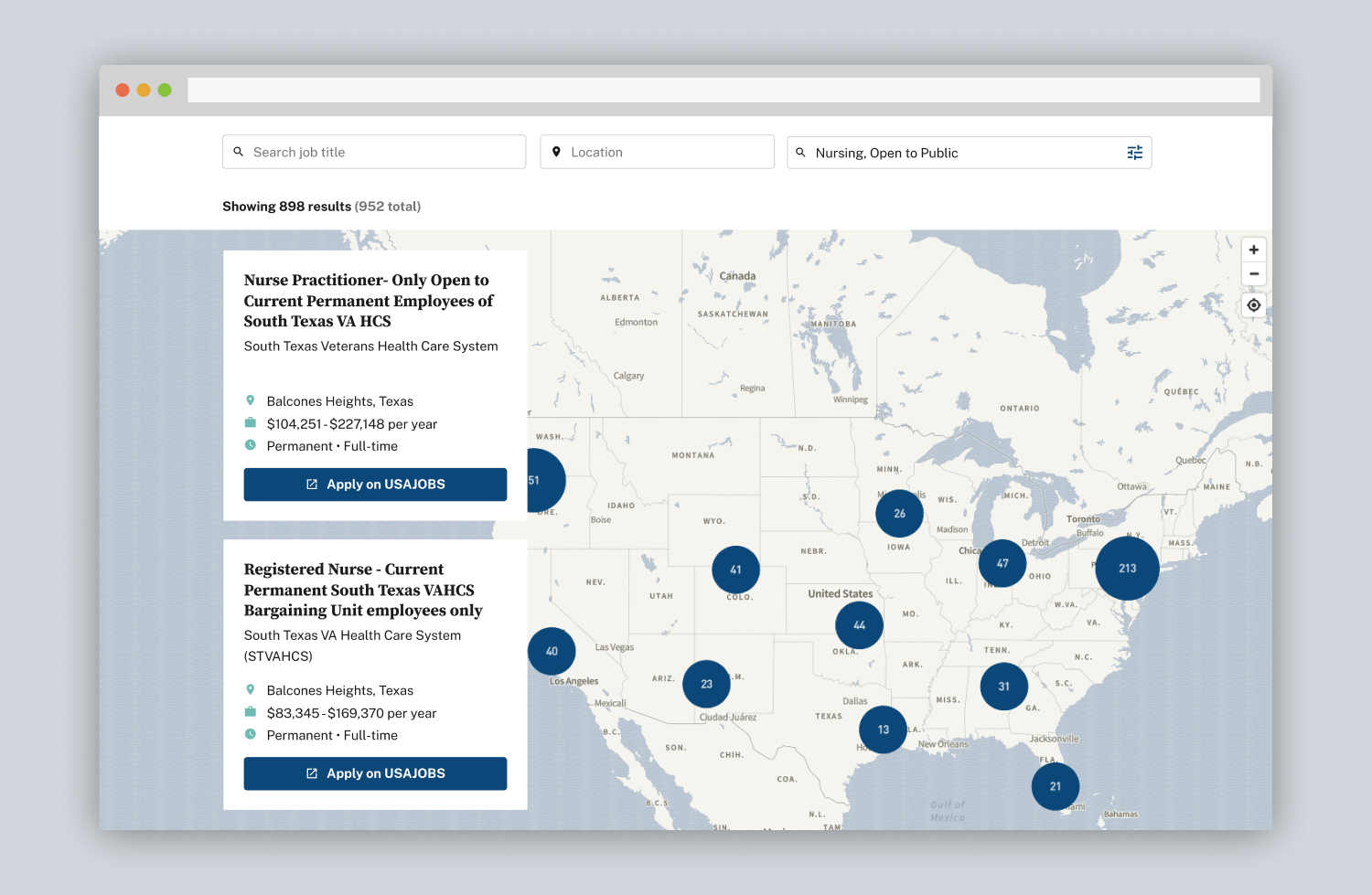
I eventually did away with the popup design for selected jobs entirely because it felt redundant. The popup wasn’t showing any information that wasn’t already being displayed in the sidebar. Removing the popup entirely also solved issues I had uncovered during user testing, such as users expecting the popup to appear upon hover rather than clicking a job post, or not knowing how to exit the popup. In essence, it simplified the entire design more, for multiple reasons. In order to show which job had been selected on the map, I showed a vibrant marker in a shade of red that was already being used throughout the website.

My manager said that my solution of using tabs to switch between the map and the job listings on mobile screens would be technically impractical to implement, and advised I stick to keeping everything visible on one screen, as we had had it in the initial prototype. I was anxious that this would simply lead to a repeat of the issues we had encountered during user testing, and so I took steps to mitigate that. I made the text in the job listings section smaller on mobile than on desktop, and designed the filter section to occupy as little room as possible, so as to allow for a more expansive space in which to have the map situated. As stated earlier, I also figured that having the query/text search be as optimized as possible would reduce users’ reliance on the map in the first place, thus relegating the map more to a location-display role than having it be the dominant interactive element in the job search process. I also made the scrolling horizontal so that users wouldn’t get stuck scrolling through an infinite amount of jobs as they navigated their way down the entire page.

I also paid attention to the accent colors. During some of these final visual design rounds, I assigned teal to icons and notifications, and left dark blue as the color for CTA buttons, markers on the map, and other clickable elements.

Increased engagement and conversion rates
In June 2025, the map was launched on the VA Careers website. As of March 2026, pages with the map had an increased engagement rate of 30 percent, and time spent on those pages had doubled. We measured the conversion rate in terms of outbound clicks to apply on USAJOBS; they had increased by 22 percent. This proved our job search map to be a success; it demonstrated clear evidence that users were utilizing the map to apply to jobs and that it was overall making their experience of doing so more seamless. The job search map continues to be an important tool in VA recruitment efforts today.