Raslan Safe & Lock
I did the logo and rebranding for Brooklyn-based locksmiths Raslan Safe & Lock.
Categories
Logo design, print design, locksmith
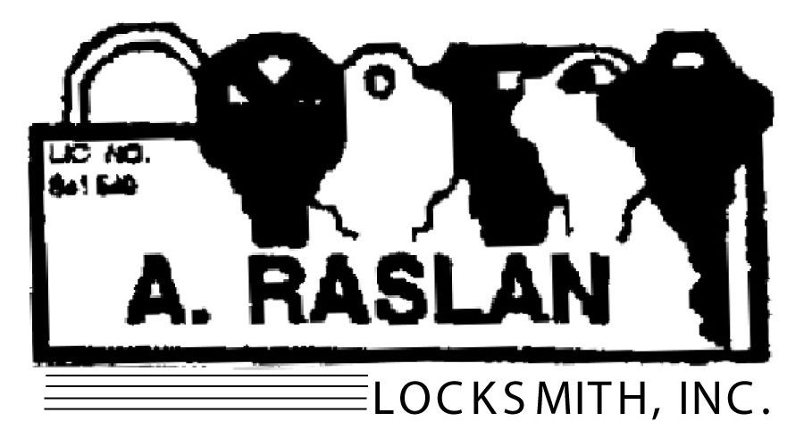
Raslan Safe & Lock used to be known as A. Raslan Locksmith, before the owner passed the company down to his son. Back when they were still A. Raslan Locksmith, they approached me for a logo redesign.
Their existing logo was in dire need of a replacement:
I began by surveying the client. They requested that I find a way to incorporate safe- or vault-related imagery into their logo. After brainstorming I came up with some sketches.
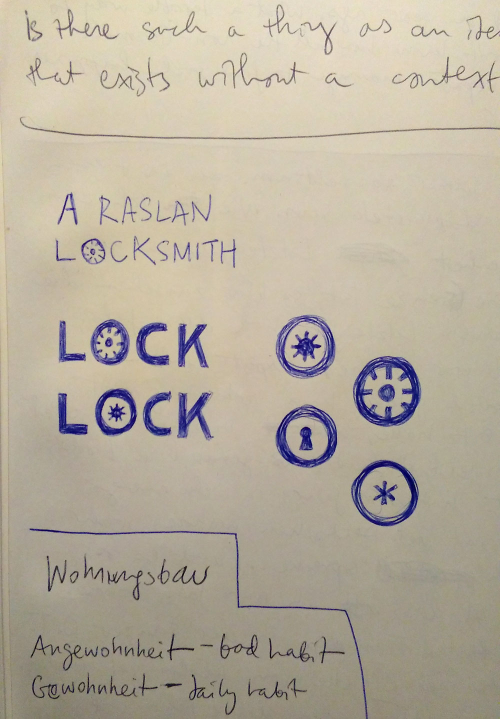
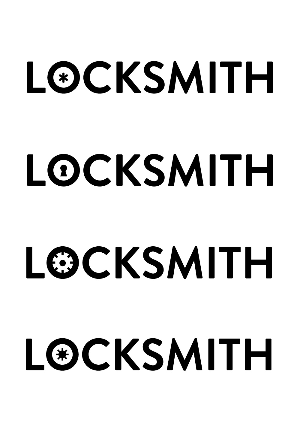
The client decided on the second-to-last option, in the right-hand image above. I took it and produced some more drafts, experimenting with different typefaces.
I felt the typeface that I ultimately chose, Gotham Book, suited the client better than Brandon Grotesque. It felt current and fresh without looking too trendy. It felt like a better choice for a mom and pop shop in a quiet family neighborhood.
Several years later, when company ownership changed hands, they once again contacted me for a logo refresh, to reflect their name change.

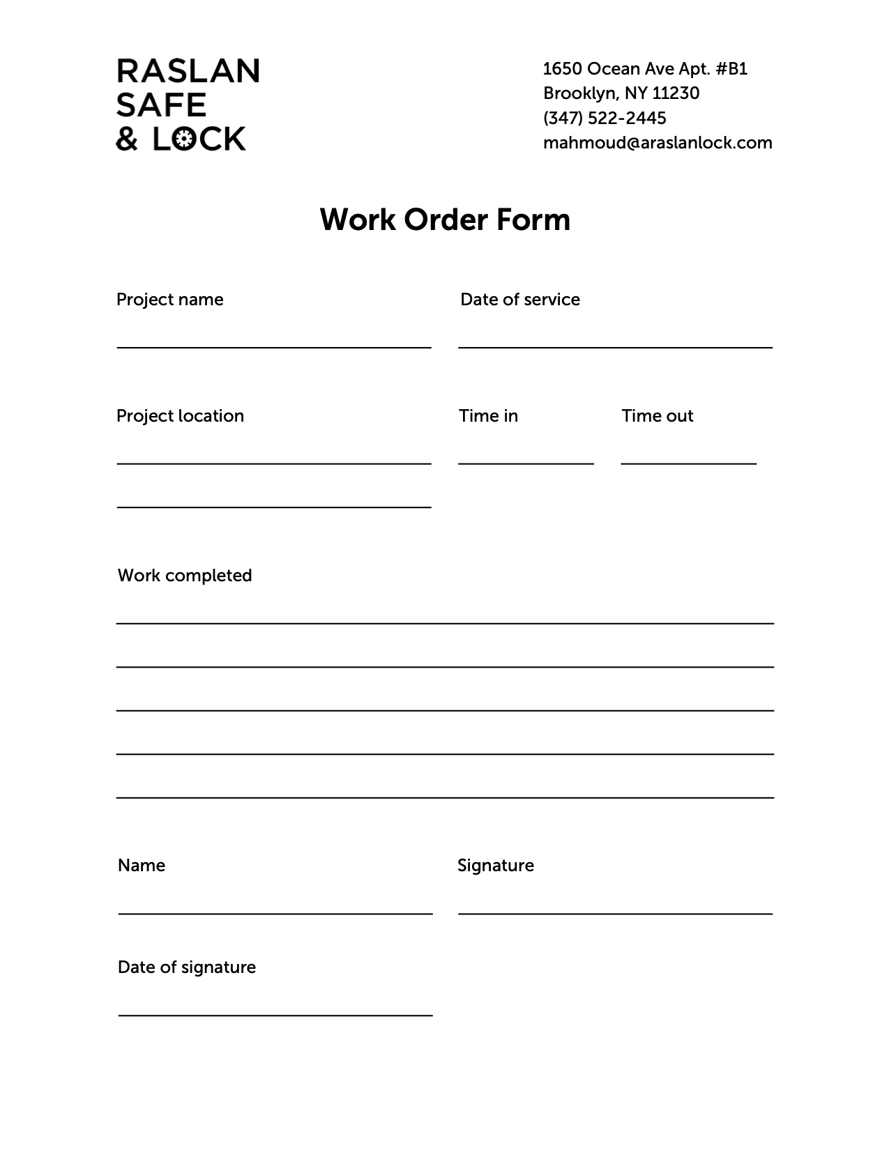
I also redesigned their work order form:
